
纯css滚动阴影
纯css滚动阴影
提问于 2016-07-23 13:10:01
当内容超过可用宽度时,我需要启用滚动阴影。这是我试图用纯css(没有JS)来实现的。我见过很多文章,可以用css实现多个背景和背景附件。如果内容是文本类型的,则使用下面的jsfilldle代码可以很好地工作,在按钮的大小写中,按钮后面是背景。所以从视觉上看这是行不通的。
预期行为:
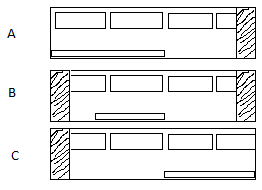
场景A:应该只在右侧启用阴影,因为滚动条位于最左边
场景B:应该同时启用阴影右侧和左侧,因为滚动条位于中间,从左移动一个部件。
场景C:应该只在左侧启用阴影,因为滚动条位于极右。
例如:
/**
 * Scrolling shadows by @kizmarh and @leaverou
 * Only works in browsers supporting background-attachment: local; & CSS gradients
 * Degrades gracefully
 */

html {
  background: white;
  font: 120% sans-serif;
}
.scrollbox {
  overflow: auto;
  width: 200px;
  max-height: 200px;
  margin: 50px auto;
  background:
  /* Shadow covers */
  linear-gradient(white 30%, rgba(255, 255, 255, 0)), linear-gradient(rgba(255, 255, 255, 0), white 70%) 0 100%,
  /* Shadows */
  radial-gradient(50% 0, farthest-side, rgba(0, 0, 0, .2), rgba(0, 0, 0, 0)), radial-gradient(50% 100%, farthest-side, rgba(0, 0, 0, .2), rgba(0, 0, 0, 0)) 0 100%;
  background:
  /* Shadow covers */
  linear-gradient(white 30%, rgba(255, 255, 255, 0)), linear-gradient(rgba(255, 255, 255, 0), white 70%) 0 100%,
  /* Shadows */
  radial-gradient(farthest-side at 50% 0, rgba(0, 0, 0, .2), rgba(0, 0, 0, 0)), radial-gradient(farthest-side at 50% 100%, rgba(0, 0, 0, .2), rgba(0, 0, 0, 0)) 0 100%;
  background-repeat: no-repeat;
  background-color: white;
  background-size: 100% 40px, 100% 40px, 100% 14px, 100% 14px;
  /* Opera doesn't support this in the shorthand */
  background-attachment: local, local, scroll, scroll;
}<h1>CSS-only shadow-scrolling effect.</h1>
<div class="scrollbox">
<ul>
<li>Ah! Scroll below!</li>
<li><button>Button</button></li>
<li><button>Button</button></li>
<li><button>Button</button></li>
<li><button>Button</button></li>
<li>3</li>
<li>4</li>
<li>5</li>
<li>6</li>
<li>7</li>
<li>8</li>
<li>9</li>
<li>10</li>
<li>1</li>
<li>2</li>
<li>3</li>
<li>4</li>
<li>5</li>
<li>6</li>
<li>7</li>
<li>8</li>
<li>9</li>
<li>10</li>
<li>1</li>
<li>2</li>
<li>3</li>
<li>4</li>
<li>5</li>
<li>6</li>
<li>7</li>
<li>8</li>
<li>The end!</li>
<li>No shadow there.</li>
</ul>
</div>
回答 1
Stack Overflow用户
发布于 2016-07-23 13:32:20
这也发生在文本,但你看不到它,因为它们是相同的颜色。一个解决方案是:孩子的z-index比父母的要低。要使这一工作奏效,还需要另外两件事情:
- 用于子级和父级的
position,而不是static .scrollbox的透明背景
解决方案
.scrollbox li * {
  z-index:0;
  position:relative;
}
.scrollbox {
  z-index:1;
  position:relative;
  background-color:transparent;
}
/**
 * Scrolling shadows by @kizmarh and @leaverou
 * Only works in browsers supporting background-attachment: local; & CSS gradients
 * Degrades gracefully
 */

html {
  background: white;
  font: 120% sans-serif;
}
.scrollbox {
  overflow: auto;
  width: 200px;
  max-height: 200px;
  margin: 50px auto;
  background:
  /* Shadow covers */
  linear-gradient(white 30%, rgba(255, 255, 255, 0)), linear-gradient(rgba(255, 255, 255, 0), white 70%) 0 100%,
  /* Shadows */
  radial-gradient(50% 0, farthest-side, rgba(0, 0, 0, .2), rgba(0, 0, 0, 0)), radial-gradient(50% 100%, farthest-side, rgba(0, 0, 0, .2), rgba(0, 0, 0, 0)) 0 100%;
  background:
  /* Shadow covers */
  linear-gradient(white 30%, rgba(255, 255, 255, 0)), linear-gradient(rgba(255, 255, 255, 0), white 70%) 0 100%,
  /* Shadows */
  radial-gradient(farthest-side at 50% 0, rgba(0, 0, 0, .2), rgba(0, 0, 0, 0)), radial-gradient(farthest-side at 50% 100%, rgba(0, 0, 0, .2), rgba(0, 0, 0, 0)) 0 100%;
  background-repeat: no-repeat;
  background-color: transparent;
  background-size: 100% 40px, 100% 40px, 100% 14px, 100% 14px;
  /* Opera doesn't support this in the shorthand */
  background-attachment: local, local, scroll, scroll;
  z-index:1;
  position:relative;
}

.scrollbox li * {
  z-index:0;
  position:relative;
}<h1>CSS-only shadow-scrolling effect.</h1>
<div class="scrollbox">
<ul>
<li>Ah! Scroll below!</li>
<li><button>Button</button></li>
<li><button>Button</button></li>
<li><button>Button</button></li>
<li><button>Button</button></li>
<li>3</li>
<li>4</li>
<li>5</li>
<li>6</li>
<li>7</li>
<li>8</li>
<li>9</li>
<li>10</li>
<li>1</li>
<li>2</li>
<li>3</li>
<li>4</li>
<li>5</li>
<li>6</li>
<li>7</li>
<li>8</li>
<li>9</li>
<li>10</li>
<li>1</li>
<li>2</li>
<li>3</li>
<li>4</li>
<li>5</li>
<li>6</li>
<li>7</li>
<li>8</li>
<li>The end!</li>
<li>No shadow there.</li>
</ul>
</div>
唯一的问题是,你需要一个坚实的背景颜色,这是工作。
编辑:
孩子的z-index需要比父级的低,但是如果像我建议的那样使用负z-index,像单击和悬停这样的事件就会停止工作。我适当地修改了代码。
页面原文内容由Stack Overflow提供。腾讯云小微IT领域专用引擎提供翻译支持
原文链接:
https://stackoverflow.com/questions/38542163
复制相关文章
相似问题
腾讯云开发者

Copyright © 2013 - 2026 Tencent Cloud. All Rights Reserved. 腾讯云 版权所有
深圳市腾讯计算机系统有限公司 ICP备案/许可证号:粤B2-20090059  粤公网安备44030502008569号
腾讯云计算(北京)有限责任公司 京ICP证150476号 | 京ICP备11018762号