
CSS -如何使Mac在CSS中停靠?除了高度或宽度外,还有第三个参数吗?
CSS -如何使Mac在CSS中停靠?除了高度或宽度外,还有第三个参数吗?
提问于 2016-07-09 14:09:52
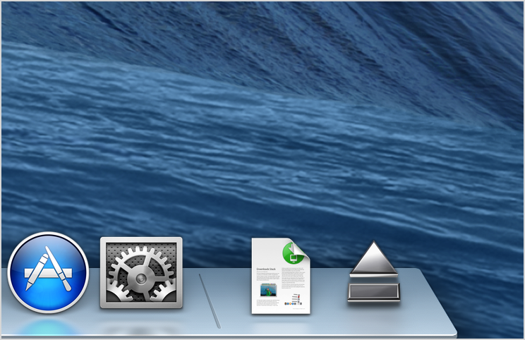
你是如何将这个3D转换的码头设计成“深度”,而不仅仅是高度和宽度?
(注意在底部的圆角处,有一些灰色的“深度”在3-5像素左右)
下面是我的CSS现在的样子:
.dock{
  transform: matrix3d(1,0,0.00,0,0.00,1,0.00,-0.0015,0,0,1,0,0,0,0,1);
  width:800px;
  height:80px;
  perspective: 300px;
  opacity:0.8;
  position:fixed;
  bottom:20px;
  left:50%;
  margin-left: -400px;
  border-radius:5px;
  background: -webkit-linear-gradient(grey, white);
}
我们将非常感谢您的帮助!
编辑:非常感谢您的帮助。不到5分钟就搞定了。太棒了!
回答 1
Stack Overflow用户
发布于 2016-07-09 14:22:47
transform: perspective(200px) rotateX(45deg);应该做好这项工作。您可能想要更改值。
如果要将多个节点转换为相同的消失点,则应阅读有关perspective-css-属性的内容。
下面是关于这个主题的一个很好的介绍:https://css-tricks.com/almanac/properties/p/perspective/
页面原文内容由Stack Overflow提供。腾讯云小微IT领域专用引擎提供翻译支持
原文链接:
https://stackoverflow.com/questions/38282681
复制相关文章
相似问题
腾讯云开发者

Copyright © 2013 - 2026 Tencent Cloud. All Rights Reserved. 腾讯云 版权所有
深圳市腾讯计算机系统有限公司 ICP备案/许可证号:粤B2-20090059  粤公网安备44030502008569号
腾讯云计算(北京)有限责任公司 京ICP证150476号 | 京ICP备11018762号