
将圆形图像分割成4片
假设我有这样的形象:
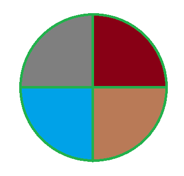
现在,我想要实现的是:当鼠标悬停在一个特定的切片时,这个切片会变大一点,圆圈的其他部分也会变模糊。
我真的不知道如何做到这一点,即使使用Javascript,JQuery和CSS!也许我可以绘制图像,但我仍然有一些疑问,如何实现我所需要的。
我的圆圈图像的4种不同颜色将是4种不同的图像,所以我既可以将它们合在一起,也可以使用HTML使它们看起来像一个圆圈。我可以同时使用这两种解决方案。
谢谢你,为我糟糕的英语>_>道歉
回答 3
Stack Overflow用户
发布于 2016-07-02 14:18:36
这可以只使用CSS :D。
你要做一个包含四个季度的包装纸。通过将边框半径设置在每个季度的一个拐角上,您将创建一个圆圈。在:hover上,您可以使用transform: scale();更改大小,在.wrapper:hover .quarter时可以使用opacity更改模糊大小。
div.wrapper { position: relative; width: 100px; height: 100px; border-radius: 50px; }
div.quarter { position: absolute; width: 50px; height: 50px; background-color: #333; transition: transform .5s, opacity .5s; }
div.quarter.left-top { left: 0; top: 0; border-top-left-radius: 50px; }
div.quarter.right-top { left: 50px; top: 0; border-top-right-radius: 50px; }
div.quarter.left-bottom { left: 0; top: 50px; border-bottom-left-radius: 50px; }
div.quarter.right-bottom { left: 50px; top: 50px; border-bottom-right-radius: 50px; }
div.wrapper:hover div.quarter { opacity: .5; }
div.quarter:hover { opacity: 1 !important; transform: scale(1.5) }<div class="wrapper">
<div class="quarter left-top"></div>
<div class="quarter right-top"></div>
<div class="quarter left-bottom"></div>
<div class="quarter right-bottom"></div>
</div>
Stack Overflow用户
发布于 2016-07-02 14:26:47
在这里,您只使用css来实现它。
将您的所有四个div封装在一个.container中,然后给它们相同的height和weigth,即:.scale{height: 150px; weight 150px},并进行四分之一的循环,您需要添加border-radius属性。之后,您需要通过以下方式处理hover事件
.scale:hover{
  transform: scale(1.1);
  z-index: 100;
    filter: blur(0) !important;
  -webkit-filter: blur(0) !important;
}
.container:hover .scale{
  filter: blur(5px);
  -webkit-filter: blur(5px);
}
Demo
.container{
  position: relative;
  height: 300px;
  width: 300px;
}
.scale{
  height: 150px;
  width: 150px;
  background-size: cover;
  position: absolute;
  transition: 0.3s all;
}
div#one {
  background-image: url(http://dummyimage.com/150.png/09f/fff);
  -moz-border-radius: 150px 0 0 0;
  border-radius: 150px 0 0 0;
  left: 0;
  top: 0;
}
div#two{
   background-image: url(http://dummyimage.com/150.png/f00/fff);
  -moz-border-radius: 0 150px 0 0;
  border-radius: 0 150px 0 0;
  right: 0;
}
div#three{
  background-image: url(http://dummyimage.com/150.png/f60/fff);
  -moz-border-radius: 0 0 150px 0;
  border-radius: 0 0 150px 0;
  bottom: 0;
  right: 0;
}
div#four{
  background-image: url(http://dummyimage.com/150.png/000/fff);
  -moz-border-radius: 0 0 0 150px;
  border-radius: 0 0 0 150px;
  bottom: 0;
}
.scale:hover{
  transform: scale(1.1);
  z-index: 100;
    filter: blur(0) !important;
  -webkit-filter: blur(0) !important;
}
.container:hover .scale{
  filter: blur(5px);
  -webkit-filter: blur(5px);
}<div class="container">
<div class="scale" id="one"></div>
<div class="scale" id="two"></div>
<div class="scale" id="three"></div>
<div class="scale" id="four"></div>
</div>
Stack Overflow用户
发布于 2016-07-02 14:05:01
您可以使用4个单独的图像来显示用css定位的图像,然后在每个图像中添加一个onmouseover,以更改其宽度和高度。
示例
<img src='grey_quadrant' id='grey' width=100 height=100 style='position: absolute; top: 0px; left:0px' onmousover='this.width=120; this.height=120'>

<img src='red_quadrant' id='red' width=100 height=100 style='position: absolute; top: 0px; left:100px' onmousover='this.width=120; this.height=120'>

<img src='blue_quadrant' id='blue' width=100 height=100 style='position: absolute; top: 100px; left:0px' onmousover='this.width=120; this.height=120'>

<img src='brown_quadrant' id='brown' width=100 height=100 style='position: absolute; top: 100px; left:100px' onmousover='this.width=120; this.height=120'>
或者你也可以用svg做类似的事情。
一种快速而简单的方法来模糊其他3个象限,也就是把它包括在鼠标上方,比如变成红色象限。
onmousover='this.width=120; this.height=120; document.getElementById("blue").src="blurred_blue_quadrant.jpg"; document.getElementById("grey").src="blurred_grey_quadrant.jpg";document.getElementById("brown").src="blurred_brown_quadrant.jpg"'为了恢复原始图像,在红色象限的情况下,对每个img标记使用onmouseout,添加一个onmouseout,如
onmouseout='this.width=100; this.height=100; document.getElementById("blue").src="blue_quadrant.jpg"; document.getElementById("grey").src="grey_quadrant.jpg";document.getElementById("brown").src="brown_quadrant.jpg"'如果你想做一些模糊的事情,你可以使用SVG或CSS,这就要求你对每个象限都有模糊的和非模糊的图像。
https://stackoverflow.com/questions/38160952
复制相似问题
腾讯云开发者

Copyright © 2013 - 2026 Tencent Cloud. All Rights Reserved. 腾讯云 版权所有
深圳市腾讯计算机系统有限公司 ICP备案/许可证号:粤B2-20090059  粤公网安备44030502008569号
腾讯云计算(北京)有限责任公司 京ICP证150476号 | 京ICP备11018762号