
未应用媒体查询
这是我的CSS media query
@media screen and (max-width: 450px) {
    .box_url {
        font-size: 12pt;
    }
    .box_heading {
        font-size: 13pt;
    }
    .right {
    text-align: left;
    }
    .jane {
    font-size: 10pt;
    }
    .ninja {
    font-size: 12pt;
    }
}
我的普通CSS
.right {
  text-align: right;
}
.jane {
  width: 100%;
  font-size: 70pt;
}
.ninja {
  width: 100%;
    font-size: 25pt;
}
但是当我运行这个站点时,有些媒体查询并没有被应用。
当我在chrome中打开dev工具时,它会显示媒体查询正在被覆盖。
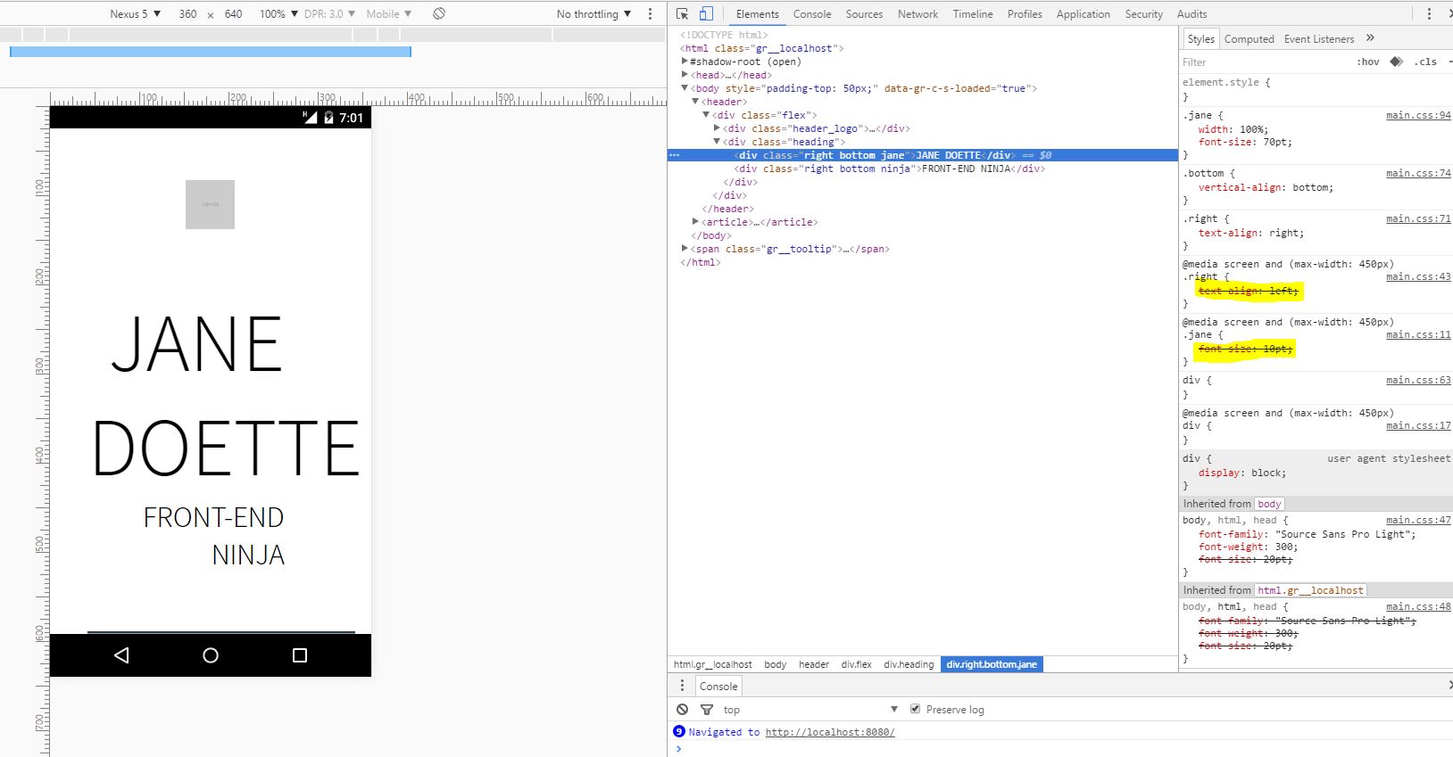
我也尝试过使用min-width,但它仍然没有应用这些样式。为什么会发生这种情况,以及如何解决这个问题?
回答 5
Stack Overflow用户
发布于 2016-06-27 15:06:18
CSS代表层叠样式表,因此必须将媒体查询放在标准CSS之后。
就像这样:
.right {
  text-align: right;
}
.jane {
  width: 100%;
  font-size: 70pt;
}
.ninja {
  width: 100%;
  font-size: 25pt;
}
@media screen and (max-width: 450px) {
  .box_url {
    font-size: 12pt;
  }
  .box_heading {
    font-size: 13pt;
  }
  .right {
    text-align: left;
  }
  .jane {
    font-size: 10pt;
  }
  .ninja {
    font-size: 12pt;
  }
}
或者,如果您希望将媒体查询放在首位,那么您需要在CSS选择器中进行更具体的操作。
就像这样:
@media screen and (max-width: 450px) {
  .flex .box_url {
    font-size: 12pt;
  }
  .flex .box_heading {
    font-size: 13pt;
  }
  .flex .right {
    text-align: left;
  }
  .flex .jane {
    font-size: 10pt;
  }
  .flex .ninja {
    font-size: 12pt;
  }
}
.right {
  text-align: right;
}
.jane {
  width: 100%;
  font-size: 70pt;
}
.ninja {
  width: 100%;
  font-size: 25pt;
}Stack Overflow用户
发布于 2016-06-27 15:05:37
CSS的重要性顺序如下:
1-单一宣言
body {
    background: red;
}
2-第一份声明之下的任何声明
body {
    background-color: red;
}

body {
    background-color: blue; /* (This will be applied) */
}

/* I'm overwriting my background, so it should be blue now */
标题上的位置也会产生影响。
<link rel="stylesheet" href="https://maxcdn.bootstrapcdn.com/bootstrap/3.3.6/css/bootstrap.min.css">
<link rel="stylesheet" href="style.css">
在本例中,我的style.css覆盖了引导文件上的任何内容,但请参阅下一主题中的异常。
3-更具体的声明
.container button.awesome-button {
    font-size: 14px; /* (This will be applied) */
}

.awesome-button{
    font-size: 10px;
}由于第一项宣言非常具体,因此将审议这一宣言。这就像告诉‘嘿,任何.awesome-button都应该是10 be,然后指出“button在.container下,类.awesome-button应该是14 be,所以您的CSS应该尊重最具体和精确的坐标。”
4- CSS作为属性
<style>
  .blue{
    color:blue;
  }
</style>

<div class="blue" style="color: red">The color of this div will be red, no matter the class</div>
直接在HTML上进行样式设计将获得优先于样式表上任何内容的优先级。
5-使用!important的元素(如果有更多的!important元素,则具体的事情)
.awesome-button {
    font-size: 14px !important; /* (This will be applied) */
}

.awesome-button{
    font-size: 10px;
}任何与!important有关的东西都是.更重要的是,所以CSS会理解这一点。但是,如果有更多的!important规则,其他规则将在重要元素中应用。
要小心:使用!important的应该谨慎使用,并且在某些情况下作为最后的资源使用。
因此,在您的示例中,简单地将所有媒体查询放在“普通”css之后,如下所示:
.right {
  text-align: right;
}
.jane {
  width: 100%;
  font-size: 70pt;
}
.ninja {
  width: 100%;
  font-size: 25pt;
}
@media screen and (max-width: 450px) {
  .box_url {
    font-size: 12pt;
  }
  .box_heading {
    font-size: 13pt;
  }
  .right {
    text-align: left;
  }
  .jane {
    font-size: 10pt;
  }
  .ninja {
    font-size: 12pt;
  }
}Stack Overflow用户
发布于 2016-06-27 15:10:24
简单地说:媒体查询中的规则和“正常”规则都适用于这里,因此,由于级联的原因,正在应用“正常”规则。
您的屏幕大小小于450px,因此应用媒体查询规则。“正常”规则将适用于任何情况。级联将通过样式表中后面出现的任何一个选项来确定“胜利者”,因为它们都是同样具体的,这似乎是您的“正常”规则。
在您的情况下,您可以反转CSS中规则的顺序,也可以反转逻辑,使您的移动案例成为默认视图(移动优先!)并使用类似于min-width媒体查询的内容来改变文本在大屏幕上的行为方式。
https://stackoverflow.com/questions/38057330
复制相似问题
腾讯云开发者

Copyright © 2013 - 2026 Tencent Cloud. All Rights Reserved. 腾讯云 版权所有
深圳市腾讯计算机系统有限公司 ICP备案/许可证号:粤B2-20090059  粤公网安备44030502008569号
腾讯云计算(北京)有限责任公司 京ICP证150476号 | 京ICP备11018762号