
React d3 --如何:单行图上的几个区域
React d3 --如何:单行图上的几个区域
提问于 2016-06-14 10:19:28
我正在使用d3 图书馆 in react.js。
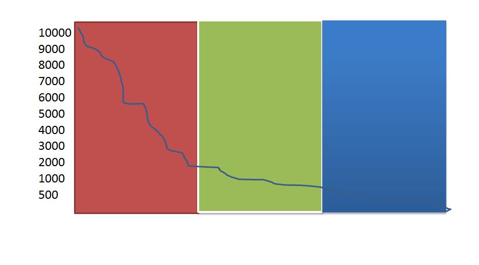
我有一张线图,我想把它划分成三个不同颜色的区域,如图中所示。例如,如果我设置了2000年的按钮,那么应该是绿色的。同样,蓝色和它的支架也是如此。一旦我让它用硬编码的值绘制,那么我需要实现一个滑块,并使它更加动态,但我想这是很容易的,因为我知道如何实现这个区域着色。
这是我拥有的初始代码:
<div style={{marginLeft: '20px', width: (this.state.xWidth + 160)}}>
      <Loader style={{float: 'left'}} loaded={this.state.loaded}>
        <Chart width={this.state.xWidth + 160}
               height={this.state.height}
               data={this.state.parts}
               title={this.state.title}
               chartSeries={this.state.chartSeries}
               x={this.state.xAxis}
               >
          <Line
            chartSeries={this.state.chartSeries}
            />
          <Area
              chartSeries = {this.state.redZone}
          />
         <Area
              chartSeries = {this.state.greenZone}
          />
         <Area
              chartSeries = {this.state.blueZone}
          />
          <Xaxis/>
          <Yaxis/>
          <Xgrid/>
          <Ygrid/>

        </Chart>
      </Loader>
    </div>
和准备工作:
redZone = [
      {
        field: 'redZone',
        name: 'Red Zone ',
        color: '#005C00',
        style: {
          "strokeWidth": 2,
          "strokeOpacity": .2,
          "fillOpacity": .2
        }
      }
    ],
  greenZone = [
      {
        field: 'greenZone',
        name: 'Green Zone ',
        color: '#005C00',
        style: {
          "strokeWidth": 2,
          "strokeOpacity": .2,
          "fillOpacity": .2
        }
      }
    ],
  blueZone = [
      {
        field: 'blueZone',
        name: 'Blue Zone ',
        color: '#005C00',
        style: {
          "strokeWidth": 2,
          "strokeOpacity": .2,
          "fillOpacity": .2
        }
      }
    ],
和数据:
{
    "name": "Miss Demond Weissnat V",
    "zoneCount": 10000,
    "city": "Savionberg",
    "index": 1
},
{
    "name": "Easton Mante",
    "zoneCount": 2000,
    "city": "Kutchberg",
    "index": 2
}, ...
我想我需要添加属性到我的数据模型的颜色区域,但这是我迷路了…
在实现区域之后,它们将显示在图像中。
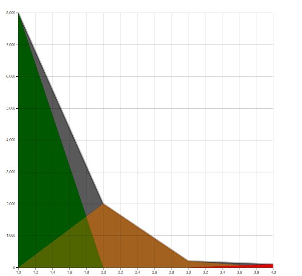
但我怎样才能让它一直展示到顶端,而不应该有逐渐下降的趋势。应该是流线,就像上一张照片上的那样?
回答 1
Stack Overflow用户
回答已采纳
发布于 2016-06-16 14:53:36
chartSeries中的字段名必须在数据中具有完全相同的名称(也是区分大小写的)的相应属性。
您的chartSeries应该是这样的Array of Objects:
    redZone = [{
      field: 'redZone',
      name: 'Red Zone ',
      color: '#005C00',
      style: {
        "strokeWidth": 2,
        "strokeOpacity": .2,
        "fillOpacity": .2
      }
    }, {
      field: 'greenZone',
      name: 'Green Zone ',
      color: '#005C00',
      style: {
        "strokeWidth": 2,
        "strokeOpacity": .2,
        "fillOpacity": .2
      }
    }, {
      field: 'blueZone',
      name: 'Blue Zone ',
      color: '#005C00',
      style: {
        "strokeWidth": 2,
        "strokeOpacity": .2,
        "fillOpacity": .2
      }
    }];
你的数据应该是这样的:
    var data = [{
      "name": "Miss Demond Weissnat V",
      "zoneCount": 10000,
      "city": "Savionberg",
      "index": 1,
      "redZone": 10000
    }, {
      "name": "Easton Mante",
      "zoneCount": 2000,
      "city": "Kutchberg",
      "index": 2,
      "greenZone": 10000
    }, {
      "name": "What ever",
      "zoneCount": 3000,
      "city": "wherever",
      "index": 3,
      "blueZone": 3000
}]需要注意的是,在chartSeries中提供的每个字段的名称在对象的数据数组中都有一个相应的属性。
页面原文内容由Stack Overflow提供。腾讯云小微IT领域专用引擎提供翻译支持
原文链接:
https://stackoverflow.com/questions/37809252
复制相关文章
相似问题
腾讯云开发者

Copyright © 2013 - 2026 Tencent Cloud. All Rights Reserved. 腾讯云 版权所有
深圳市腾讯计算机系统有限公司 ICP备案/许可证号:粤B2-20090059 ![]() 粤公网安备44030502008569号
粤公网安备44030502008569号
腾讯云计算(北京)有限责任公司 京ICP证150476号 | 京ICP备11018762号