
动态CSS宽度
动态CSS宽度
提问于 2016-05-18 05:12:49
因此,我有一个div容器跨越整个页面(请看图片)。
<div class="container">
  <div class="A">Content length changes</div>
  <div class="B">Width dependent on "A"</div>
  <div class="C">fixed 27px width</div>
  <div class="D">fixed 27px width</div>
</div>
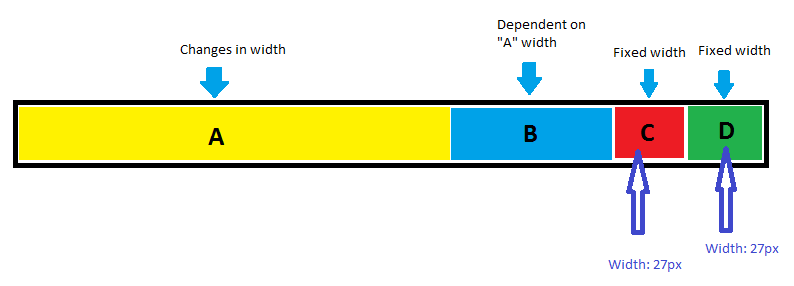
问题是"A“的宽度是动态的,它的变化意味着"B”宽度也会发生变化(尽管"B“的最小宽度为27 is )。
我可以测量"A“的宽度并使用jQuery更改CSS,但是我想知道是否有一种方法可以简单地使用css来处理"A”和"B“的宽度变量。
回答 2
Stack Overflow用户
回答已采纳
发布于 2016-05-18 05:53:11
我有一个没有任何弹性的解决方案。只有简单的CSS。
.A {
  float:left;
}
.B {
  overflow: hidden;
}
.C, .D {
  float: right;
  width: 27px;
  min-width: 27px;
}

/* beautiful appearance */
.container {
  border: 4px solid #999;
  padding: 8px;
}
.A, .B, .C, .D {
  padding: 4px 8px;
}
.A { background: #ff6; }
.B { background: #69f; }
.C { background: #f60; }
.D { background: #6c6; }<div class="container">
<div class="D">D</div>
<div class="C">C</div>
<div class="A">A. Content length changes</div>
<div class="B">B. Dependent on "A"</div>
</div>
http://jsfiddle.net/glebkema/Lf5fw9e6/
UPD。为了清楚起见,我在容器中添加了一个边框。
Stack Overflow用户
发布于 2016-05-18 05:34:26
下面是我如何使用flexbox的
div {
  border: 3px solid;
}
.child {
  padding: 10px;
  margin: 10px;
  background-color: #eee;
}
.container {
  padding: 10px;
  background-color: yellow;
  display: -webkit-flex;
  display: flex;
}
.child.one {
  -webkit-flex: 5 1 200px;
  flex: 5 1 200px;
  color: green;
}
.child.two {
  -webkit-flex: 1 3 200px;
  flex: 1 3 200px;
  color: purple;
}
.child.three,
.child.four {
  width: 50px;
}<div class="container">
<div class="child one">
Child One
<br>Lorem ipsum
<br>dolor sit amet
<br>This is a bit longer line
</div>
<div class="child two">
Two
</div>
<div class="child three">
Three
</div>
<div class="child four">
Four
</div>
</div>
页面原文内容由Stack Overflow提供。腾讯云小微IT领域专用引擎提供翻译支持
原文链接:
https://stackoverflow.com/questions/37290781
复制相关文章
相似问题
腾讯云开发者

Copyright © 2013 - 2026 Tencent Cloud. All Rights Reserved. 腾讯云 版权所有
深圳市腾讯计算机系统有限公司 ICP备案/许可证号:粤B2-20090059  粤公网安备44030502008569号
腾讯云计算(北京)有限责任公司 京ICP证150476号 | 京ICP备11018762号