
ggplot geom_lines中的绘图值
ggplot geom_lines中的绘图值
提问于 2016-05-14 18:14:22
我有一个像这样的数据:
> dput(df)
structure(list(OBBLIGATORIO = structure(c(2L, 2L, 2L, 2L, 2L,
2L, 2L, 2L, 2L, 2L, 2L, 2L, 2L, 2L, 2L, 2L, 2L, 2L, 2L, 2L, 2L,
2L, 2L, 2L, 2L, 2L, 2L, 2L, 2L, 2L, 2L, 2L, 2L, 2L, 2L, 2L, 2L,
2L, 2L, 2L, 2L, 2L, 2L, 2L, 2L, 2L, 2L, 2L, 2L, 2L, 2L, 2L, 2L,
2L, 2L, 2L, 2L, 2L, 2L, 2L, 2L, 2L, 2L, 2L, 2L, 2L, 2L, 2L, 2L,
2L, 2L, 2L, 2L, 2L, 2L, 2L, 2L, 2L, 2L, 2L, 2L, 2L, 2L, 2L, 2L,
2L, 2L, 2L, 2L, 2L, 2L, 2L, 2L, 2L, 2L, 2L, 2L, 2L), .Label = c("no",
"yes"), class = "factor"), COUNTRY = structure(c(16L, 16L, 16L,
16L, 16L, 16L, 16L, 16L, 16L, 16L, 16L, 16L, 16L, 16L, 16L, 16L,
16L, 16L, 16L, 16L, 16L, 16L, 16L, 16L, 16L, 16L, 16L, 16L, 16L,
16L, 16L, 16L, 16L, 16L, 16L, 16L, 16L, 16L, 16L, 16L, 16L, 16L,
16L, 16L, 16L, 16L, 16L, 16L, 16L, 16L, 16L, 16L, 16L, 16L, 16L,
16L, 16L, 16L, 16L, 16L, 16L, 16L, 16L, 16L, 16L, 16L, 16L, 16L,
16L, 16L, 16L, 16L, 16L, 16L, 16L, 16L, 16L, 16L, 16L, 16L, 16L,
16L, 16L, 16L, 16L, 16L, 16L, 16L, 16L, 16L, 16L, 16L, 16L, 16L,
16L, 16L, 16L, 16L), .Label = c("Austria", "Belgium", "Bulgaria",
"Croatia", "Cyprus", "Czech Republic", "Denmark", "Estonia",
"Finland", "France", "Germany", "Greece", "Hungary", "Iceland",
"Ireland", "Italy", "Latvia", "Lithuania", "Luxembourg", "Malta",
"Norway", "Poland", "Portugal", "Romania", "Slovakia", "Slovenia",
"Spain", "Sweden", "United Kingdom of Great Britain and Northern Ireland"
), class = "factor"), YEAR = c(2003L, 2006L, 2007L, 2008L, 2009L,
2010L, 1995L, 1996L, 1997L, 1998L, 1999L, 2000L, 2001L, 2002L,
2003L, 2006L, 2007L, 2008L, 2009L, 2010L, 1995L, 1996L, 1997L,
1998L, 1999L, 2000L, 2001L, 2002L, 2003L, 2006L, 2007L, 2008L,
2009L, 2010L, 1995L, 1996L, 1997L, 1998L, 1999L, 2000L, 2001L,
2002L, 2003L, 2006L, 2007L, 2008L, 2009L, 2010L, 1995L, 1996L,
1997L, 1998L, 1999L, 2000L, 2001L, 2002L, 2003L, 2006L, 2007L,
2008L, 2009L, 2010L, 1995L, 1996L, 1997L, 1998L, 1999L, 2000L,
2001L, 2002L, 2003L, 2006L, 2007L, 2008L, 2009L, 2010L, 1995L,
1996L, 1997L, 1998L, 1999L, 2000L, 2001L, 2002L, 2003L, 2006L,
2007L, 2008L, 2009L, 2010L, 1995L, 1996L, 1997L, 1998L, 1999L,
2000L, 2001L, 2002L), AGE = structure(c(1L, 1L, 1L, 1L, 1L, 1L,
1L, 1L, 1L, 1L, 1L, 1L, 1L, 1L, 1L, 1L, 1L, 1L, 1L, 1L, 1L, 1L,
1L, 1L, 1L, 1L, 1L, 1L, 1L, 1L, 1L, 1L, 1L, 1L, 1L, 1L, 1L, 1L,
1L, 1L, 1L, 1L, 1L, 1L, 1L, 1L, 1L, 1L, 1L, 1L, 1L, 1L, 1L, 1L,
1L, 1L, 1L, 1L, 1L, 1L, 1L, 1L, 1L, 1L, 1L, 1L, 1L, 1L, 1L, 1L,
1L, 1L, 1L, 1L, 1L, 1L, 1L, 1L, 1L, 1L, 1L, 1L, 1L, 1L, 1L, 1L,
1L, 1L, 1L, 1L, 1L, 1L, 1L, 1L, 1L, 1L, 1L, 1L), .Label = "Total", class = "factor"),
    `CAUSE OF DEATH` = c("Acute poliomyelitis", "Acute poliomyelitis",
    "Acute poliomyelitis", "Acute poliomyelitis", "Acute poliomyelitis",
    "Acute poliomyelitis", "Acute poliomyelitis", "Acute poliomyelitis",
    "Acute poliomyelitis", "Acute poliomyelitis", "Acute poliomyelitis",
    "Acute poliomyelitis", "Acute poliomyelitis", "Acute poliomyelitis",
    "Diphtheria", "Diphtheria", "Diphtheria", "Diphtheria", "Diphtheria",
    "Diphtheria", "Diphtheria", "Diphtheria", "Diphtheria", "Diphtheria",
    "Diphtheria", "Diphtheria", "Diphtheria", "Diphtheria", "Measles",
    "Measles", "Measles", "Measles", "Measles", "Measles", "Measles",
    "Measles", "Measles", "Measles", "Measles", "Measles", "Measles",
    "Measles", "Tetanus", "Tetanus", "Tetanus", "Tetanus", "Tetanus",
    "Tetanus", "Tetanus", "Tetanus", "Tetanus", "Tetanus", "Tetanus",
    "Tetanus", "Tetanus", "Tetanus", "Tuberculosis", "Tuberculosis",
    "Tuberculosis", "Tuberculosis", "Tuberculosis", "Tuberculosis",
    "Tuberculosis", "Tuberculosis", "Tuberculosis", "Tuberculosis",
    "Tuberculosis", "Tuberculosis", "Tuberculosis", "Tuberculosis",
    "Viral hepatitis", "Viral hepatitis", "Viral hepatitis",
    "Viral hepatitis", "Viral hepatitis", "Viral hepatitis",
    "Viral hepatitis", "Viral hepatitis", "Viral hepatitis",
    "Viral hepatitis", "Viral hepatitis", "Viral hepatitis",
    "Viral hepatitis", "Viral hepatitis", "Whooping cough", "Whooping cough",
    "Whooping cough", "Whooping cough", "Whooping cough", "Whooping cough",
    "Whooping cough", "Whooping cough", "Whooping cough", "Whooping cough",
    "Whooping cough", "Whooping cough", "Whooping cough", "Whooping cough"
    ), VALUE = structure(c(1L, 1L, 1L, 1L, 1L, 1L, 1L, 1L, 1L,
    1L, 1L, 1L, 1L, 1L, 1L, 1L, 1L, 1L, 1L, 1L, 1L, 1L, 1L, 1L,
    1L, 1L, 1L, 1L, 4L, 2L, 2L, 2L, 1L, 1L, 6L, 7L, 7L, 1L, 2L,
    3L, 2L, 5L, 12L, 9L, 13L, 9L, 13L, 8L, 17L, 14L, 16L, 18L,
    15L, 19L, 11L, 10L, 25L, 24L, 21L, 22L, 23L, 20L, 34L, 32L,
    31L, 30L, 29L, 28L, 27L, 26L, 41L, 42L, 43L, 45L, 46L, 47L,
    33L, 35L, 36L, 37L, 38L, 39L, 40L, 44L, 1L, 2L, 1L, 1L, 1L,
    2L, 2L, 2L, 1L, 3L, 1L, 1L, 1L, 1L), .Label = c("0", "1",
    "2", "3", "6", "7", "9", "17", "18", "19", "21", "22", "27",
    "28", "30", "31", "37", "41", "42", "301", "329", "333",
    "344", "350", "396", "413", "415", "460", "517", "558", "597",
    "609", "622", "647", "681", "1087", "1349", "1413", "1448",
    "1499", "1576", "1654", "1725", "1948", "2531", "2665", "2757"
    ), class = "factor"), ID = 1:98), .Names = c("OBBLIGATORIO",
"COUNTRY", "YEAR", "AGE", "CAUSE OF DEATH", "VALUE", "ID"), row.names = c(NA,
-98L), class = "data.frame")
我想要一张图表:
- 在x轴上有来自年份列的值。
- 在y轴上
- 值列数据中的值按死亡原因列除以。
所以,就像:
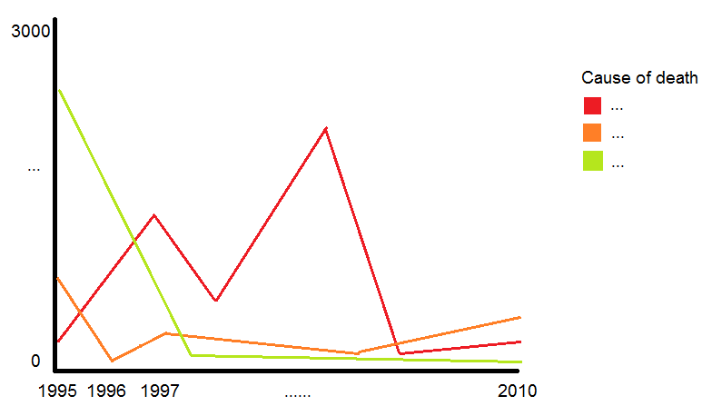
我试着:
x11()
ggplot(df, aes(x = df$`YEAR`, y = df$`VALUE`, fill = df$`CAUSE OF DEATH`, colour = df$`CAUSE OF DEATH`)) +
  geom_density(alpha = 0.1) +
  xlim(1995, 2010)
但结果和我想要的完全不同。
谢谢
回答 1
Stack Overflow用户
回答已采纳
发布于 2016-05-14 20:50:24
我不知道您的实际问题是什么,但是dataframe的一个问题是,VALUE列当前被定义为因子,而不是数值。我认为纠正这个问题对解决你的问题有很大的帮助。我在下面(即在已经创建了dataframe之后)进行后续操作,但是如果您要通过read.table()或类似的命令将数据输入R,则可以在数据帧创建时指定列的class,这可能是一种更好的方法。
在下面的代码中,我使用dplyr包来操作数据格式。它非常强大,但是对于这个特殊的例子,它没有做任何基础R不能做的事情。
require(ggplot2)
require(dplyr)
require(magrittr)
df <- ### YOUR dput output goes here ###
# fix the problem with the `VALUE` column
df %<>% mutate(VALUE = VALUE %>% as.character %>% as.numeric)
# equivalent in base R:
# df$VALUE <- as.numeric(as.character(df$VALUE))
# make a graph (is it the one you want?)
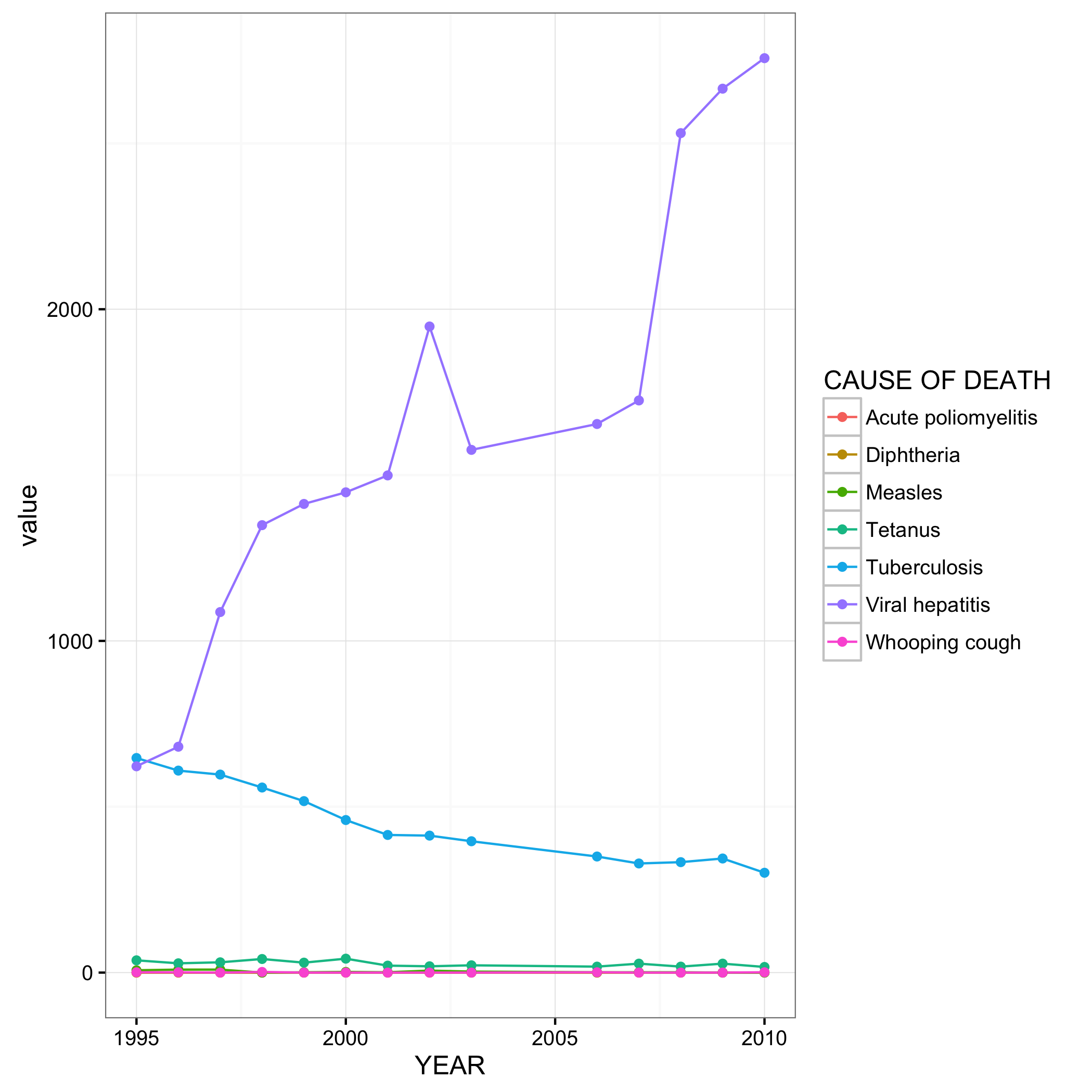
df %>% group_by(YEAR, `CAUSE OF DEATH`) %>%
summarize(value = sum(VALUE)) %>%
ggplot(aes(x = YEAR, y = value, color = `CAUSE OF DEATH`)) +
geom_line() +
theme_bw() +
geom_point()
# save graph for uploading to SO
ggsave('SO37230266.png')结果是这个图表:
页面原文内容由Stack Overflow提供。腾讯云小微IT领域专用引擎提供翻译支持
原文链接:
https://stackoverflow.com/questions/37230266
复制相关文章
相似问题
腾讯云开发者

Copyright © 2013 - 2026 Tencent Cloud. All Rights Reserved. 腾讯云 版权所有
深圳市腾讯计算机系统有限公司 ICP备案/许可证号:粤B2-20090059 ![]() 粤公网安备44030502008569号
粤公网安备44030502008569号
腾讯云计算(北京)有限责任公司 京ICP证150476号 | 京ICP备11018762号