
高图表-列图表定制
高图表-列图表定制
提问于 2016-05-02 05:04:58
我正在使用高级图表库创建列图表。我试图根据我的要求定制列图表,但有两件事我做不到。第一,列图的底部边框,第二是所有系列的列背景。看看下面的图片,我需要实现什么。
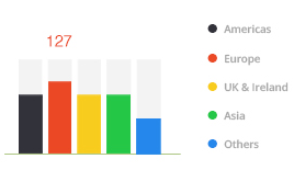
到目前为止,我在这里所做的是:小提琴
jQuery(document).ready(function(jQuery) {

          jQuery('#portlet-content').highcharts({
        credits: {
            enabled: false
        },
        exporting: {
          enabled: false
        },
        chart: {
            type: 'column'
        },
        title: {
            text: 'Number of Applications'
        },
        subtitle: {
            text: 'BY COUNTRY'
        },
        xAxis: {
          visible: false
        },
        yAxis: {
            visible: false
        },
        legend: {
            enabled: true,
            align: 'right',
            verticalAlign: 'middle',
            layout: 'vertical',
            padding: 3,
            itemMarginTop: 5,
            itemMarginBottom: 5,
            itemStyle: {
                lineHeight: '14px'
            },
            symbolHeight: 12,
            symbolWidth: 12,
            symbolRadius: 6
        },
        tooltip: {
            formatter: function() {
                                return '<b style="color:'+this.point.color+'">'+ this.y +'</b>';
                            },
            useHTML: true,
            borderWidth: 0,
            style: {
                padding: 0,
                fontSize: '16px'
            },
            shadow: false
        },
        series: [
            {
              name: "United Kingdom",
              color: '#32323A',
              data: [
                  [294]
              ]
            }, {
              name: "USA",
              color: '#EB4825',
              data: [
                  [65]
              ]
            }
            , {
              name: "United Arab Emirates",
              color: '#F7CC1E',
              data: [
                  [35]
              ]
            }
            , {
              name: "India",
              color: '#24C746',
              data: [
                  [23]
              ]
            }
            , {
              name: "Canada",
              color: '#2587EC',
              data: [
                  [18]
              ]
            }
        ]
      });

});回答 1
Stack Overflow用户
发布于 2016-05-02 13:37:00
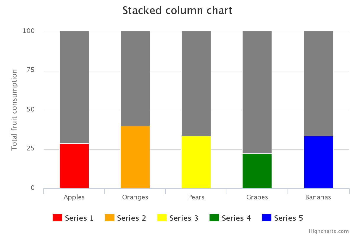
注意:,我修改了我的答案,以更好地解决原海报问题中的具体要求。
以下是我的建议:
创建一个堆叠的列图,其中一个系列是“虚拟”系列,用户无法与之交互。这将作为你的背景。
这里有一个快速的小提琴,我根据高图表堆叠的列演示:http://jsfiddle.net/brightmatrix/v97p3eam/
plotOptions: {
    column: { stacking: 'percent' }
},
series: [
    /* this is the "dummy" series
       set the "showInLegend" and "enableMouseTracking" attributes
       to "false" to prevent user interaction */
    { name: 'dummy data', data: [5, 3, 4, 7, 2], color:'gray',
              showInLegend: false, enableMouseTracking: false },
    /* here's the real data; set a unique color for each
       set nulls for the columns where that color/data is not needed */
    { name: 'Series 1', color: 'red', data: [2,null,null,null,null] },
    { name: 'Series 2', color: 'orange', data: [null,2,null,null,null] },
    { name: 'Series 3', color: 'yellow', data: [null,null,2,null,null] },
    { name: 'Series 4', color: 'green', data: [null,null,null,2,null] },
    { name: 'Series 5', color: 'blue', data: [null,null,null,null,1] }
]
如果这对你有帮助,请告诉我!
页面原文内容由Stack Overflow提供。腾讯云小微IT领域专用引擎提供翻译支持
原文链接:
https://stackoverflow.com/questions/36975302
复制相关文章
相似问题
腾讯云开发者

Copyright © 2013 - 2026 Tencent Cloud. All Rights Reserved. 腾讯云 版权所有
深圳市腾讯计算机系统有限公司 ICP备案/许可证号:粤B2-20090059 ![]() 粤公网安备44030502008569号
粤公网安备44030502008569号
腾讯云计算(北京)有限责任公司 京ICP证150476号 | 京ICP备11018762号