
引导网格和行对齐问题
引导网格和行对齐问题
提问于 2016-04-25 11:27:46
如图所示,我正在努力实现以下布局:
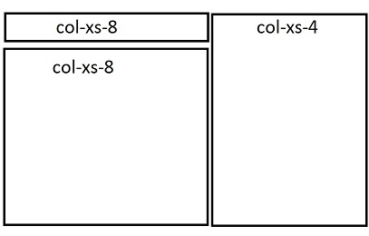
我希望-xs-8和col-xs-4都能从同样的高度开始,所以我把它们放在一排,另一排放在另一排。我得到的是:
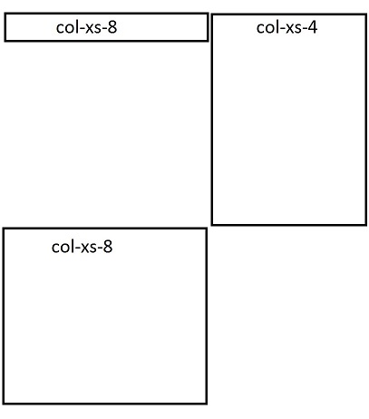
有没有办法解决这个问题,并正确地显示两列?我也希望两列的高度完全一样。较低的-xs-8,有一个固定的高度.谢谢!
回答 5
Stack Overflow用户
回答已采纳
发布于 2016-04-25 11:42:32
将pull-right类添加到第二个元素。该类将float:right;属性添加到元素中。
<link href="https://maxcdn.bootstrapcdn.com/bootstrap/3.3.6/css/bootstrap.min.css" rel="stylesheet" />
<div class="row">
  <div class="col-xs-4 bg-warning">Lorem Ipsum is simply dummy text.</div>
  <div class="col-xs-8 bg-primary pull-right">Lorem Ipsum is simply dummy text of the printing and typesetting industry. Lorem Ipsum has been the industry's standard dummy text ever since the 1500s, when an unknown printer took a galley of type and scrambled it to make a type specimen book. It has survived not only five centuries, but also the leap into electronic typesetting, remaining essentially unchanged. It was popularised in the 1960s with the release of Letraset sheets containing Lorem Ipsum passages, and more recently with desktop publishing software like Aldus PageMaker including versions of Lorem Ipsum.</div>
  <div class="col-xs-4 bg-success">Lorem Ipsum is simply dummy text of the printing and typesetting industry. Lorem Ipsum has been the industry's standard dummy text ever since the 1500s, when an unknown printer took a galley of type and scrambled it to make a type specimen book. It has survived not only five centuries, but also the leap into electronic typesetting, remaining essentially unchanged. It was popularised in the 1960s with the release of Letraset sheets containing Lorem Ipsum passages, and more recently with desktop publishing software like Aldus PageMaker including versions of Lorem Ipsum.</div>
</div>
Stack Overflow用户
发布于 2016-04-25 11:37:03
<div class ='row'>
  <div class='col-md-8'>
    <div style='background:green' class='col-md-12'>a</div>
    <div style='background:yellow' class='col-md-12'>b</div>
  </div>
  <div class='col-md-4'>
    <div style='background:red' class='col-md-12'>c</div>
  </div>
</div>Stack Overflow用户
发布于 2016-04-25 11:45:29
尝试以下代码并查看引导链接:
<div class="row-fluid">
  <div class="container">
    <div class="col-lg-8 col-md-8 col-sm-12 col-xs-12">
      <div class="col-lg-12 col-md-12 col-sm-12 col-xs-12 test">
        col-8
      </div>
      <div class="col-lg-12 col-md-12 col-sm-12 col-xs-12 test1">
        col-8
      </div>
    </div>
    <div class="col-lg-4 col-md-4 col-sm-12 col-xs-12">
      <div class="col-lg-12 col-md-12 col-sm-12 col-xs-12 test2">
        col-4
      </div>
    </div>
  </div>
</div>
此处使用的/* CSS将在bootstrap.css */之后应用。
.test {
  background-color: #ff0000;
  border: 1px solid;
  color: #ffffff;
}
.test1 {
  background-color: #000000;
  border: 1px solid;
  color: #ffffff;
}
.test2 {
  background-color: #008000;
  border: 1px solid;
  color: #ffffff;
}
http://www.bootply.com/nR4VPtCzy6
页面原文内容由Stack Overflow提供。腾讯云小微IT领域专用引擎提供翻译支持
原文链接:
https://stackoverflow.com/questions/36839253
复制相关文章
相似问题
腾讯云开发者

Copyright © 2013 - 2026 Tencent Cloud. All Rights Reserved. 腾讯云 版权所有
深圳市腾讯计算机系统有限公司 ICP备案/许可证号:粤B2-20090059  粤公网安备44030502008569号
腾讯云计算(北京)有限责任公司 京ICP证150476号 | 京ICP备11018762号