
在滑雪板前后使用CSS..。无法调整小于初始宽度的图像大小。
在滑雪板前后使用CSS..。无法调整小于初始宽度的图像大小。
提问于 2016-03-23 07:56:39
我正在开发一个WP网站,它是从HTML代码迁移过来的。因此,我有一个困难的时间使用插件在WP。
我搜索并找到了一种使用CSS实现功能之前和之后的方法。它起作用了,我对此很高兴。
这就是我发现的地方:
http://lea.verou.me/2014/07/image-comparison-slider-with-pure-css/
产出:
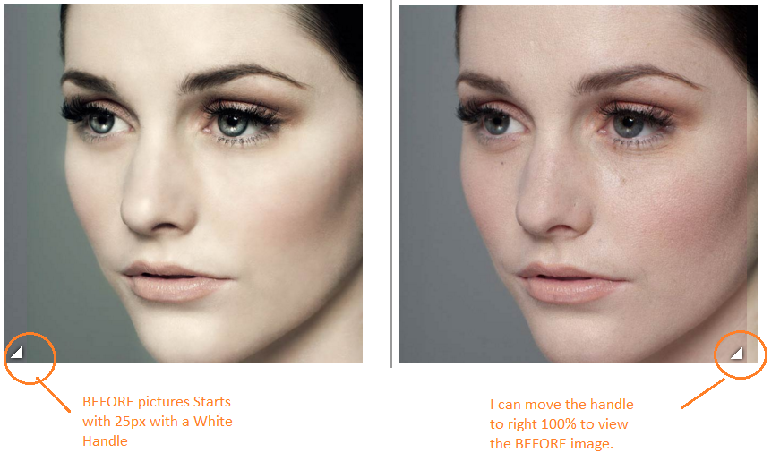
现在我想稍微调整一下.
好的..。所以现在..。如果我将( .image-slider > div )宽度更改为200 to。
.image-slider > div {
      position: absolute;
      top: 0; bottom: 0; left: 0;
      width: 200px;
      max-width: 100%;
      overflow: hidden;
      resize: horizontal;
    }
输出:
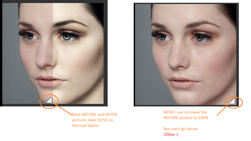
下面将找到完整的代码和片段链接:
 /**
 * Image slider with pure CSS
 * Original version in http://demosthenes.info/blog/css
 */

.image-slider {
  position:relative;
  display: inline-block;
  line-height: 0;
}

/* Could use a pseudo-element, but they’re currently
   super buggy. See: http://dabblet.com/gist/ab432c3f6a8f672cd077 */
.image-slider > div {
  position: absolute;
  top: 0; bottom: 0; left: 0;
  width: 200px;
  max-width: 100%;
  overflow: hidden;
  resize: horizontal;
}

/* Cross-browser resizer styling */
.image-slider > div:before {
  content: '';
  position: absolute;
  right: 0; bottom: 0;
  width: 40px; height: 40px;
  padding: 5px;
  background: linear-gradient(-45deg, white 40%, transparent 0);
  background-clip: content-box;
  cursor: ew-resize;
  -webkit-filter: drop-shadow(0 0 2px black);
  filter: drop-shadow(0 0 2px black);
}

.image-slider img {
  user-select: none;
  max-width: 400px;
}<div class="image-slider">
<div>
<img src="https://s3-us-west-2.amazonaws.com/s.cdpn.io/4273/photoshop-face-before.jpg" />
</div>
<img src="https://s3-us-west-2.amazonaws.com/s.cdpn.io/4273/photoshop-face-after.jpg" />
</div>
我需要一些帮助,以调整前图片小于200 to的大小。
很抱歉提了个很长的问题。谢谢你抽出时间:)
我更新了我的代码,增加了一些内容&媒体查询。
<script type='text/javascript'>

  function mouseOver1()

{
    document.getElementById('pic1').style.width="700px";

  }


</script>


<script type='text/javascript'>

  function mouseOverReset1() {

  document.getElementById('pic1').style.width="15px";
										    }

</script>/**
* Title: Custom Style For Smile Gallery
* Author: Nick D' Curz
* Company: Nick Software Solutions
* URL:http://nicksoftwaresolutions.com;
*/
@media screen and (min-width: 200px)
{
/**
* Image slider with pure CSS
* Original version in http://demosthenes.info/blog/css
*/
.image-slider {
position:relative;
display: inline-block;
line-height: 0;
}
/* Could use a pseudo-element, but they’re currently
super buggy. See: http://dabblet.com/gist/ab432c3f6a8f672cd077 */
.image-slider > div {
position: absolute;
top: 0; bottom: 0; left: 0;
width:150px;
max-width: 100%;
overflow: hidden;
resize: horizontal;
-webkit-transition: width 1s; /* Safari */
-webkit-transition-timing-function: linear; /* Safari */
transition: width 1s;
transition-timing-function: linear;
}
/* Cross-browser resizer styling */
.image-slider > div:before {
content: '';
position: absolute;
right: 0; bottom: 0;
width: 40px; height: 40px;
padding: 5px;
background: linear-gradient(-45deg, white 40%, transparent 0);
background-clip: content-box;
cursor: ew-resize;
-webkit-filter: drop-shadow(0 0 2px black);
filter: drop-shadow(0 0 2px black);
}
.image-slider img {
user-select: none;
max-width: 300px;
}
/*.image-slider > div:hover{
width:25px;
}*/
}
@media screen and (min-width: 768px)
{
/**
* Image slider with pure CSS
* Original version in http://demosthenes.info/blog/css
*/
.image-slider {
position:relative;
display: inline-block;
line-height: 0;
}
/* Could use a pseudo-element, but they’re currently
super buggy. See: http://dabblet.com/gist/ab432c3f6a8f672cd077 */
.image-slider > div {
position: absolute;
top: 0; bottom: 0; left: 0;
width:350px;
max-width: 100%;
overflow: hidden;
resize: horizontal;
-webkit-transition: width 1s; /* Safari */
-webkit-transition-timing-function: linear; /* Safari */
transition: width 1s;
transition-timing-function: linear;
}
/* Cross-browser resizer styling */
.image-slider > div:before {
content: '';
position: absolute;
right: 0; bottom: 0;
width: 40px; height: 40px;
padding: 5px;
background: linear-gradient(-45deg, white 40%, transparent 0);
background-clip: content-box;
cursor: ew-resize;
-webkit-filter: drop-shadow(0 0 2px black);
filter: drop-shadow(0 0 2px black);
}
.image-slider img {
user-select: none;
max-width: 700px;
}
/*.image-slider > div:hover{
width:25px;
}*/
}<link href="http://www.example.com/wp-content/themes/blankslate/css/bootstrap.css" rel="stylesheet"/>
<!-- SMILE GALLERY SLIDER PICTURES STARTS HERE -->
<!-- PICTURE 1 STARTS HERE -->
<div style="text-align: center;">
<div>
<div class="image-slider">
<div id="pic1">
<img src="http://www.example.com/wp-content/uploads/2016/03/o1-b.jpg" />
</div>
<img src="http://www.example.com/wp-content/uploads/2016/03/o1-a.jpg" />
</div>
<span >
<a data-toggle="tooltip" title="Click" class="btn btn-warning pull-left" onclick="mouseOver1()" style="width:70px">Before</a></span>
<span >
<a data-toggle="tooltip" title="Click" class="btn btn-success pull-right" onclick="mouseOverReset1()" style="width:70px">After</a></span>
</div>
<br><br>
</div>
<!-- PICTURE 1 ENDS HERE -->
回答 1
Stack Overflow用户
回答已采纳
发布于 2016-03-23 09:06:35
我找到的唯一解决方案是添加悬浮鼠标来改变div的宽度。
.image-slider > div:hover{ width:10px; }
页面原文内容由Stack Overflow提供。腾讯云小微IT领域专用引擎提供翻译支持
原文链接:
https://stackoverflow.com/questions/36172546
复制相关文章
相似问题
腾讯云开发者

Copyright © 2013 - 2026 Tencent Cloud. All Rights Reserved. 腾讯云 版权所有
深圳市腾讯计算机系统有限公司 ICP备案/许可证号:粤B2-20090059  粤公网安备44030502008569号
腾讯云计算(北京)有限责任公司 京ICP证150476号 | 京ICP备11018762号