
googleVis中标签的悬停样式
googleVis中标签的悬停样式
提问于 2016-03-21 07:39:02
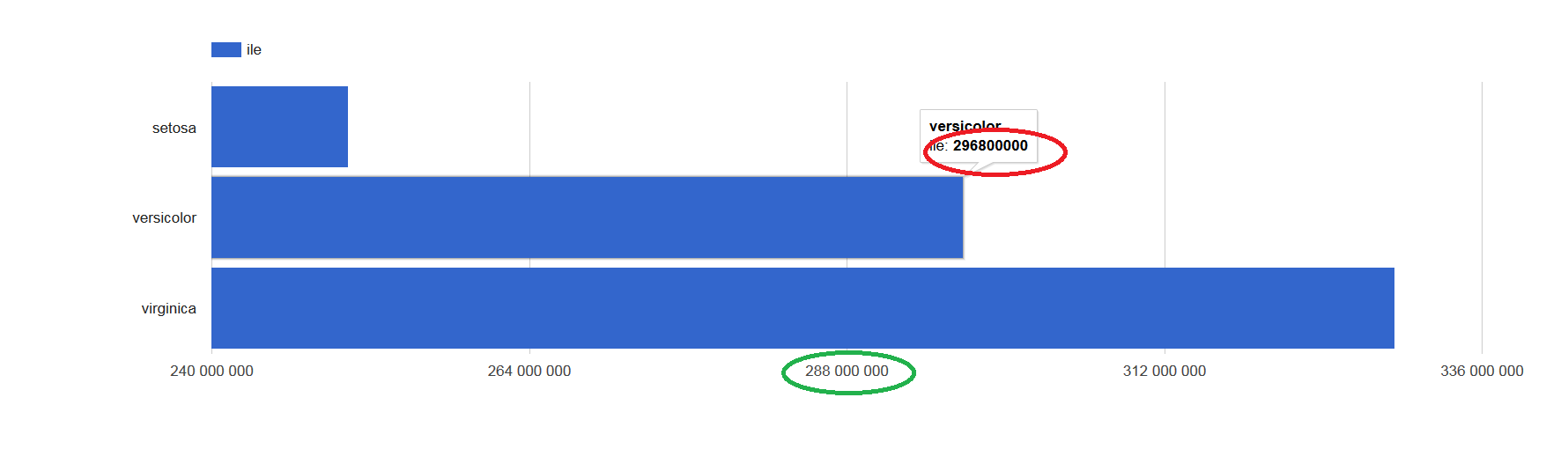
我试图改变googleVis columnChart中悬停标签的风格。我想格式化大数字,因为它是在轴上做的。你知道如何管理它(我读过整个互联网,但仍然不知道如何修复它:D)?
说明我的问题(红色是我想要的格式和绿色):
还有闪亮的应用程序例子:
ui.R:
library("shiny")
library("googleVis")

shinyUI(fluidPage(

    htmlOutput("wyk")

))
和服务者:
library("shiny")
library("googleVis")
library("dplyr")

shinyServer(function(input, output) {

    d <- iris %>% group_by(Species) %>% summarise(ile=1e6*sum(Sepal.Length))

    output$wyk <- renderGvis({

      gvisBarChart(d, xvar = "Species", yvar = "ile",
                      options=list(legend="top", bar="{groupWidth:'90%'}", height=500))

    })

})回答 1
Stack Overflow用户
回答已采纳
发布于 2016-03-21 09:08:01
您可以使用要显示的文本创建一个额外的列变量,并传递y-变量的向量,给出以".tooltip“结尾的标签aame。工具提示可以使用html标记进行样式化。format和big.mark可以在R中添加逗号。
shinyServer(function(input, output) {

    d <- iris %>% group_by(Species) %>% summarise(ile=1e6*sum(Sepal.Length))
  d$ile.tooltip <- sprintf("<p><b>%s</b><br/><b>%s</b></p>",
    d$Species, format(d$ile, big.mark=","))

  output$wyk <- renderGvis({
    gvisBarChart(d, xvar = "Species", yvar = c("ile", "ile.tooltip"),
      options=list(legend="top",
        tooltip="{isHtml:'True'}",  # so you can format it with html
        bar="{groupWidth:'90%'}", height=500))
  })
})页面原文内容由Stack Overflow提供。腾讯云小微IT领域专用引擎提供翻译支持
原文链接:
https://stackoverflow.com/questions/36125419
复制相关文章
相似问题
腾讯云开发者

Copyright © 2013 - 2026 Tencent Cloud. All Rights Reserved. 腾讯云 版权所有
深圳市腾讯计算机系统有限公司 ICP备案/许可证号:粤B2-20090059 ![]() 粤公网安备44030502008569号
粤公网安备44030502008569号
腾讯云计算(北京)有限责任公司 京ICP证150476号 | 京ICP备11018762号