
如何使用css实现这种透明效果?
如何使用css实现这种透明效果?
提问于 2016-03-04 11:53:49

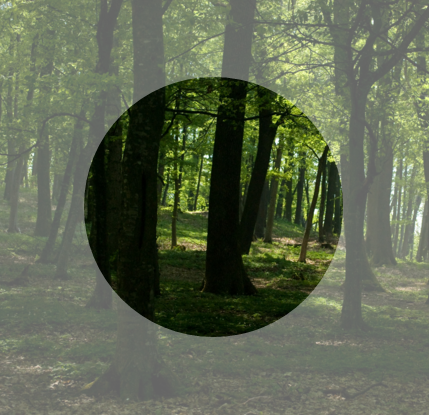
这个设计是在photoshop中创建的,我正在尝试转换为html和css。我有一个背景图像(与绿色灯),一个减少不透明度的覆盖和一些文本与图标定位在中心。我如何才能达到以下html和css显示的效果?
回答 3
Stack Overflow用户
回答已采纳
发布于 2016-03-04 12:05:45
检查这里!
基本上,您可以创建一个透明的圆形与一个大的白色(或黑色)边框!
background: transparent;
border-radius: 50%;
border: 1000px solid rgba(0, 0, 0, 0.5);Stack Overflow用户
发布于 2016-03-04 12:03:14
您可以将border-radius应用于内部元素,并应用如下所示的box-shadow:
Codepen Demo
div {
    height: 100vh;
    display: flex;
    align-items: center;
    justify-content: center;
    background: url(...) no-repeat;
    background-size: cover;
}

p {
    border-radius: 50%;

    /* add responsive behaviour */
    height : 60vw;
    width  : 60vw;

    /* but limit its max-height/width */
    max-height : 400px;
    max-width  : 400px;

    /* apply a gray shadow outside */
    box-shadow : 0 0 0 50vmax rgba(255,255,255, .4);
}50vmax是一个足够宽的阴影,可以通过挠曲箱定位来实现中间对准。只需根据您的喜好调整阴影(或颜色)的alpha值。
最终结果
Stack Overflow用户
发布于 2016-03-04 12:05:15
.container {
  height:400px;
  width:400px;
  position:relative;
 overflow:hidden;
  }

.overlay {
      top:50%;
    left:50%;
    margin-top:-500px;
    margin-left:-500px;
    width: 200px;
    height: 200px;
    border-radius: 50%;
    position: absolute;
    background-color: transparent;
    border-style: solid;
    box-sizing: content-box;
    z-index:999;
    pointer-events:none;
    border: 400px solid rgba(0,0,0,.9);
}<div class="container">
<div class="overlay"></div>
</div>
页面原文内容由Stack Overflow提供。腾讯云小微IT领域专用引擎提供翻译支持
原文链接:
https://stackoverflow.com/questions/35795377
复制相关文章
相似问题
腾讯云开发者

Copyright © 2013 - 2026 Tencent Cloud. All Rights Reserved. 腾讯云 版权所有
深圳市腾讯计算机系统有限公司 ICP备案/许可证号:粤B2-20090059  粤公网安备44030502008569号
腾讯云计算(北京)有限责任公司 京ICP证150476号 | 京ICP备11018762号