
如何在Matlab的Pdist关联中着色事件?
如何在Matlab的Pdist关联中着色事件?
提问于 2016-03-02 14:23:35
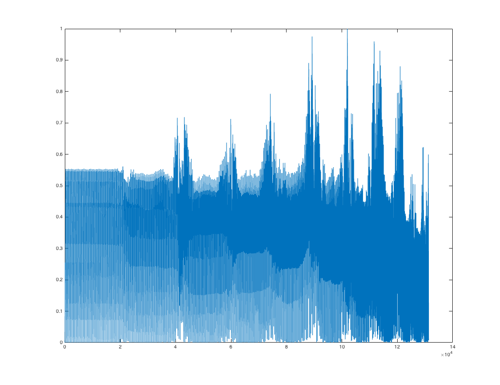
plot(mat2gray(pdist(data, 'correlation')));输出
我看到了大约3-5个趋势,我想更好地想象。我认为plot可能不是这里的最佳选择。它的imshow(squareform(pdist(data, 'correlation'))) (相当于imshow(squareform(pdist(data, 'correlation'), 'tomatrix')))是基于丹的answer的以下内容。具有归一化pdist值的图像,即imshow(squareform( mat2gray(pdist(data, 'correlation')), 'tomatrix') ); colormap('parula');
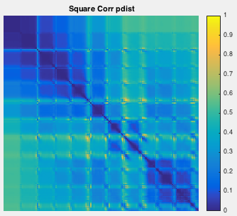
然而,我在解释这幅画时遇到了一些困难。如果你考虑一个黑暗的地方,就像一个特征值,似乎有三个特征值。我该把什么放在斧头上?
如何更好地可视化dist相关性的输出?
回答 1
Stack Overflow用户
回答已采纳
发布于 2016-03-02 15:04:01
怎么样
imshow(squareform(pdist(data, 'correlation')))在调用imshow之前,您可能必须对结果进行按摩,以使其范围从0到1,或者类型为uint8,范围从0到255。
页面原文内容由Stack Overflow提供。腾讯云小微IT领域专用引擎提供翻译支持
原文链接:
https://stackoverflow.com/questions/35749854
复制相关文章
相似问题
腾讯云开发者

Copyright © 2013 - 2026 Tencent Cloud. All Rights Reserved. 腾讯云 版权所有
深圳市腾讯计算机系统有限公司 ICP备案/许可证号:粤B2-20090059 ![]() 粤公网安备44030502008569号
粤公网安备44030502008569号
腾讯云计算(北京)有限责任公司 京ICP证150476号 | 京ICP备11018762号