
在timeseries中按行在列中峰值的时间对行进行分组。
在timeseries中按行在列中峰值的时间对行进行分组。
提问于 2016-03-01 19:35:38
我正在设计一个细胞周期时间序列中高度调控基因的热图。
example <- read.csv("example.csv", header = T)
example.m <- melt(example)
(e <- ggplot(example.m, aes(variable, Gene_ID)) + geom_tile(aes(fill =
value), colour = "white") + scale_fill_gradient(low = "white", high =
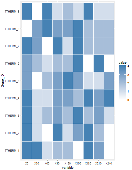
"steelblue"))结果是这样的,
示例热图
我的值是日志转换的,我想知道是否有一种方法来排列我的行,使它们按它们在时间序列中的峰值位置排列(即,所有在0处表达最高的基因被聚在一起,在30处表达最高的基因被聚在一起,等等)。
我试着这样做
order <- arrange(example, X0, X30, X60, X90, X120, X150, X180, X210, X240)然后用有序的数据帧绘制热图,但没有发生变化。
感谢您提供的任何帮助或建议。我真的很感激你的时间。
回答 1
Stack Overflow用户
回答已采纳
发布于 2016-03-02 02:45:23
您应该能够添加这一行来设置Y轴example.m$Gene_ID <- factor(example.m$Gene_ID, levels = order$Gene_ID, labels = order$Gene_ID)的顺序
下面是包含一些示例数据的完整代码:
example <- data.frame(Gene_ID = paste0("TTHERM_", 1:9),
                      X0 = round(runif(9, min =0, max = 4.4999),0),
                      X30 = round(runif(9, min =0, max = 4.4999),0),
                      X60 = round(runif(9, min =0, max = 4.4999),0),
                      X90 = round(runif(9, min =0, max = 4.4999),0),
                      X120 = round(runif(9, min =0, max = 4.4999),0),
                      X150 = round(runif(9, min =0, max = 4.4999),0),
                      X180 = round(runif(9, min =0, max = 4.4999),0),
                      X210 = round(runif(9, min =0, max = 4.4999),0),
                      X240 = round(runif(9, min =0, max = 4.4999),0))

library(dplyr)
library(reshape2)
library(ggplot2)
example.m <- melt(example)

# This is your original plot
(e <- ggplot(example.m, aes(variable, Gene_ID)) + geom_tile(aes(fill =
                                                                  value), colour = "white") + scale_fill_gradient(low = "white", high =
                                                                                                                    "steelblue"))
# Your order command gives us the right order
order <- arrange(example, X0, X30, X60, X90, X120, X150, X180, X210, X240)

# This changes the order of the Y axis based on the sort order
example.m$Gene_ID <- factor(example.m$Gene_ID, levels = order$Gene_ID, labels = order$Gene_ID)

# This is the new plot
(e <- ggplot(example.m, aes(variable, Gene_ID)) + geom_tile(aes(fill =
                                                                  value), colour = "white") + scale_fill_gradient(low = "white", high =
                                                                                                                    "steelblue"))
原情节:
新情节:
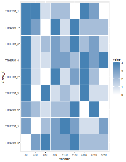
这就是你想要的吗?
页面原文内容由Stack Overflow提供。腾讯云小微IT领域专用引擎提供翻译支持
原文链接:
https://stackoverflow.com/questions/35731853
复制相关文章
相似问题
腾讯云开发者

Copyright © 2013 - 2026 Tencent Cloud. All Rights Reserved. 腾讯云 版权所有
深圳市腾讯计算机系统有限公司 ICP备案/许可证号:粤B2-20090059 ![]() 粤公网安备44030502008569号
粤公网安备44030502008569号
腾讯云计算(北京)有限责任公司 京ICP证150476号 | 京ICP备11018762号