
如何在一个集装箱的中心,并使网页适合移动?
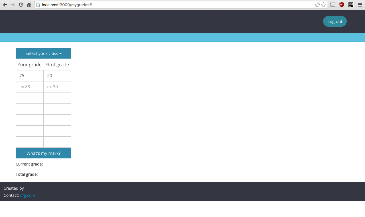
这就是我的网页在我的电脑上的样子
我想做的是:
- 将我的内容(按钮、表格、下拉列表)移动到网页的中心(根据屏幕大小动态和自动地移动)。
- 使网页适合移动浏览器。(即内容占屏幕空间的绝大部分)
我是一个自举和css的菜鸟。下面是一个具有与我的网页类似的代码的jsFiddle:https://jsfiddle.net/zpvrspaq/18/
如何将其中一行作为中心,例如:
<div class="row no-gutter">
  <div class="col-xs-1"><h5 class="text-center">Your grade</h5></div>
  <div class="col-xs-1"> <h5 class="text-center">% of grade</h5</div>
</div>
<div class="row no-gutter">
   <div class="col-xs-1"><input type="text" class="marks form-control"></div>
   <div class="col-xs-1"> <input type="text" class="grades form-control"></div>
</div>
任何能为我指明正确方向的东西都会很棒。
回答 3
Stack Overflow用户
发布于 2016-02-22 02:57:30
尽量不要太依赖Bootstrap的行和列来调整表的大小。当视图被展开或缩小时,col-xs-[number]实际上应该被限制在确定元素排列或分解到新行的方式上。
我给#table-of-grades提供了一种显示类型的表和自动边距以使其中心,并添加了一个新的类.table-cell,使表的单元格在#table-of-grades的宽度内浮动。
#table-of-grades {
  display: table;
  margin: auto;
}


.table-cell {
  width:50%;
  float:left;
}我还移动了#table-of-grades容器中的所有内容,因此当视图端口缩小或展开时,它们将填充该元素的宽度。还请注意标记中的更改,即我删除了表本身中的行和列,以创建不依赖引导程序的行和列的布局。
Stack Overflow用户
发布于 2016-02-22 02:15:59
尝试将容器放入一个,然后使用边距-左:auto;和边-右:auto;将div居中。
Stack Overflow用户
发布于 2016-02-22 02:32:48
演示
使用flex将非常简单。
下面是演示的要点
.container{

  display: flex;
  height: 100%;
  justify-content: center;
  align-items: center;

}
html
<div class="container">
  <div class='content'> //you can size this anyway you want
    put anything you want here,
  </div>
</div>https://stackoverflow.com/questions/35544560
复制相似问题
腾讯云开发者

Copyright © 2013 - 2026 Tencent Cloud. All Rights Reserved. 腾讯云 版权所有
深圳市腾讯计算机系统有限公司 ICP备案/许可证号:粤B2-20090059  粤公网安备44030502008569号
腾讯云计算(北京)有限责任公司 京ICP证150476号 | 京ICP备11018762号