
使用ggplot2时stat_quantile的置信区间带?
使用ggplot2时stat_quantile的置信区间带?
提问于 2016-02-02 17:00:51
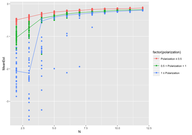
我想将中值样条和相应的置信区间带添加到ggplot2散点图中。我使用的是‘’quantreg‘-包裹,更具体地说是rqss函数(加法分位数回归平滑)。
在ggplot2中,我可以添加中间样条,但不能添加置信区间带:
fig = ggplot(dd, aes(y = MeanEst, x = N, colour = factor(polarization)))
fig + stat_quantile(quantiles=0.5, formula = y ~ qss(x), method = "rqss") +
  geom_point()
quantreg-package附带了自己的绘图函数:plot.rqss。在这里,我可以添加置信区间(bands=TRUE):
plot(1, type="n", xlab="", ylab="", xlim=c(2, 12), ylim=c(-3, 0)) # empty plot
plotfigs = function(df) {
  rqss_model = rqss(df$MeanEst ~ qss(df$N))
  plot(rqss_model, bands=TRUE, add=TRUE, rug=FALSE, jit=FALSE)
  return(NULL)
}
figures = lapply(split(dd, as.factor(dd$polarization)), plotfigs)
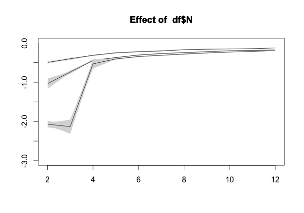
然而,quantreg-package附带的绘图函数并不非常灵活/非常适合我的需要。是否有可能在ggplot2图中得到置信带?也许是模仿quantreg-package中使用的方法,还是简单地从绘图中复制它们?
资料来源:巴斯丁.
回答 1
Stack Overflow用户
回答已采纳
发布于 2016-02-02 22:09:44
你差点就有了。当你打电话的时候
plot(rqss_model, bands=TRUE, add=TRUE, rug=FALSE, jit=FALSE)函数非常有用地返回绘制的数据。我们要做的就是抓取数据帧。首先,稍微调整一下函数,以合理的方式返回数据。
plotfigs = function(df) {
  rqss_model = rqss(df$MeanEst ~ qss(df$N))
  band = plot(rqss_model, bands=TRUE, add=TRUE, rug=FALSE, jit=FALSE)
  data.frame(x=band[[1]]$x, low=band[[1]]$blo, high=band[[1]]$bhi,
             pol=unique(df$polarization))
}
下一次调用函数并压缩
figures = lapply(split(dd, as.factor(dd$polarization)), plotfigs)
bands = Reduce("rbind", figures)然后使用geom_ribbon绘制
## We inherit y and color, so have to set them to NULL
fig + geom_ribbon(data=bands,
                  aes(x=x, ymin=low, ymax=high,
                  y=NULL, color=NULL, group=factor(pol)),
alpha=0.3)页面原文内容由Stack Overflow提供。腾讯云小微IT领域专用引擎提供翻译支持
原文链接:
https://stackoverflow.com/questions/35159455
复制相关文章
相似问题
腾讯云开发者

Copyright © 2013 - 2026 Tencent Cloud. All Rights Reserved. 腾讯云 版权所有
深圳市腾讯计算机系统有限公司 ICP备案/许可证号:粤B2-20090059 ![]() 粤公网安备44030502008569号
粤公网安备44030502008569号
腾讯云计算(北京)有限责任公司 京ICP证150476号 | 京ICP备11018762号