
Python: LogLog图与线性图相结合
Python: LogLog图与线性图相结合
提问于 2016-01-12 00:01:33
我在Python中生成了以下日志图:
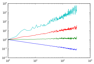
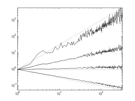
数据为这里。我想在这幅图中添加一系列直线,在这些数据值之间开始和结束:
[1.0, 0.05556],
[1.0, 1.0],
[1.0, 17.9996],
[1.0, 5831.9992]
在Matlab中,您只需生成上面所述的日志图,然后使用两个数据点作为输入,然后使用简单的绘图命令,然后将这两个图组合成一个。Python/Matplotlib中有类似的方法吗?我试着用:
plt.loglog(main_data)
plt.plot(linspace_data)  # linspace_data is a linear interpolation between the data values above.
但没有成功..。基本上,我想要这个图(在Matlab中生成):
回答 1
Stack Overflow用户
回答已采纳
发布于 2016-01-12 00:09:44
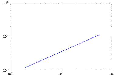
这在O-O接口中变得简单得多:
fig, ax = plt.subplots() # this is the only "plt" fxn you need 99% of the time
x = [2, 57]
y = [12, 112]
ax.plot(x, y, '-')
ax.set_yscale('log')
ax.set_xscale('log')
页面原文内容由Stack Overflow提供。腾讯云小微IT领域专用引擎提供翻译支持
原文链接:
https://stackoverflow.com/questions/34733367
复制相关文章
相似问题
腾讯云开发者

Copyright © 2013 - 2026 Tencent Cloud. All Rights Reserved. 腾讯云 版权所有
深圳市腾讯计算机系统有限公司 ICP备案/许可证号:粤B2-20090059 ![]() 粤公网安备44030502008569号
粤公网安备44030502008569号
腾讯云计算(北京)有限责任公司 京ICP证150476号 | 京ICP备11018762号