
HTML,CSS-动画:在iphone上浮动,与其他浏览器不同
HTML,CSS-动画:在iphone上浮动,与其他浏览器不同
提问于 2015-12-14 20:46:02
我有一个奇怪的问题,在一个网站,我目前正在开发。灵感来自一个从这里拍摄的动画。这种效果也适用于iPhone Safari。由于这个效果使用字体太棒,我没有自由选择图标,所以我调整了CSS和HTML,以使用任何我想要的图标。这在个人电脑和安卓手机上工作得很好,但在Safari的iPhone上就不行了。当盘旋/聚焦时,图标如下所示:
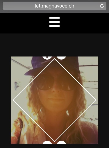
而不是这个
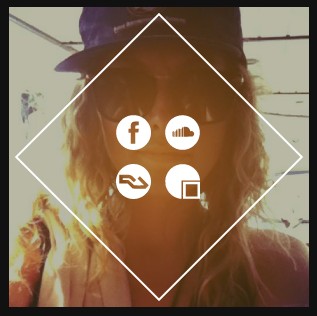
您可以访问本站查看问题。只有第一个艺术家面板使用自定义解决方案。这是HTML
<body>
    <div id="wrapper">
        <div class="section" id="artists">
            <div class="section_wrapper">

                <div class="title">
                    <h1>ARTISTS</h1>
                </div>

                <div class="grid">

                    <!-- CLINT EASTWOOD -->
                    <figure onclick="" class="effect-hera">
                        <img src="gx/artists/clit.jpg" alt="img17"/>
                        <figcaption onclick="" onclick="">
                            <h2>Clint <span>Eastwood</span></h2>
                            <p>
                                <a><img src="gx/icons/ic_facebook.svg" alt="https://www.facebook.com/eastandslider/?fref=ts" /></a>
                                <a><img src="gx/icons/ic_soundcloud.svg" alt="https://soundcloud.com/clit-eastwood-1" /></a>
                                <a><img src="gx/icons/ic_resident.svg" /></a>
                                <a><img src="gx/icons/ic_gigatools.svg" /></a>
                            </p>
                        </figcaption>
                    </figure>
                    <!-- (...) -->
                </div>
                <!-- (...) -->
            </div>
        </div>
        <!-- (...) -->
    </body>
和CSS (也包括原来效果的CSS )
* { box-sizing: border-box }
html, body{
    font-family: 'theano_didotregular';

    -webkit-touch-callout: none;
    -webkit-user-select: none;
    -webkit-tap-highlight-color: rgba(0,0,0,0);
    -webkit-tap-highlight-color: transparent;

    color: #eeeeee;
    margin:auto;
    padding:0px;
}

#wrapper{
    overflow-y: scroll;
    -webkit-overflow-scrolling: touch;
}


.section_wrapper{
    max-width: 1000px;
    margin: auto;
}

#artists{
    overflow: hidden;
    padding-top: 4px;
    padding-bottom: 4px;
    min-height: 97%;
    background-color: #111111;
}

/** EFFECT HERA **/
    .grid, .gridFull {
    width: 100%;
    margin: auto;
    cursor: pointer;
    position: relative;
    z-index: 90;
    text-align: center;
}

/* Common style */
.grid figure {
    position: relative;
    overflow: hidden;
    margin: 10px 1%;
    min-width: 250px;
    min-height: 250px;
    max-width: 300px;
    max-height: 300px;
    text-align: center;
    display: inline-block;
    float: none;
}

.gridFull figure {
    position: relative;
    float: left;
    overflow: hidden;
    margin: 20px 2%;
    max-width: 750px;
    max-height: 450px;
    width: 66%;
    height: auto;
    background: #3085a3;
    text-align: center;
    cursor: pointer;
}


.grid figure img,
 .gridFull figure img {
    position: relative;
    display: block;
    min-height: 100%;
    max-width: 100%;
    opacity: 0.8;
}

.grid figure figcaption,
 .gridFull figure figcaption {
    color: #fff;
    text-transform: uppercase;
    font-size: 1.25em;
    -webkit-backface-visibility: hidden;
    backface-visibility: hidden;
}

.grid figure figcaption,
.grid figure figcaption > a ,
.gridFull figure figcaption,
.gridFull figure figcaption > a{
    position: absolute;
    top: 0;
    left: 0;
    width: 100%;
    height: 100%;
}

/* Anchor will cover the whole item by default */
/* For some effects it will show as a button */
.grid figure figcaption > a,
.gridFull figure figcaption > a {
    z-index: 1000;
    text-indent: 200%;
    white-space: nowrap;
    font-size: 0;
    opacity: 0;
}

.grid figure h2,
 .gridFull figure h2 {
    word-spacing: -0.15em;
    font-weight: 300;
}

.grid figure h2 span,
 .gridFull figure h2 span {
    font-weight: 800;
}

.grid figure h2,
.grid figure p,
 .gridFull figure h2,
 .gridFull figure p {
    margin: 0;
}

.grid figure p ,
 .gridFull figure p{
    letter-spacing: 1px;
    font-size: 68.5%;
}
figure.effect-hera h2 {
    font-size: 158.75%;
}

figure.effect-hera h2,
figure.effect-hera p {
    position: absolute;
    top: 50%;
    left: 50%;
    -webkit-transition: opacity 0.35s, -webkit-transform 0.35s;
    transition: opacity 0.35s, transform 0.35s;
    -webkit-transform: translate3d(-50%,-50%,0);
    transform: translate3d(-50%,-50%,0);
    -webkit-transform-origin: 50%;
    transform-origin: 50%;
}

figure.effect-hera figcaption::before {
    position: absolute;
    top: 50%;
    left: 50%;
    width: 200px;
    height: 200px;
    border: 2px solid #fff;
    content: '';
    opacity: 0;
    -webkit-transition: opacity 0.35s, -webkit-transform 0.35s;
    transition: opacity 0.35s, transform 0.35s;
    -webkit-transform: translate3d(-50%,-50%,0) rotate3d(0,0,1,-45deg) scale3d(0,0,1);
    transform: translate3d(-50%,-50%,0) rotate3d(0,0,1,-45deg) scale3d(0,0,1);
    -webkit-transform-origin: 50%;
    transform-origin: 50%;
}

figure.effect-hera p {
    width: 100px;
    text-transform: none;
    font-size: 150%;
    line-height: 2;
}

figure.effect-hera p a {
    color: #fff;
}

figure.effect-hera p a:hover,
figure.effect-hera p a:focus {
    opacity: 0.6;
}

figure.effect-hera p a i{
    opacity: 0;
    -webkit-transition: opacity 0.35s, -webkit-transform 0.35s;
    transition: opacity 0.35s, transform 0.35s;
}

figure.effect-hera p a:first-child i{
    -webkit-transform: translate3d(-60px,-60px,0);
    transform: translate3d(-60px,-60px,0);
}

figure.effect-hera p a:nth-child(2) i{
    -webkit-transform: translate3d(60px,-60px,0);
    transform: translate3d(60px,-60px,0);
}

figure.effect-hera p a:nth-child(3) i{
    -webkit-transform: translate3d(-60px,60px,0);
    transform: translate3d(-60px,60px,0);
}

figure.effect-hera p a:nth-child(4) i{
    -webkit-transform: translate3d(60px,60px,0);
    transform: translate3d(60px,60px,0);
}


figure.effect-hera p a img{
    opacity: 0;
    visibility: hidden;
    -webkit-transition: opacity 0.35s, -webkit-transform 0.35s;
    transition: opacity 0.35s, transform 0.35s;
    max-width: 35px;
    max-height: 35px;
    float: left;
    margin: 7px;
}

figure.effect-hera p a:first-child img{
    -webkit-transform: translate3d(-60px,-60px,0);
    transform: translate3d(-60px,-60px,0);
}

figure.effect-hera p a:nth-child(2) img{
    -webkit-transform: translate3d(60px,-60px,0);
    transform: translate3d(60px,-60px,0);
}

figure.effect-hera p a:nth-child(3) img{
    -webkit-transform: translate3d(-60px,60px,0);
    transform: translate3d(-60px,60px,0);
}

figure.effect-hera p a:nth-child(4) img{
    -webkit-transform: translate3d(60px,60px,0);
    transform: translate3d(60px,60px,0);
}


figure.effect-hera:hover p img:empty{
    -webkit-transform: translate3d(0,0,0);
    transform: translate3d(0,0,0); /* just because it's stronger than nth-child */
    opacity: 1;
    visibility: visible;
}


figure.effect-hera img {
    opacity: 0.9;
}

figure.effect-hera img{
    -webkit-transition: opacity 0.35s, -webkit-transform 0.35s;
    transition: opacity 0.35s, transform 0.35s;
}

figure.effect-hera:hover img {
    opacity: 0.7;
    -webkit-transform: scale3d(1.25,1.25,1);
    transform: scale3d(1.25,1.25,1);
}

figure.effect-hera:hover figcaption::before {
    opacity: 1;
    -webkit-transform: translate3d(-50%,-50%,0) rotate3d(0,0,1,-45deg) scale3d(1,1,1);
    transform: translate3d(-50%,-50%,0) rotate3d(0,0,1,-45deg) scale3d(1,1,1);
}

figure.effect-hera:hover h2 {
    opacity: 0;
    -webkit-transform: translate3d(-50%,-50%,0) scale3d(0.8,0.8,1);
    transform: translate3d(-50%,-50%,0) scale3d(0.8,0.8,1);
}

figure.effect-hera:hover p i:empty{
    -webkit-transform: translate3d(0,0,0);
    transform: translate3d(0,0,0); /* just because it's stronger than nth-child */
    opacity: 1;
}回答 1
Stack Overflow用户
回答已采纳
发布于 2015-12-17 11:23:45
在我的iPhone和mac浏览器上更改这个CSS块可以在Safari上工作,只需添加50 on的高度值,并将转换值更改为-40%,-125%:
figure.effect-hera p {
width: 125px;
text-transform: none;
font-size: 150%;
line-height: 2;
height:50px;
position: absolute;
top: 50%;
left: 50%;
-webkit-transition: opacity 0.35s, -webkit-transform 0.35s;
transition: opacity 0.35s, transform 0.35s;
-webkit-transform: translate3d(-40%,-125%,0);
transform: translate3d(-40%,-125%,0);
-webkit-transform-origin: 50%;
transform-origin: 50%;}
希望这能有所帮助。
页面原文内容由Stack Overflow提供。腾讯云小微IT领域专用引擎提供翻译支持
原文链接:
https://stackoverflow.com/questions/34276282
复制相关文章
相似问题
腾讯云开发者

Copyright © 2013 - 2026 Tencent Cloud. All Rights Reserved. 腾讯云 版权所有
深圳市腾讯计算机系统有限公司 ICP备案/许可证号:粤B2-20090059  粤公网安备44030502008569号
腾讯云计算(北京)有限责任公司 京ICP证150476号 | 京ICP备11018762号