
数据点可以在条带图中标记吗?
数据点可以在条带图中标记吗?
提问于 2015-12-03 12:28:38
我找不到在stripchart中标注数据点的方法。使用text函数(如本question中所建议的),当点被堆叠或抖动时会分解。
我有4个类别的数字数据(列2-5),并希望用首字母(第1栏)标记每个数据点。
这是我的数据和我尝试过的代码:
initials,total,interest,slides,presentation
CU,1.6,1.7,1.5,1.6
DS,1.6,1.7,1.5,1.7
VA,1.7,1.5,1.5,2.1
MB,2.3,2.0,2.1,2.9
HS,1.2,1.3,1.4,1.0
LS,1.8,1.8,1.5,2.0

stripchart(CTscores[-1], method = "stack", las = 1)
text(CTscores$total + 0.05, 1, labels = CTscores$name, cex = 0.5)
下面的情节是我迄今为止处理得最好的。如您所见,数据点标签重叠。此外,最长的y标签被切断。
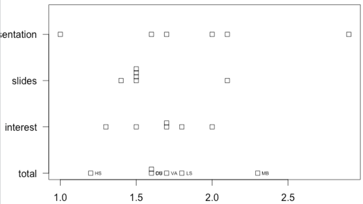
点能在条形图上标出吗?或者我必须用另一个命令来显示这个以允许标记?
回答 2
Stack Overflow用户
回答已采纳
发布于 2015-12-03 17:38:12
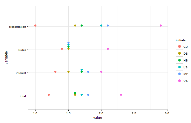
这里有一个选项,允许您为条形图添加颜色,以识别首字母:
library(ggplot2)
library(reshape2)
library(gtable)
library(gridExtra)

# Gets default ggplot colors
gg_color_hue <- function(n) {
  hues = seq(15, 375, length=n+1)
  hcl(h=hues, l=65, c=100)[1:n]}

# Transform to long format
CTscores.m = melt(CTscores, id.var="initials")

# Create a vector of colors with keys for the initials
colvals <- gg_color_hue(nrow(CTscores))
names(colvals) <- sort(CTscores$initials)

# This color vector needs to be the same length as the melted dataset
cols <- rep(colvals,ncol(CTscores)-1)

# Create a basic plot that will have a legend with the desired attributes
g1 <- ggplot(CTscores.m, aes(x=variable, y=value, fill=initials)) +
  geom_dotplot(color=NA)+theme_bw()+coord_flip()+scale_fill_manual(values=colvals)

# Extract the legend
fill.legend <- gtable_filter(ggplot_gtable(ggplot_build(g1)), "guide-box")
legGrob <- grobTree(fill.legend)

# Create the plot we want without the legend
g2 <- ggplot(CTscores.m, aes(x=variable, y=value)) +
  geom_dotplot(binaxis="y", stackdir="up",binwidth=0.03,fill=cols,color=NA) +
  theme_bw()+coord_flip()

# Create the plot with the legend
grid.arrange(g2, legGrob, ncol=2, widths=c(10, 1))
Stack Overflow用户
发布于 2015-12-03 14:13:40
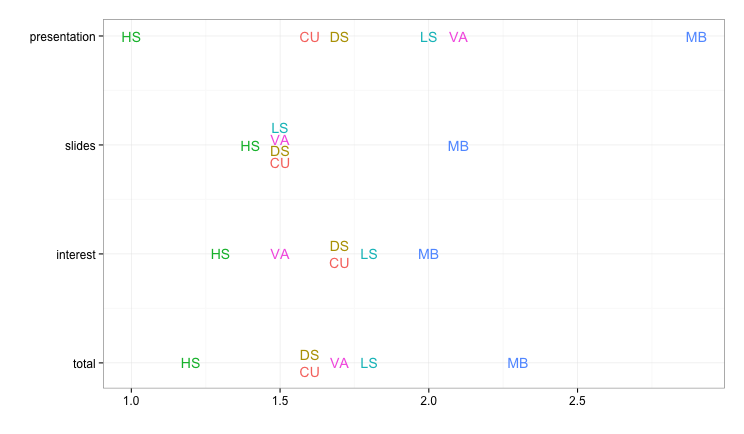
如何使用标签作为点标记,而不是有单独的标签?下面是一个使用ggplot2而不是基本图形的例子。
为了避免重叠,我们直接为重复值设置垂直偏移量,而不是把它留给随机抖动。为此,我们需要赋值y-数值(以便我们可以添加偏移量),然后用适当的文本标签替换数字轴标签。
library(ggplot2)
library(reshape2)
library(dplyr)

# Convert data from "wide" to "long" format
CTscores.m = melt(CTscores, id.var="initials")

# Create an offset that we'll use for vertically separating the repeated values
CTscores.m = CTscores.m %>% group_by(variable, value) %>%
  mutate(repeats = ifelse(n()>1, 1,0),
         offset = ifelse(repeats==0, 0, seq(-n()/25, n()/25, length.out=n())))

ggplot(CTscores.m, aes(label=initials, x=value, y=as.numeric(variable) + offset,
                       color=initials)) +
  geom_text() +
  scale_y_continuous(labels=sort(unique(CTscores.m$variable))) +
  theme_bw(base_size=15) +
  labs(y="", x="") +
  guides(color=FALSE)
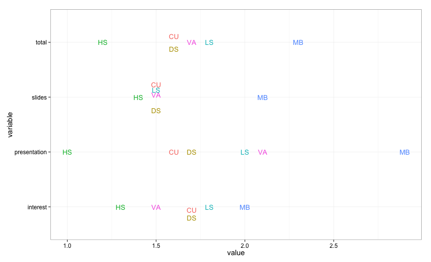
为了完整起见,下面是如何为重复的值创建带有抖动的图形,而不是使用特定的偏移量:
# Convert data from "wide" to "long" format
CTscores.m = melt(CTscores, id.var="initials")

# Mark repeated values (so we can selectively jitter them later)
CTscores.m = CTscores.m %>% group_by(variable, value) %>%
  mutate(repeats = ifelse(n()>1, 1,0))

# Jitter only the points with repeated values
set.seed(13)
ggplot() +
  geom_text(data=CTscores.m[CTscores.m$repeats==1,],
            aes(label=initials, x=value, y=variable, color=initials),
            position=position_jitter(height=0.25, width=0)) +
  geom_text(data=CTscores.m[CTscores.m$repeats==0,],
            aes(label=initials, x=value, y=variable, color=initials)) +
  theme_bw(base_size=15) +
  guides(color=FALSE)
页面原文内容由Stack Overflow提供。腾讯云小微IT领域专用引擎提供翻译支持
原文链接:
https://stackoverflow.com/questions/34066131
复制相关文章
相似问题
腾讯云开发者

Copyright © 2013 - 2026 Tencent Cloud. All Rights Reserved. 腾讯云 版权所有
深圳市腾讯计算机系统有限公司 ICP备案/许可证号:粤B2-20090059  粤公网安备44030502008569号
腾讯云计算(北京)有限责任公司 京ICP证150476号 | 京ICP备11018762号