
如何用“`ggplot2` 2”可视化成对的比较?
如何用“`ggplot2` 2”可视化成对的比较?
提问于 2015-11-11 03:56:43
问题
是否有一个简单的解决方案来可视化成对的比较和他们的p.values (或者仅仅是.,*,**,***)在一个用ggplot构建的盒子图上
一个已经内置的功能(或方便的东西)将是伟大的!
下面是一个可以处理的例子。
虚拟数据
require(ggplot2)
set.seed(11)
n=15
mu=1.2
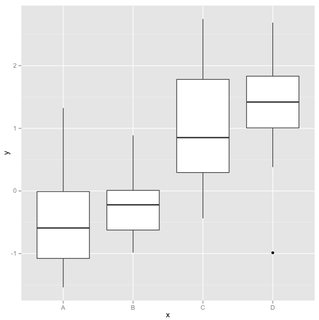
d = data.frame(y=c(rnorm(n), rnorm(n), rnorm(n,mu), rnorm(n,mu)),x=rep(LETTERS[1:4],each=n))图
ggplot(d, aes(y=y, x=x)) + geom_boxplot()
统计分析
m = aov(data=d, y~x)
anova(m)
# Analysis of Variance Table
# Response: y
# Df Sum Sq Mean Sq F value Pr(>F)
# x 3 34.074 11.358 16.558 8.021e-08 ***
# Residuals 56 38.414 0.686
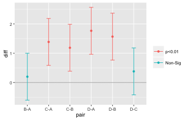
TukeyHSD(m)$x
diff lwr upr p adj
B-A 0.1989620 -0.6018277 0.9997517 9.123300e-01
C-A 1.3858613 0.5850716 2.1866510 1.504711e-04
D-A 1.7658291 0.9650394 2.5666188 1.639309e-06
C-B 1.1868993 0.3861096 1.9876890 1.337608e-03
D-B 1.5668671 0.7660774 2.3676568 1.824795e-05
D-C 0.3799678 -0.4208219 1.1807575 5.941266e-01回答 1
Stack Overflow用户
回答已采纳
发布于 2015-11-11 04:30:33
以下是几个选择:
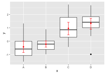
# Add means and bootstrap confidence intervals to the boxplots
ggplot(d, aes(y=y, x=x)) +
  geom_boxplot() +
  stat_summary(fun.data=mean_cl_boot, geom="errorbar", colour="red", width=0.1) +
  stat_summary(fun.y=mean, geom="point", colour="red")
# Anova
m = aov(data=d, y~x)
anova(m)

tky = as.data.frame(TukeyHSD(m)$x)
tky$pair = rownames(tky)

# Plot pairwise TukeyHSD comparisons and color by significance level
ggplot(tky, aes(colour=cut(`p adj`, c(0, 0.01, 0.05, 1),
                           label=c("p<0.01","p<0.05","Non-Sig")))) +
  geom_hline(yintercept=0, lty="11", colour="grey30") +
  geom_errorbar(aes(pair, ymin=lwr, ymax=upr), width=0.2) +
  geom_point(aes(pair, diff)) +
  labs(colour="")
页面原文内容由Stack Overflow提供。腾讯云小微IT领域专用引擎提供翻译支持
原文链接:
https://stackoverflow.com/questions/33644034
复制相关文章
相似问题
腾讯云开发者

Copyright © 2013 - 2026 Tencent Cloud. All Rights Reserved. 腾讯云 版权所有
深圳市腾讯计算机系统有限公司 ICP备案/许可证号:粤B2-20090059 ![]() 粤公网安备44030502008569号
粤公网安备44030502008569号
腾讯云计算(北京)有限责任公司 京ICP证150476号 | 京ICP备11018762号