
自动调整自定义绘图字符的大小?
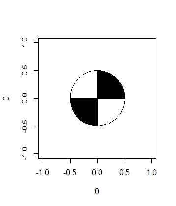
大家好,我希望有一个人可以帮助我绘制一个定制的pch,在我的例子中,我试图创建一个与水质有关的图表。一种监测水质的方法是使用secchi光盘,它基本上是一种金属圆盘,其中四分之一的光盘涂上了黑色和白色(见下面的图)。
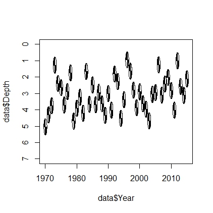
到目前为止,我已经能够成功地创建光盘并将其放在一个绘图上,但是我的问题是,根据情节的大小,我的问题会产生拉伸效果。
下面是我到目前为止用来创建磁盘的函数:
# A circle function to draw a circle (pulled form another stackoverflow page)

circleFun <- function(center=c(0,0), diameter=1, npoints=100, start=0, end=2, filled=TRUE){
  tt <- seq(start*pi, end*pi, length.out=npoints)
  df <- data.frame(
    x = center[1] + diameter / 2 * cos(tt),
    y = center[2] + diameter / 2 * sin(tt)
  )
  if(filled==TRUE) { #add a point at the center so the whole 'pie slice' is filled
    df <- rbind(df, center)
  }
  return(df)
}

# and my function to create a secchi disc
secchiDisc = function(x,y,diameter = 1){
  quarterCircle1 = circleFun(c(x,y),diameter = diameter, start=0, end=0.5)
  quarterCircle3 = circleFun(c(x,y),diameter = diameter, start=1, end=1.5)
  fullCircle = circleFun(c(x, y), diameter, start=0, end=2)
  polygon(quarterCircle1$x,quarterCircle1$y,col="black")
  polygon(quarterCircle3$x,quarterCircle3$y,col="black")
  polygon(fullCircle$x,fullCircle$y)
}

# make a plot to show what it looks like
par(mar = c(5, 4, 4, 2) + 0.1)
plot(0,0,pch = "")
secchiDisc(0,0)
# create data frame
data = as.data.frame(list(Year = 1970:2015,
                          Depth = rnorm(46,3,1)))

# and create a time series plot showing changes in depth over time
plot(data$Year,data$Depth,pch="",ylim = c(7,0))
for(i in 1:nrow(data)){
  secchiDisc(data$Year[i],data$Depth[i])
}
下面是用时间序列作图时的样子:
很明显,我可以水平地拉伸这个情节,直到它清理干净,但我想知道是否有人对如何根据情节自动调整光盘大小有任何建议?
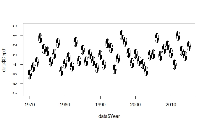
我尝试自定义圆圈函数,以允许拉伸效果,但没有效果。我认为‘拉伸效应’方法的一个问题是,我仍然希望圆盘呈圆形,但我无法得到圆的直径与x或y维数无关的变化。
另一个想法是将secchi光盘的空白区域保存为png文件,并尝试绘制导入的文件。对这种方法的想法?
谢谢你的帮助。
回答 1
Stack Overflow用户
发布于 2015-11-06 16:21:51
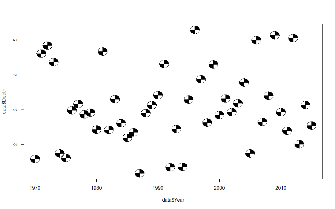
我想我有办法了。如果不是的话,我一定很亲近。问题是,在您的函数中,x轴和y轴的直径是相同的,这与数据的范围无关。换句话说,年轴的范围是45,深度轴的范围是5。当你试图将相同直径的单位施加到两个轴上时,圆的形状就会发生变形。我的解决办法是计算x轴和y轴的范围之比。然后将该比率应用到sin行中的circleFun中。我不确定这个比率是否应该除以sqrt(2),但它有效。此外,在绘制图表后,不应手动调整绘图窗口的大小。在绘图前,在windows中使用win.graph,在mac中使用quartz()。
    # A circle function to draw a circle (pulled form another stackoverflow page)

circleFun <- function(center=c(0,0), diameter=1, npoints=100, start=0, end=1, filled=TRUE,ratio=1){
  tt <- seq(start*pi, end*pi, length.out=npoints)
  df <- data.frame(
    x = center[1] + diameter / 2 * cos(tt),
    y = center[2] + diameter/ratio / 2 * sin(tt)
  )
  if(filled==TRUE) { #add a point at the center so the whole 'pie slice' is filled
    df <- rbind(df, center)
  }
  return(df)
}

# and my function to create a secchi disc
secchiDisc = function(x,y,diameter = 1,ratio=1){
  quarterCircle1 = circleFun(c(x,y),diameter = diameter, start=0, end=0.5,ratio=ratio)
  quarterCircle3 = circleFun(c(x,y),diameter = diameter, start=1, end=1.5,ratio=ratio)
  fullCircle = circleFun(c(x, y), diameter, start=0, end=2,ratio=ratio)
  polygon(quarterCircle1$x,quarterCircle1$y,col="black")
  polygon(quarterCircle3$x,quarterCircle3$y,col="black")
  polygon(fullCircle$x,fullCircle$y)
}

data = as.data.frame(list(Year = 1970:2015,
                          Depth = rnorm(46,3,1)))

xx <-diff(range(data$Year))
yy <-diff(range(data$Depth))
ratio=(xx/yy)/sqrt(2)
plot(data$Year,data$Depth,pch="")
for(i in 1:nrow(data)){
  secchiDisc(data$Year[i],data$Depth[i],diameter = 1.5,ratio=ratio)
}
https://stackoverflow.com/questions/33555369
复制相似问题
腾讯云开发者

Copyright © 2013 - 2026 Tencent Cloud. All Rights Reserved. 腾讯云 版权所有
深圳市腾讯计算机系统有限公司 ICP备案/许可证号:粤B2-20090059 ![]() 粤公网安备44030502008569号
粤公网安备44030502008569号
腾讯云计算(北京)有限责任公司 京ICP证150476号 | 京ICP备11018762号