
and图热图与密度图误差
and图热图与密度图误差
提问于 2015-10-22 19:53:02
这个新帖子指的是前一篇文章(闪亮应用程序中的热图)。
在这里可以找到示例数据集:示例中使用的示例数据集
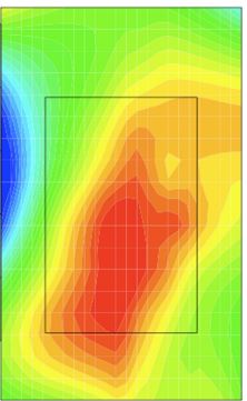
结果的密度图和显示每个位置的数据集中最大值的图表似乎不匹配。第三个ggplot有一些问题,我不知道如何解决。
- 我将第三个
ggplot在scale_fill_gradientn中的比例设置为0到100。但是,生成的地块的热图颜色与刻度应该显示的颜色不一样。例如,94.251应该是一个较暗的区域,但它不会出现在图表上。 - 第三个
ggplot中最大值的一些文本与坐标位置的矩形不匹配。我想解决这个问题。 - 我还希望第一个
ggplot中的密度图显示一个混合图,类似于这个示例密度图中显示的混合图。我不太确定该怎么做
library(grid)
library(ggplot2)
sensor.data <- read.csv("Sample_Dataset.csv")
# Create position -> coord conversion
pos.names <- names(sensor.data)[ grep("*Pos",names(sensor.data)) ] # Get column names with "Pos" in them
mock.coords <<- list()
lapply(pos.names, function(name){
})
mock.coords <- list ("Position1"=data.frame("x"=0.1,"y"=0.2),
"Position2"=data.frame("x"=0.2,"y"=0.4),
"Position3"=data.frame("x"=0.3,"y"=0.6),
"Position4"=data.frame("x"=0.4,"y"=0.65),
"Position5"=data.frame("x"=0.5,"y"=0.75),
"Position6"=data.frame("x"=0.6,"y"=0.6),
"Position7"=data.frame("x"=0.7,"y"=0.6),
"Position8"=data.frame("x"=0.8,"y"=0.43),
"Position9"=data.frame("x"=0.9,"y"=0.27),
"Position10"=data.frame("x"=0.75,"y"=0.12))
# Change format of your data matrix
df.l <- list()
cnt <- 1
for (i in 1:nrow(sensor.data)){
for (j in 1:length(pos.names)){
name <- pos.names[j]
curr.coords <- mock.coords[[name]]
df.l[[cnt]] <- data.frame("x.pos"=curr.coords$x,
"y.pos"=curr.coords$y,
"heat" =sensor.data[i,j])
cnt <- cnt + 1
}
}
df <- do.call(rbind, df.l)
# Load image
library(jpeg)
download.file("http://www.expresspcb.com/wp-content/uploads/2015/06/PhotoProductionPCB_TL_800.jpg","pcb.jpg")
img <- readJPEG("/home/oskar/pcb.jpg")
g <- rasterGrob(img, interpolate=TRUE,width=1,height=1)
# Show overlay of image and heatmap
ggplot(data=df,aes(x=x.pos,y=y.pos,fill=heat)) +
annotation_custom(g, xmin=-Inf, xmax=Inf, ymin=-Inf, ymax=Inf) +
stat_density2d( alpha=0.2,aes(fill = ..level..), geom="polygon" ) +
scale_fill_gradientn(colours = rev( rainbow(3) )) +
scale_x_continuous(expand=c(0,0)) +
scale_y_continuous(expand=c(0,0)) +
ggtitle("Density")
# # Show where max temperature is
# dat.max = df[which.max(df$heat),]
#
# ggplot(data=coords,aes(x=x,y=y)) +
# annotation_custom(g, xmin=-Inf, xmax=Inf, ymin=-Inf, ymax=Inf) +
# geom_point(data=dat.max,aes(x=x.pos,y=y.pos), shape=21,size=5,color="black",fill="red") +
# geom_text(data=dat.max,aes(x=x.pos,y=y.pos,label=round(heat,3)),vjust=-1,color="red",size=10) +
# ggtitle("Max Temp Position")
# bin data manually
# Manually set number of rows and columns in the matrix containing sums of heat for each square in grid
nrows <- 30
ncols <- 30
# Define image coordinate ranges
x.range <- c(0,1) # x-coord range
y.range <- c(0,1) # x-coord range
# Create matrix and set all entries to 0
heat.density.dat <- matrix(nrow=nrows,ncol=ncols)
heat.density.dat[is.na(heat.density.dat)] <- 0
# Subdivide the coordinate ranges to n+1 values so that i-1,i gives a segments start and stop coordinates
x.seg <- seq(from=min(x.range),to=max(x.range),length.out=ncols+1)
y.seg <- seq(from=min(y.range),to=max(y.range),length.out=nrows+1)
# List to hold found values
a <- list()
cnt <- 1
for( ri in 2:(nrows+1)){
x.vals <- x.seg [c(ri-1,ri)]
for ( ci in 2:(ncols+1)){
# Get current segments, for example x.vals = [0.2, 0.3]
y.vals <- y.seg [c(ci-1,ci)]
# Find which of the entries in the data.frame that has x or y coordinates in the current grid
x.inds <- which( ( (df$x.pos >= min(x.vals)) & (df$x.pos <= max(x.vals)))==T )
y.inds <- which( ((df$y.pos >= min(y.vals)) & (df$y.pos <= max(y.vals)))==T )
# Find which entries has both x and y in current grid
inds <- intersect( x.inds , y.inds )
# If there's any such coordinates
if (length(inds) > 0){
# Append to list
a[[cnt]] <- data.frame("x.start"=min(x.vals), "x.stop"=max(x.vals),
"y.start"=min(y.vals), "y.stop"=max(y.vals),
"acc.heat"=sum(df$heat[inds],na.rm = T) )
print(length(df$heat[inds]))
# Increment counter variable
cnt <- cnt + 1
}
}
}
# Construct data.frame from list
heat.dens.df <- do.call(rbind,a)
# Plot again
ggplot(data=heat.dens.df,aes(x=x.start,y=y.start)) +
annotation_custom(g, xmin=-Inf, xmax=Inf, ymin=-Inf, ymax=Inf) +
geom_rect(data=heat.dens.df, aes(xmin=x.start, xmax=x.stop, ymin=y.start, ymax=y.stop, fill=acc.heat), alpha=0.5) +
scale_fill_gradientn(colours = rev( rainbow(3) )) +
scale_x_continuous(expand=c(0,0)) +
scale_y_continuous(expand=c(0,0))
mock.coords <- list ("Position1"=data.frame("x"=0.1,"y"=0.2),
"Position2"=data.frame("x"=0.2,"y"=0.4),
"Position3"=data.frame("x"=0.3,"y"=0.6),
"Position4"=data.frame("x"=0.4,"y"=0.65),
"Position5"=data.frame("x"=0.5,"y"=0.75),
"Position6"=data.frame("x"=0.6,"y"=0.6),
"Position7"=data.frame("x"=0.7,"y"=0.6),
"Position8"=data.frame("x"=0.8,"y"=0.43),
"Position9"=data.frame("x"=0.9,"y"=0.27),
"Position10"=data.frame("x"=0.75,"y"=0.12))
# Show where max temperature is
heat.dat <- sensor.data[pos.names]
# Get max for each position
max.df <- apply(heat.dat,2,max)
dat.max.l <- lapply(1:length(max.df), function(i){
h.val <- max.df[i]
c.name <- names(h.val)
c.coords <- mock.coords[[c.name]]
data.frame("x.pos"=c.coords$x, "y.pos"=c.coords$y,"heat"=h.val)
})
coords <- data.frame("x"=c(0,1),"y"=c(0,1))
dat.max <- do.call(rbind,dat.max.l)
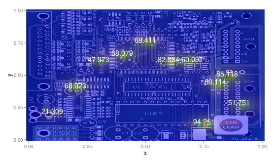
ggplot(data=coords,aes(x=x,y=y)) +
annotation_custom(g, xmin=-Inf, xmax=Inf, ymin=-Inf, ymax=Inf) +
geom_point(data=dat.max,aes(x=x.pos,y=y.pos), shape=13,size=5,color="black",fill="red") +
geom_text(data=dat.max,aes(x=x.pos,y=y.pos,label=round(heat,3)),vjust=-1,color="red",size=10) +
geom_rect(data=heat.dens.df, aes(xmin=x.start, xmax=x.stop, ymin=y.start, ymax=y.stop, fill=acc.heat,x=NULL,y=NULL), alpha=0.5) +
scale_fill_gradientn(limits = c(0,100), colours = rev( rainbow(3) )) +
scale_x_continuous(expand=c(0,0)) +
scale_y_continuous(expand=c(0,0))回答 1
Stack Overflow用户
回答已采纳
发布于 2015-10-23 13:25:03
几件事。
- 若要对文本进行居中,请删除geom_text中的geom_text值。
- 为了为这些数据创建一个热图,我们需要某种类型的插值或平滑,因为您只有10个点的数据(或者只有几个数据点)
这可能是一种解决办法:
library(grid)
library(ggplot2)


sensor.data <- read.csv("/home/oskar/Downloads/Sample_Dataset.csv - Sample_Dataset.csv.csv")

# Create position -> coord conversion
pos.names <- names(sensor.data)[ grep("*Pos",names(sensor.data)) ] # Get column names with "Pos" in them
mock.coords <- list ("Position1"=data.frame("x"=0.1,"y"=0.2),
                     "Position2"=data.frame("x"=0.2,"y"=0.4),
                     "Position3"=data.frame("x"=0.3,"y"=0.6),
                     "Position4"=data.frame("x"=0.4,"y"=0.65),
                     "Position5"=data.frame("x"=0.5,"y"=0.75),
                     "Position6"=data.frame("x"=0.6,"y"=0.6),
                     "Position7"=data.frame("x"=0.7,"y"=0.6),
                     "Position8"=data.frame("x"=0.8,"y"=0.43),
                     "Position8.1"=data.frame("x"=0.85,"y"=0.49),
                     "Position9"=data.frame("x"=0.9,"y"=0.27),
                     "Position10"=data.frame("x"=0.75,"y"=0.12))

# Change format of your data matrix
df.l <- list()
cnt <- 1

for (i in 1:nrow(sensor.data)){
  for (j in 1:length(pos.names)){
    name <- pos.names[j]
    curr.coords <- mock.coords[[name]]
    df.l[[cnt]] <- data.frame("x.pos"=curr.coords$x,
                              "y.pos"=curr.coords$y,
                              "heat" =sensor.data[i,j])
    cnt <- cnt + 1
  }
}

df <- do.call(rbind, df.l)

# Load image
library(jpeg)
download.file("http://www.expresspcb.com/wp-content/uploads/2015/06/PhotoProductionPCB_TL_800.jpg","pcb.jpg")
img <- readJPEG("/home/oskar/pcb.jpg")
g <- rasterGrob(img, interpolate=TRUE,width=1,height=1)

# Manually set number of rows and columns in the matrix containing max of heat for each square in grid
nrows <- 50
ncols <- 50

# Define image coordinate ranges
x.range <- c(0,1) # x-coord range
y.range <- c(0,1) # x-coord range

x.bounds <- seq(from=min(x.range),to=max(x.range),length.out = ncols + 1)
y.bounds <- seq(from=min(y.range),to=max(y.range),length.out = nrows + 1)

# Create matrix and set all entries to 0
heat.max.dat <<- matrix(nrow=nrows,ncol=ncols)

lapply(1:length(mock.coords), function(i){
  c <- mock.coords[[i]]
  # calculate where in matrix this fits
  x <- c$x; y <- c$y
  x.ind <- findInterval(x, x.bounds)
  y.ind <- findInterval(y, y.bounds)
  heat.max.dat[x.ind,y.ind] <<- max(sensor.data[names(mock.coords)[i]])
})
heat.max.dat[is.na(heat.max.dat)]<-0

require(fields)
# Look at the image plots to see how the smoothing works
#image(heat.max.dat)
h.mat.interp <- image.smooth(heat.max.dat)
#image(h.mat.interp$z)

mat <- h.mat.interp$z

require(reshape2)
m.dat <- melt(mat)
# Change to propper coors, image is assumed to have coors between 0-1
m.dat$Var1 <-  seq(from=min(x.range),to=max(x.range),length.out=ncols)[m.dat$Var1]
m.dat$Var2 <-  seq(from=min(y.range),to=max(y.range),length.out=ncols)[m.dat$Var2]

# Show where max temperature is
heat.dat <- sensor.data[pos.names]

# Get max for each position
max.df <- apply(heat.dat,2,max)
dat.max.l <- lapply(1:length(max.df), function(i){
  h.val <- max.df[i]
  c.name <- names(h.val)
  c.coords <- mock.coords[[c.name]]
  data.frame("x.pos"=c.coords$x, "y.pos"=c.coords$y,"heat"=h.val)
})

dat.max <- do.call(rbind,dat.max.l)

coords <- data.frame("x"=c(0,1),"y"=c(0,1))
ggplot(data=coords,aes(x=x,y=y)) +
  annotation_custom(g, xmin=-Inf, xmax=Inf, ymin=-Inf, ymax=Inf) +
  geom_raster(data=m.dat,aes(x=Var1,y=Var2,fill=value), interpolate = TRUE, alpha=0.5) +
  scale_fill_gradientn(colours = rev( rainbow(3) ),guide=FALSE) +
  geom_text(data=dat.max,aes(x=x.pos,y=y.pos,label=round(heat,3)),vjust=0,color="white",size=5) +
  scale_x_continuous(expand=c(0,0)) +
  scale_y_continuous(expand=c(0,0))
最后我明白了
页面原文内容由Stack Overflow提供。腾讯云小微IT领域专用引擎提供翻译支持
原文链接:
https://stackoverflow.com/questions/33289542
复制相关文章
相似问题
腾讯云开发者

Copyright © 2013 - 2026 Tencent Cloud. All Rights Reserved. 腾讯云 版权所有
深圳市腾讯计算机系统有限公司 ICP备案/许可证号:粤B2-20090059 ![]() 粤公网安备44030502008569号
粤公网安备44030502008569号
腾讯云计算(北京)有限责任公司 京ICP证150476号 | 京ICP备11018762号