
散点图
散点图
提问于 2015-10-19 11:41:44
我想在融化的数据帧中绘制变量的分散(xy)图,如下所示。
df
class var  mean
0      x   4.25
0      y   6.25
1      x   2.00
1      y  11.00
我试过了,但它画了4分。如何绘制x和y?
library(ggplot2)

ggplot(df, aes(x=mean, y=mean, group=var, colour=class)) +
geom_point( size=5, shape=21, fill="white")回答 1
Stack Overflow用户
回答已采纳
发布于 2015-10-19 12:05:57
正如Heroka所指出的,您需要数据采用更宽的类型格式。如果数据是这样读取的,您可以使用以下方法来转换它。
## you don't need this since you already have df
text = "class var mean
0 x 4.25
0 y 6.25
1 x 2.00
1 y 11.00"
df = read.delim(textConnection(text),header=TRUE,strip.white=TRUE,
stringsAsFactors = FALSE, sep = " ");df2
## use this library to switch from long-wide
library(reshape2)
df2 = dcast(df, class ~ var, value.var = "mean")
library(ggplot2)
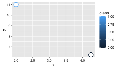
ggplot(df2, aes(x=x, y=y, colour=class)) +
geom_point( size=5, shape=21, fill="white")
页面原文内容由Stack Overflow提供。腾讯云小微IT领域专用引擎提供翻译支持
原文链接:
https://stackoverflow.com/questions/33213475
复制相关文章
相似问题
腾讯云开发者

Copyright © 2013 - 2026 Tencent Cloud. All Rights Reserved. 腾讯云 版权所有
深圳市腾讯计算机系统有限公司 ICP备案/许可证号:粤B2-20090059 ![]() 粤公网安备44030502008569号
粤公网安备44030502008569号
腾讯云计算(北京)有限责任公司 京ICP证150476号 | 京ICP备11018762号