
在Google图表中定义工具提示模板
在Google图表中定义工具提示模板
提问于 2015-10-16 08:09:59
我使用谷歌图表堆叠的图表来显示我的数据,我想改变默认的工具提示,我想要做的唯一改变就是删除在下面的图片中标记为的数据:
我试着阅读了关于角色类型的文章,我确实找到了一种方法来实现它,但是它使代码变得一团糟,因为我必须使用两倍的列。
而不是编写这种简单的格式:
var legend = ['School', 'A', 'B', 'C', 'D', 'E', 'F', 'G'];

var line = ['line', 0.05, 0.10, 0.20, 0.33, 0.05, 0.12, 0.15];
我用:
var legend = ['School', 'A', {type: 'string' , role: 'tooltip'}, 'B', {type: 'string' , role: 'tooltip'}, 'C', {type: 'string' , role: 'tooltip'}, 'D', {type: 'string' , role: 'tooltip'}, 'E', {type: 'string' , role: 'tooltip'}, 'F', {type: 'string' , role: 'tooltip'}, 'G', {type: 'string' , role: 'tooltip'}];

var line = ['line', 0.05, 'A' , 0.10, 'B' ,0.20, 'C', 0.33, 'D', 0.05 , 'E', 0.12, 'F' , 0.15, 'G'];
这里肯定有一个更简单的选项,也许是一种定义工具提示模板的方法?我遗漏了什么?
请查一下这个JSFiddle。
HTML:
<div id="chartdiv"></div>
<button onclick='DrawChart();'>Draw Chart</button>
CSS:
#chartdiv{
    height: 400px;
    overflow-x: hidden;
    overflow-y: scroll;
    border: solid;
}
JS:
google.load("visualization", "1", { packages: ["corechart"] });
// create legend
var legend = ['School', 'A', {type: 'string' , role: 'tooltip'}, 'B', {type: 'string' , role: 'tooltip'}, 'C', {type: 'string' , role: 'tooltip'}, 'D', {type: 'string' , role: 'tooltip'}, 'E', {type: 'string' , role: 'tooltip'}, 'F', {type: 'string' , role: 'tooltip'}, 'G', {type: 'string' , role: 'tooltip'}];
// create table
var dataTable = [legend];
// create line
var line = ['line', 0.05, 'A' , 0.10, 'B' ,0.20, 'C', 0.33, 'D', 0.05 , 'E', 0.12, 'F' , 0.15, 'G'];

function DrawChart() {
    dataTable.push(line);
    console.warn("here");


    var data = google.visualization.arrayToDataTable(dataTable);
    var view = new google.visualization.DataView(data);

    var options_fullStacked = {
        isStacked: 'percent',
        legend: { position: 'top', maxLines: 3 },
        height: '100%',
        width: 615,
        bar: {  groupWidth: 50  },
        explorer: { keepInBounds: true },
        hAxis: {
            minValue: 0,
            ticks: [0, .25, .5, .75, 1]
        },

    };
    var chart = new google.visualization.BarChart(document.getElementById("chartdiv"));
    chart.draw(view, options_fullStacked);
}
更新:
在我的工具提示中添加HTML也有问题,我希望将标签字体更改为粗体,但它也不起作用。
回答 1
Stack Overflow用户
发布于 2015-10-16 22:31:38
从性能角度看,可能不是最优的,但是您可以考虑使用列工具提示角色的下列方法:
google.load("visualization", "1", { packages: ["corechart"] });
google.setOnLoadCallback(drawChart);
function prepareDataTable(legend,lines){
var data = [legend];
data.push.apply(data, lines);
var dataTable = google.visualization.arrayToDataTable(data);
for(var i = 1; i < dataTable.getNumberOfColumns();i+=2){
dataTable.insertColumn(i + 1, 'string', 'Tooltip'); //insert role Tooltip column
dataTable.setColumnProperty(i + 1, 'role', 'tooltip');
for(var j = 0; j < dataTable.getNumberOfRows();j++){
dataTable.setValue(j,i+1,dataTable.getColumnLabel(i));
}
}
return dataTable;
}
function drawChart() {
var legend = ['School', 'A', 'B', 'C', 'D', 'E', 'F', 'G'];
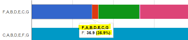
var lineFirst = ['FABDECG', 0.05, 0.10, 0.20, 0.33, 0.05, 0.12, 0.15];
var lineSecond = ['CABDEFG', 0.15, 0.05, 0.20, 0.15, 0.12, 0.10, 0.35];
var dataTable = prepareDataTable(legend,[lineFirst,lineSecond]);
//var view = new google.visualization.DataView(dataTable);
var options_fullStacked = {
isStacked: 'percent',
legend: { position: 'top', maxLines: 3 },
height: '100%',
width: 615,
bar: { groupWidth: 50 },
explorer: { keepInBounds: true },
hAxis: {
minValue: 0,
ticks: [0, .25, .5, .75, 1]
},
tooltip: {
isHtml: true
}
};
var chart = new google.visualization.BarChart(document.getElementById("chartdiv"));
chart.draw(dataTable, options_fullStacked);
}<script type="text/javascript" src="https://www.google.com/jsapi"></script>
<div id="chartdiv"></div>
页面原文内容由Stack Overflow提供。腾讯云小微IT领域专用引擎提供翻译支持
原文链接:
https://stackoverflow.com/questions/33165495
复制相关文章
相似问题
腾讯云开发者

Copyright © 2013 - 2026 Tencent Cloud. All Rights Reserved. 腾讯云 版权所有
深圳市腾讯计算机系统有限公司 ICP备案/许可证号:粤B2-20090059 ![]() 粤公网安备44030502008569号
粤公网安备44030502008569号
腾讯云计算(北京)有限责任公司 京ICP证150476号 | 京ICP备11018762号