
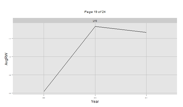
R图2轴多重图
我试图生成一个非常具体的图形输出,但是找不到一个包来完成我想要的所有事情。首先,我需要:(1)生成多个图( ggplot中的facet_wrap很好) (2)具有不同尺度的2y-轴(格似乎是这方面最好的) (3)使用dplR生成一个类似于“绘图”输出的图形。
我有一个数据框架与多个独特的网站。我想把每个站点的年平均值绘制成一个线图,另一个y轴上的第二条线图表示样本深度。我想为每个网站制作一个单独的地块。
下面是一些可重复的数据(小子集),以及到目前为止我得出的结果:
> sites <- structure(list(Year = c("2009", "2009", "2009", "2009", "2009",
"2009", "2009", "2009", "2009", "2009", "2009", "2009", "2009",
"2009", "2009", "2009", "2009", "2009", "2009", "2009", "2009",
"2010", "2010", "2010", "2010", "2010", "2010", "2010", "2010",
"2010", "2010", "2010", "2010", "2010", "2010", "2010", "2010",
"2010", "2010", "2010", "2010", "2010", "2010", "2010", "2010",
"2011", "2011", "2011", "2011", "2011", "2011", "2011", "2011",
"2011", "2011", "2011", "2011", "2011", "2011", "2011", "2011",
"2011", "2011", "2011", "2011", "2011", "2011", "2012", "2012",
"2012"), plot = c("FA6", "FA7", "FK1", "FK2", "FK3", "FO1", "FO2",
"FO6", "GA2", "GA4", "GR1", "GR2", "HE2", "HE3", "LY1", "LY3",
"LY8", "NM2", "NM3", "TH3", "TH5", "BR1", "BR8", "FA5", "FA6",
"FA7", "FK1", "FK2", "FK3", "FO1", "FO2", "FO6", "GA2", "GA4",
"GR1", "GR2", "HE2", "HE3", "LY1", "LY3", "LY8", "NM2", "NM3",
"TH3", "TH5", "FA5", "FA6", "FA7", "FK1", "FK2", "FK3", "FO1",
"FO2", "FO6", "GA2", "GA4", "GR1", "GR2", "HE2", "HE3", "LY1",
"LY3", "LY8", "NM2", "NM3", "TH3", "TH5", "HE2", "HE3", "TH5"
), AvgRW = c(0.628666666666667, 0.485027777777778, 0.479269230769231,
0.826875, 0.633269230769231, 1.01830769230769, 1.34580555555556,
1.13061764705882, 0.422375, 1.377625, 0.535375, 0.366384615384615,
0.493119047619048, 0.300777777777778, 0.971923076923077, 1.02302941176471,
1.47245833333333, 1.00654166666667, 0.56425, 1.66342857142857,
1.28477586206897, 0.860666666666667, 2.10155130769231, 1.74626923076923,
0.616148148148148, 0.42775, 0.402576923076923, 0.859333333333333,
0.608961538461538, 1.28303846153846, 1.84344444444444, 1.52214705882353,
0.425546875, 1.66179166666667, 0.647208333333333, 0.390461538461538,
0.565892857142857, 0.237388888888889, 1.60419230769231, 1.16611764705882,
1.95329166666667, 1.18795833333333, 0.655928571428571, 2.009,
1.36198275862069, 2.61165384615385, 0.873296296296296, 0.596,
0.485884615384615, 1.13633333333333, 0.684461538461538, 1.30946153846154,
1.69747222222222, 1.64197058823529, 0.40740625, 1.40716666666667,
0.641625, 0.428576923076923, 0.729011904761905, 0.376222222222222,
1.52984615384615, 1.15317647058824, 1.66183333333333, 1.17904166666667,
0.604857142857143, 1.57425, 1.55772222222222, 0.7315, 0.119,
1.125875), SampDepth = c(27L, 18L, 13L, 12L, 13L, 13L, 18L, 17L,
32L, 12L, 12L, 13L, 14L, 18L, 13L, 17L, 12L, 12L, 14L, 14L, 29L,
21L, 13L, 13L, 27L, 18L, 13L, 12L, 13L, 13L, 18L, 17L, 32L, 12L,
12L, 13L, 14L, 18L, 13L, 17L, 12L, 12L, 14L, 14L, 29L, 13L, 27L,
18L, 13L, 12L, 13L, 13L, 18L, 17L, 32L, 12L, 12L, 13L, 14L, 18L,
13L, 17L, 12L, 12L, 14L, 4L, 9L, 2L, 1L, 8L)), .Names = c("Year",
"plot", "AvgRW", "SampDepth"), row.names = 2330:2399, class = "data.frame")
我可以使用ggplot和ggplus获得一个很好的布局,但似乎不能添加第二个y轴:
Plot1 <- ggplot(sites,aes(x=Year, y=AvgRW, group=plot)) +
    theme(axis.text=element_text(size=4),
          panel.grid.minor=element_blank(),
          panel.grid.major=element_line(colour = "gray",size=0.5),
          strip.text=element_text(size=8)) +
    geom_line()

facet_multiple(plot = Plot1, facets = 'plot', ncol = 1, nrow = 1, scales="free")
然后,我尝试用格子和latticeExtra来做一个latticeExtra,但是我无法让线条出现:
Plot2a <- xyplot(AvgRW ~ Year, data=sites, groups=plot,
              xlab=list("Year", fontsize = 12),
              ylab = list("Avg RW (mm)", fontsize = 12),
              ylab.right = list("Sample Depth", fontsize = 12),
              par.settings = simpleTheme(col = 1),
              type = c("l","g"),
              lty=1,
              scales=list(x=list(rot=90,tick.number=25,
                                 cex=1,axs="r")))

> Plot2b <- xyplot(SampDepth ~ Year,data=sites, groups=plot, type = "o",col="black",
              lty=9)

> doubleYScale(Plot2a, Plot2b)
我的最终目标是为我的dplR中的每个站点生成一个与data.frame输出类似的图形:
任何关于如何将我的三个目标结合在一起的想法都将不胜感激。
回答 1
Stack Overflow用户
发布于 2015-10-14 01:06:33
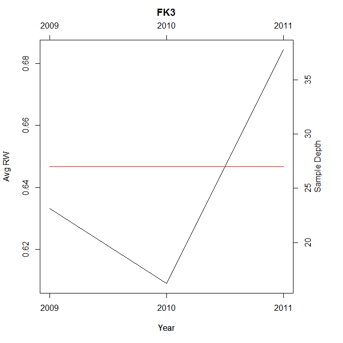
ggplot2不支持二级y轴,因为他的创建者认为它可能会误导人。但是,您可以使用base R。这里有一个解决问题的循环:一个循环中的多个图,二级y轴,类似于附图的外观。我假设您在Windows上,并包含了使用savePlot保存savePlot目录中每个图表的代码。
for (i in sites$plot){                          #start loop
par(mar=c(5.1,4.1,4.1,5.1))                     #increase right margin
plot(sites[sites$plot==i,c(1,3)],xaxt="n", type="l", ylab="Avg RW")
title(main=i,line=2.5)                              #add title
axis(1,at=as.integer(sites$Year),labels=sites$Year) #bottom axis
axis(3,at=as.integer(sites$Year),labels=sites$Year) #top axis
par(new = TRUE)                                     #overlay for secondary y
plot(sites[sites$plot==i,c(1,4)],xaxt="n",yaxt="n", ylab="",type="l", col="red")
axis(4)                                             #add secondary y axis
mtext("Sample Depth", side = 4, line=2)             #add secondary y label
savePlot(filename = paste0("c:/temp/",i, ".png"), type = "png") # save
}
UPDATE如果您不在Windows上,则不能使用savePlot。使用普通的png函数。您将不会在屏幕上看到图表,但它们将被保存。确保将路径更改为要保存图表的位置。我在下面的代码中使用c:/temp/,它不会在非windows机器上工作。
for (i in sites$plot){                          #start loop
png(filename = paste0("c:/temp/",i, ".png")) # save
par(mar=c(5.1,4.1,4.1,5.1))                     #increase right margin
plot(sites[sites$plot==i,c(1,3)],xaxt="n", type="l", ylab="Avg RW")
title(main=i,line=2.5)                              #add title
axis(1,at=as.integer(sites$Year),labels=sites$Year) #bottom axis
axis(3,at=as.integer(sites$Year),labels=sites$Year) #top axis
par(new = TRUE)                                     #overlay for secondary y
plot(sites[sites$plot==i,c(1,4)],xaxt="n",yaxt="n", ylab="",type="l", col="red")
axis(4)                                             #add secondary y axis
mtext("Sample Depth", side = 4, line=2)             #add secondary y label
dev.off()
}https://stackoverflow.com/questions/33090903
复制相似问题
腾讯云开发者

Copyright © 2013 - 2026 Tencent Cloud. All Rights Reserved. 腾讯云 版权所有
深圳市腾讯计算机系统有限公司 ICP备案/许可证号:粤B2-20090059 ![]() 粤公网安备44030502008569号
粤公网安备44030502008569号
腾讯云计算(北京)有限责任公司 京ICP证150476号 | 京ICP备11018762号