
如何在R中创建一个条形图,其中每个条形图都是组的一个范畴变量的百分比?
如何在R中创建一个条形图,其中每个条形图都是组的一个范畴变量的百分比?
提问于 2015-10-09 05:32:31
假设我有以下格式的数据:
categoricalVar,  numericVar,  responseVar
           Foo,           1,         TRUE
           Bar,           0,         TRUE
           Baz,           2,        FALSE
       ...
       ...
... MUCH MUCH MORE我想要创建一个条形图,其中X轴将是3种不同类型的categoricalVar,而Y轴将成为TRUE的百分比。一张桌子也能用,像这样。
           Foo,   Bar,   Baz
respPct 0.4, 0.6, 0.9因此,在所有的Foo中,TRUE的百分比是0.4。
对于numericVar来说,同样的事情会很好。
             0,     1,     2, ....
 respPct   0.1,   0.2,   0.2
虽然我认为将numericVar分组是有意义的,如下所示:
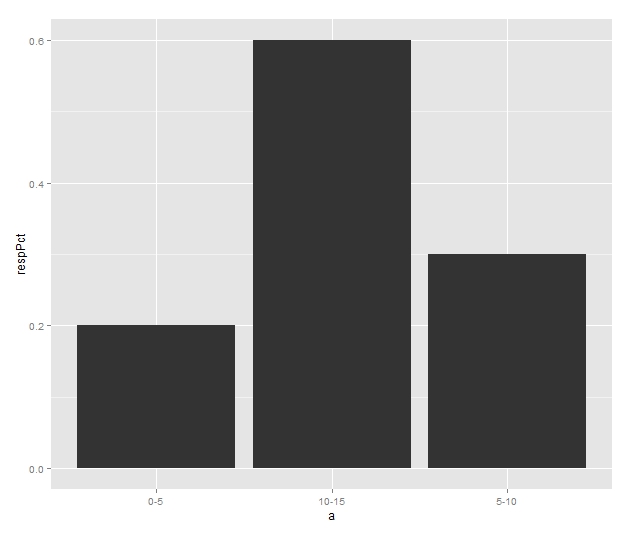
           0-5,  5-10, 10-15, ....
 respPct   0.2,   0.3,   0.6
有人能给我指明正确的方向吗?
回答 2
Stack Overflow用户
回答已采纳
发布于 2015-10-09 06:17:04
首先,您必须将您的numericVar转换为一个类别变量。但是,让我们首先创建一些示例数据:
set.seed(2)
df <- data.frame(catVar = rep(c("foo","bar","saz"),each=10),
                 respVar = c(sample(c(TRUE,TRUE,TRUE,FALSE,TRUE), 10, replace =TRUE),
                             sample(c(FALSE,TRUE,TRUE,FALSE,TRUE), 10, replace =TRUE),
                             sample(c(FALSE,FALSE,TRUE,FALSE,TRUE), 10, replace =TRUE)),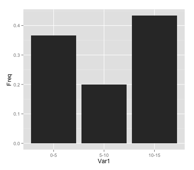
numVar = sample(0:15, 30, replace =TRUE))1:为numVar创建一个分类变量:
df$catNum <- cut(df$numVar, breaks = c(-Inf,5,10,Inf), labels = c("0-5", "5-10", "10-15"))2:用以下方法聚合数据:
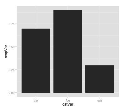
df2 <- aggregate(respVar ~ catVar, df, FUN = function(x) sum(x)/length(x))
df3 <- data.frame(table(df$catNum)/30)3:用以下内容创建一些情节:
ggplot(df2, aes(x=catVar, y=respVar)) +
  geom_bar(stat="identity")
ggplot(df3, aes(x=Var1, y=Freq)) +
  geom_bar(stat="identity")
Stack Overflow用户
发布于 2015-10-09 05:42:06
   df <- data.frame(a = c("0-5", "5-10", "10-15"), respPct =  c(0.2,   0.3,   0.6))
    library(ggplot2)
    ggplot(aes( x= a, y = respPct), data = df) + geom_bar(stat = "identity")
页面原文内容由Stack Overflow提供。腾讯云小微IT领域专用引擎提供翻译支持
原文链接:
https://stackoverflow.com/questions/33030600
复制相关文章
相似问题
腾讯云开发者

Copyright © 2013 - 2026 Tencent Cloud. All Rights Reserved. 腾讯云 版权所有
深圳市腾讯计算机系统有限公司 ICP备案/许可证号:粤B2-20090059 ![]() 粤公网安备44030502008569号
粤公网安备44030502008569号
腾讯云计算(北京)有限责任公司 京ICP证150476号 | 京ICP备11018762号