
CSS3翻译多次?
CSS3翻译多次?
提问于 2015-09-02 10:08:06
我的基本场景是这样的:
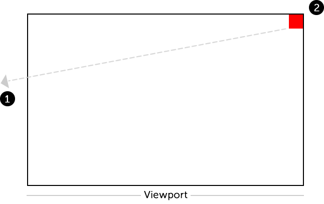
- 第一步:把红色的盒子移到左手边,离开视野。
- 第二步:然后,立即将红色方块移回开始位置,没有任何动画。
我不知道怎样才能如愿以偿。
我的代码如下所示:
.box {
  background: red;
  width: 30px;
  height: 30px;
  position: absolute;
  top: 0px;
  right: 0px;
  animation: nudge 5s linear;
}
@keyframes nudge {
  50% {
    transform: translate(-5650px, 155px);
  }
}<div class="box"></div>
回答 2
Stack Overflow用户
回答已采纳
发布于 2015-09-02 10:14:37
默认情况下,动画是这样工作的。也就是说,在动画完成后,元素将立即恢复到原来的位置(除非animation-fill-mode设置为forwards)。
您的问题在于keyframes设置。当您将转换设置为在50%进行,并且初始transform状态为空时,元素将逐渐从原始位置(不进行转换)移动到动画的前50%的转换位置,然后在接下来的50%中逐渐从结束位置移动到原始位置。您可以通过在100%上设置关键帧来避免这种情况。
.box {
   background: red;
   width: 30px;
   height: 30px;
   position: absolute;
   top: 0px;
   right: 0px;
   animation: nudge 5s linear;
}

@keyframes nudge {
   100% {
      transform: translate(-5650px, 155px);
   }
}<script src="https://cdnjs.cloudflare.com/ajax/libs/prefixfree/1.0.7/prefixfree.min.js"></script>
<div class="box"></div>
Stack Overflow用户
发布于 2015-09-02 10:12:10
使用100% {transform: translate(-5650px, 155px);}而不是50% {transform: translate(-5650px, 155px);}
.box {
   background: red;
   width: 30px;
   height: 30px;
   position: absolute;
   top: 0px;
   right: 0px;
   animation:
   nudge 2s linear;
}

@keyframes nudge {
   100% {
      transform: translate(-2560px, 155px);
   }
}<div class="box"></div>
页面原文内容由Stack Overflow提供。腾讯云小微IT领域专用引擎提供翻译支持
原文链接:
https://stackoverflow.com/questions/32350308
复制相关文章
相似问题
腾讯云开发者

Copyright © 2013 - 2026 Tencent Cloud. All Rights Reserved. 腾讯云 版权所有
深圳市腾讯计算机系统有限公司 ICP备案/许可证号:粤B2-20090059  粤公网安备44030502008569号
腾讯云计算(北京)有限责任公司 京ICP证150476号 | 京ICP备11018762号