
FSharpChart:同一图形上的两个刻度
FSharpChart:同一图形上的两个刻度
提问于 2015-07-08 23:28:54
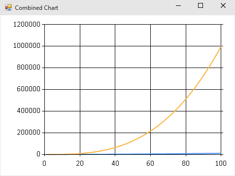
我使用FSharpChart在相同的图形上打印移动平均值和股票的体积。问题是,一个图形大约从20到50,另一个从0到8000万,所以当我将两者结合时,一个被分割到底部,这是无用的。我能有两个不同的比例在Y-轴,以便两个图形“合并”正确?
回答 2
Stack Overflow用户
回答已采纳
发布于 2015-07-09 17:10:16
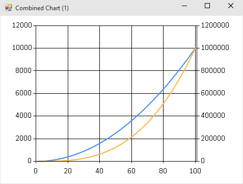
如果将其中一个系列的AxisType设置为AxisType.Secondary,则可以这样做。当然,这取决于你确定轴标签,图例,等等清楚哪些数据映射到哪个比例尺。
open FSharp.Charting
open System.Windows.Forms.DataVisualization.Charting

let squaresChart = [ 1 .. 100 ] |> List.map (fun n -> (n, n*n)) |> Chart.Line
let cubesChart   = [ 1 .. 100 ] |> List.map (fun n -> (n, n*n*n)) |> Chart.Line

let bad =
    [ squaresChart
      cubesChart ]
    |> Chart.Combine

let good =
    [ squaresChart
      cubesChart |> Chart.WithSeries.AxisType(YAxisType = AxisType.Secondary) ]
    |> Chart.Combine
坏:
好:
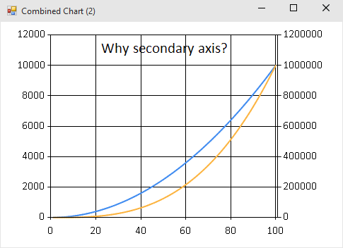
这是可行的,但是在我为编写这个答案所做的快速测试中,FSharp.Charting似乎有一些bug,其中某些定制是“具有传染性的”。在创建“好”图表之后,即使我不想要它,也会出现第二轴:
// secondary axis sticks around
bad |> Chart.WithTitle(Text = "Why secondary axis?")
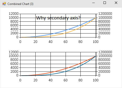
// now the title and the secondary axis *both* stick around!
Chart.Rows [bad; good]
Stack Overflow用户
发布于 2015-07-09 04:29:05
据我所知,你不能用独立比例的Chart.Combine图表。但是,您可以使用不同的组合器将它们堆叠在一起,例如在下面的代码片段中使用Chart.Rows。
#I @"C:\code\packages\FSharp.Charting.0.90.12"
#load "FSharp.Charting.fsx"
open FSharp.Charting
open System
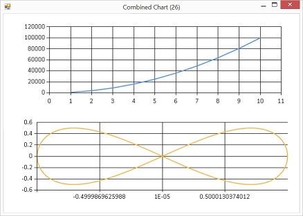
let parabola = [ for x in 1.0 .. 1.0 .. 10.0 -> (x, (x ** 2.0) * 1000.0 ) ]
let curve = [ for i in 0.0 .. 0.02 .. 2.0 * Math.PI -> (sin i, cos i * sin i) ]
Chart.Rows([Chart.Line(parabola); Chart.Line(curve)])用具有完全不同比例的成分制作组合图表:
页面原文内容由Stack Overflow提供。腾讯云小微IT领域专用引擎提供翻译支持
原文链接:
https://stackoverflow.com/questions/31305580
复制相关文章
相似问题
腾讯云开发者

Copyright © 2013 - 2026 Tencent Cloud. All Rights Reserved. 腾讯云 版权所有
深圳市腾讯计算机系统有限公司 ICP备案/许可证号:粤B2-20090059 ![]() 粤公网安备44030502008569号
粤公网安备44030502008569号
腾讯云计算(北京)有限责任公司 京ICP证150476号 | 京ICP备11018762号