
网格高度动态对齐
网格高度动态对齐
提问于 2015-07-06 06:38:54
在我的页面中有两个部分。1.Div随内容动态变化,div的高度将随内容的变化而变化。2.柔性网格显示的一些内容。
到目前为止,我的柔性网格大小是恒定的,不管第1次DIV,content.When,1 div内容是非常少的,因为柔性网格高度是恒定的,所以在网格之后剩余的大量自由空间。在这里,我的挑战是安排灵活的栅格高度,以便覆盖整个页面取决于第一DIV高度。
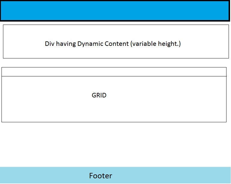
我用offset.which编写了一些代码,运行良好,但不是最优的。
这是代码
 function calcHeight() {


     var grid = $('.flexigrid').offset().top + $('.flexigrid').height();
     var footer = $('#footer').offset().top;

     var req_height;
     //checking if page has a scroll or not.
     if (grid > footer) {
         req_height = $('.bDiv').height() - $('.flexigrid').offset().top;
     } else {
         req_height = $('.bDiv').height() + footer - grid;

     }


     return req_height;


 }

 function setHeight() {

     var req_height = calcHeight();

     var styleElement = document.getElementById('styles_js');
     if (!styleElement) {
         styleElement = document.createElement('style');
         styleElement.type = 'text/css';
         styleElement.id = 'styles_js';
         document.getElementsByTagName('head')[0].appendChild(styleElement);
     }
     var newStyle = '.bDiv{height:' + req_height + 'px!important}';
     styleElement.appendChild(document.createTextNode(newStyle));
}我正在调用setHeight()函数,然后调用calcHeight来计算所需的高度。如果可以用其他方式做,请告诉我。
回答 1
Stack Overflow用户
发布于 2015-07-06 07:07:34
就像这样:
var windowheight = $(window).height();
var dynamicContentHeight = $(window).height();
var headerHeight = $("#header").height();
var footerHeight = $("#footer").height();


var gridheight = windowheight - headerHeight - footerHeight - dynamicContentHeight;

$("#gridheight").css("height", gridheight);页面原文内容由Stack Overflow提供。腾讯云小微IT领域专用引擎提供翻译支持
原文链接:
https://stackoverflow.com/questions/31239145
复制相关文章
相似问题
腾讯云开发者

Copyright © 2013 - 2026 Tencent Cloud. All Rights Reserved. 腾讯云 版权所有
深圳市腾讯计算机系统有限公司 ICP备案/许可证号:粤B2-20090059  粤公网安备44030502008569号
腾讯云计算(北京)有限责任公司 京ICP证150476号 | 京ICP备11018762号