
Python控件包-提高Nyquist绘图的分辨率
Python控件包-提高Nyquist绘图的分辨率
提问于 2015-06-28 19:16:56
我使用Python控制模块来绘制传递函数的Bode和Nyquist图。代码非常简单,如下:
# Simple Nyquist plotting

import control
import matplotlib.pyplot as plt

num = 5
den = [1,6,11,6]

#Creating a transfer function G = num/den
G = control.tf(num,den)

control.nyquist(G)
plt.grid(True)
plt.title('Nyquist Diagram of G(s) = 5/(s+1)(s+2)(s+3)')
plt.xlabel('Re(s)')
plt.ylabel('Im(s)')
plt.show()
绘制了Nyquist图:
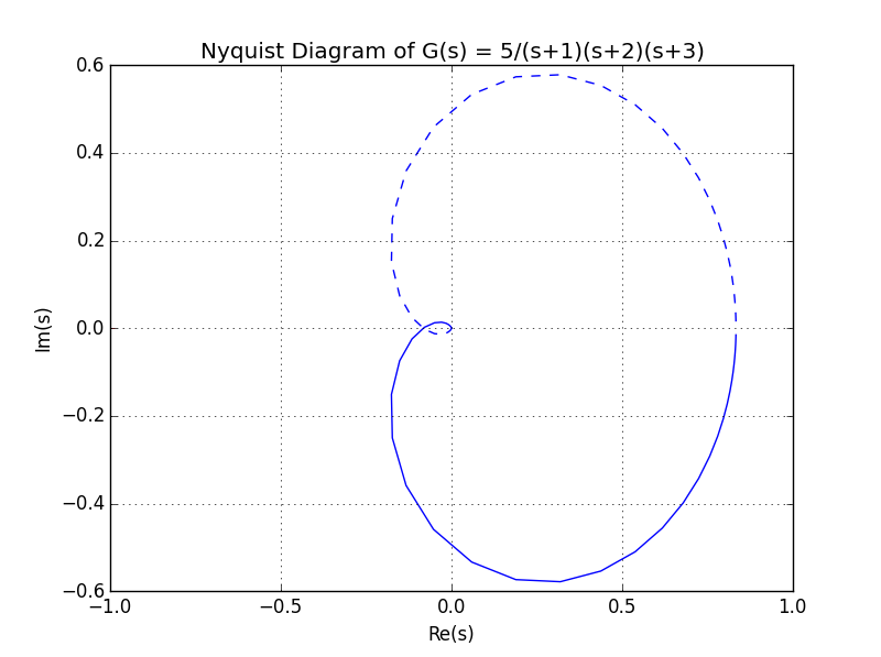
我想知道是否有可能增加点数的图表,提高它的分辨率。
回答 2
Stack Overflow用户
回答已采纳
发布于 2015-07-27 11:33:37
python-control库遵循类似matlab的语法,所以最好先检查是否可以像matlab那样进行检查。这一次确实是。实际上,您可以查看函数签名以获得提示。
例如,在IPython终端中,如果我们键入
cnt.nyquist? 我们会得到
Signature: cnt.nyquist(syslist, omega=None, Plot=True, color='b', labelFreq=0, *args, **kwargs)
Docstring:
Nyquist plot for a system

Plots a Nyquist plot for the system over a (optional) frequency range.

Parameters
----------
syslist : list of Lti
    List of linear input/output systems (single system is OK)
omega : freq_range
    Range of frequencies (list or bounds) in rad/sec
Plot : boolean
    If True, plot magnitude
labelFreq : int
    Label every nth frequency on the plot
*args, **kwargs:
    Additional options to matplotlib (color, linestyle, etc)

Returns
-------
real : array
    real part of the frequency response array
imag : array
    imaginary part of the frequency response array
freq : array
    frequencies

Examples
--------
>>> sys = ss("1. -2; 3. -4", "5.; 7", "6. 8", "9.")
>>> real, imag, freq = nyquist_plot(sys)
File:      c:\python34\lib\site-packages\control\freqplot.py
Type:      function
因此,对于您的情况,修复起来很简单。
num = 5
den = [1,6,11,6]

#Creating a transfer function G = num/den
G = control.tf(num,den)
w = numpy.logspace(-3,3,5000)
control.nyquist(G,w);Stack Overflow用户
发布于 2015-06-28 19:25:52
请注意,在图中,所有数据点都存在。你只要把窗户放大,你就会看到所有的点。
您可以手动完成此操作(只需扩大绘图窗口),也可以在显示结果之前进行set the plot window in Matplotlib:
If you've already got the figure created you can quickly do this:

fig = matplotlib.pyplot.gcf()
fig.set_size_inches(18.5, 10.5)
fig.savefig('test2png.png', dpi=100)
若要将大小更改传播到现有gui窗口,请添加forward=True
fig.set_size_inches(18.5, 10.5, forward=True)页面原文内容由Stack Overflow提供。腾讯云小微IT领域专用引擎提供翻译支持
原文链接:
https://stackoverflow.com/questions/31103784
复制相关文章
相似问题
腾讯云开发者

Copyright © 2013 - 2026 Tencent Cloud. All Rights Reserved. 腾讯云 版权所有
深圳市腾讯计算机系统有限公司 ICP备案/许可证号:粤B2-20090059 ![]() 粤公网安备44030502008569号
粤公网安备44030502008569号
腾讯云计算(北京)有限责任公司 京ICP证150476号 | 京ICP备11018762号