
流动电路动画
流动电路动画
提问于 2015-06-21 20:04:19
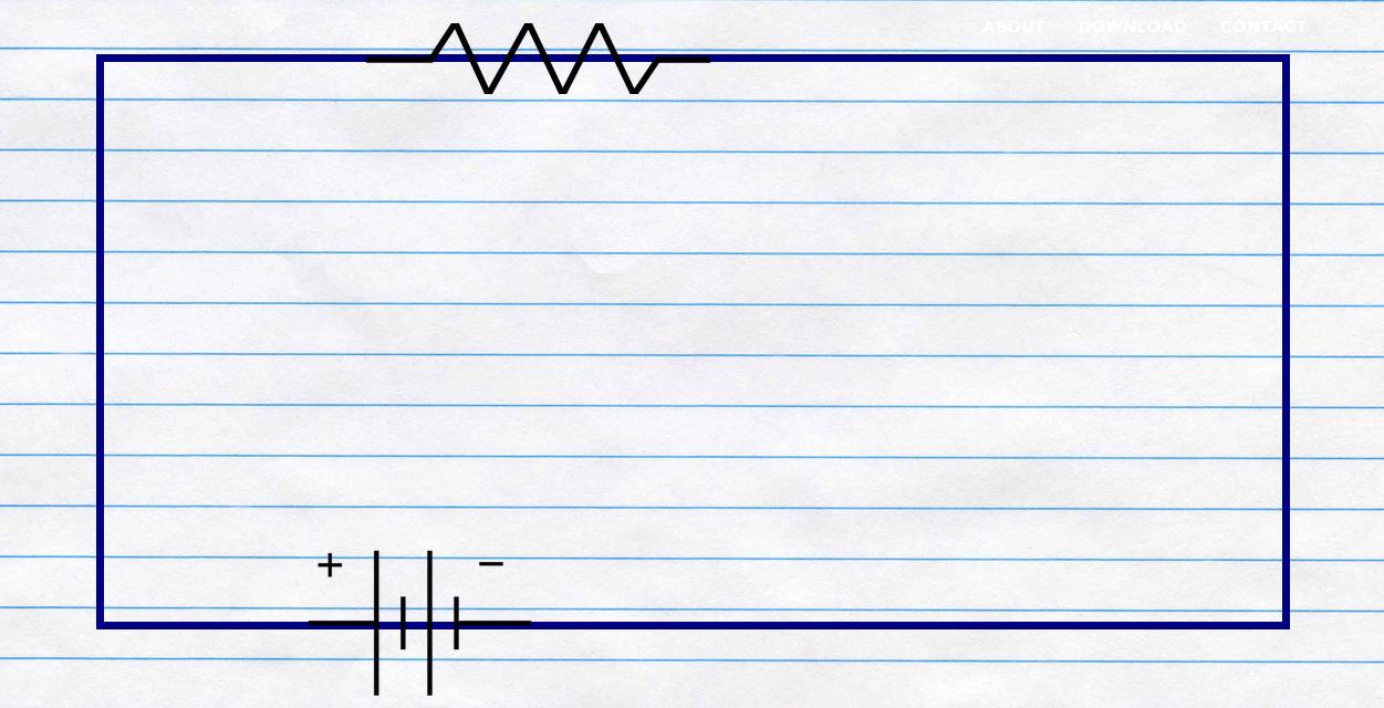
我的网站有一个div,只有边距,当页面加载时,我想要电路的效果(我在div上有电池重叠),所以从正端子,电路的颜色变为黄色,然后黄色继续到负极端。这是可能的CSS,我不完全确定CSS的力量。
这是我的div标签的代码。
#circuit {
  width: 80%;
  border: 10px solid navy;
  margin: 25px;
  height: 80%;
  margin-left: auto;
  margin-right: auto;
}
html,
body {
  height: 100%;
  margin: 0;
}<div id="circuit"></div>
回答 3
Stack Overflow用户
回答已采纳
发布于 2015-06-22 03:35:32
一系列关键帧动画完成了这项工作。您需要修改持续时间和累积延迟以获得所需的速度。
小提琴演示
    html, body {
    height: 100%;
    padding: 0;
    margin: 0;
}
* {
    box-sizing: border-box;
}
.circuit-outer {
    position: relative;
    width: 80vw;
    height: 80vh;
    margin: 5% 10% 0;
    padding: 3px;
    background: #eee;
    border: 1px solid #ddd;
    overflow: hidden;
}
.circuit-inner {
    position: absolute;
    top: 3px;
    bottom: 3px;
    left: 3px;
    right: 3px;
    background: #fff;
    border: 1px solid #ddd;
}
.current {
    background: orange;
    position: absolute;
    -webkit-animation-iteration-count: 1;
    -webkit-animation-timing-function: linear;
    -webkit-animation-fill-mode: forwards;
    animation-iteration-count: 1;
    animation-timing-function: linear;
    animation-fill-mode: forwards;
}
.current.bottom-left {
    bottom: 0;
    right: 80%;
    width: 20%;
    height: 3px;
    -webkit-animation-name: zap1;
    -webkit-animation-duration: .2s;
    animation-name: zap1;
    animation-duration: .2s;
}
.current.left {
    bottom: 0;
    left: 0;
    width: 3px;
    height: 0;
    -webkit-animation-name: zap2;
    -webkit-animation-delay: .2s;
    -webkit-animation-duration: .5s;
    animation-name: zap2;
    animation-delay: .2s;
    animation-duration: .5s;
}
.current.top {
    top: 0;
    width: 0;
    height: 3px;
    -webkit-animation-name: zap3;
    -webkit-animation-delay: .7s;
    -webkit-animation-duration: 1s;
    animation-name: zap3;
    animation-delay: .7s;
    animation-duration: 1s;
}
.current.right {
    top: 0;
    right: 0;
    width: 3px;
    height: 0;
    -webkit-animation-name: zap2;
    -webkit-animation-delay: 1.7s;
    -webkit-animation-duration: .5s;
    animation-name: zap2;
    animation-delay: 1.7s;
    animation-duration: .5s;
}
.current.bottom-right {
    bottom: 0;
    right: 0;
    width: 0%;
    height: 3px;
    -webkit-animation-name: zap4;
    -webkit-animation-delay: 2.2s;
    -webkit-animation-duration: .8s;
    animation-name: zap4;
    animation-delay: 2.2s;
    animation-duration: .8s;
}
@-webkit-keyframes zap1 {
    0% {
        width: 0;
    }
    100% {
        width: 20%;
    }
}
@keyframes zap1 {
    0% {
        width: 0;
    }
    100% {
        width: 20%;
    }
}
@-webkit-keyframes zap2 {
    0% {
        height: 0;
    }
    100% {
        height: 100%;
    }
}
@keyframes zap2 {
    0% {
        height: 0;
    }
    100% {
        height: 100%;
    }
}
@-webkit-keyframes zap3 {
    0% {
        width: 0;
    }
    100% {
        width: 100%;
    }
}
@keyframes zap3 {
    0% {
        width: 0;
    }
    100% {
        width: 100%;
    }
}
@-webkit-keyframes zap4 {
    0% {
        width: 0;
    }
    100% {
        width: 80%;
    }
}
@keyframes zap4 {
    0% {
        width: 0;
    }
    100% {
        width: 80%;
    }
}<div class="circuit-outer">
<div class="current bottom-left"></div>
<div class="current left"></div>
<div class="current top"></div>
<div class="current right"></div>
<div class="current bottom-right"></div>
<div class="circuit-inner"></div>
</div>
Stack Overflow用户
发布于 2015-06-21 20:52:44
像这样吗?它创建一个背景和动画的位置在悬停。在加载页面时,您可以很容易地应用特殊的类。
#circuit {
  width: 80%;
  border: 10px solid navy;
  margin: 25px;
  height: 80%;
  margin-left: auto;
  margin-right: auto;

  background: linear-gradient(to right, yellow 50%, blue 50%);
  background-size: 200% 100%;
  background-position:right bottom;
  transition:all 2s ease;
}
html,
body {
  height: 100%;
  margin: 0;
}

#circuit:hover {
  background-position:left bottom;
}<div id="circuit"></div>
Stack Overflow用户
发布于 2015-06-21 21:22:43
也许这就是你要找的:
#circuit {
  position:relative;
  width: 450px;
  height: 150px;
  margin: 10% auto;
  border:1px solid;

  background: linear-gradient(to right, yellow 50%, blue 50%);
  background-size: 200% 100%;
  background-position:right bottom;
  transition:all 2s ease;

}
html,
body {
  height: 100%;
  margin: 0;
}

#circuit:hover {
  background-position:left bottom;
}
.inner{
background:white;
position:absolute;
top:15%;
left:5%;
bottom:15%;
right:5%;
}<div id="circuit"><div class='inner'></div></div>
页面原文内容由Stack Overflow提供。腾讯云小微IT领域专用引擎提供翻译支持
原文链接:
https://stackoverflow.com/questions/30968795
复制相关文章
相似问题
腾讯云开发者

Copyright © 2013 - 2026 Tencent Cloud. All Rights Reserved. 腾讯云 版权所有
深圳市腾讯计算机系统有限公司 ICP备案/许可证号:粤B2-20090059  粤公网安备44030502008569号
腾讯云计算(北京)有限责任公司 京ICP证150476号 | 京ICP备11018762号