
如何使我的情节在Python中更流畅?
如何使我的情节在Python中更流畅?
提问于 2015-05-26 04:22:52
我有一个叫做calculate_cost的函数,它计算不同S_range (库存级别)供应商的绩效。函数可以工作,但图不是光滑的,有方法在Python中使其平滑吗?
import numpy
import scipy.stats
import scipy.integrate
import scipy.misc
import matplotlib
import math
import pylab
from scipy.stats import poisson

def calculate_cost(s, h, d, r, k, alphaR):
    cost = 0.0
    for i in range(0, alphaR + 1):
        #i = i-1
        binom = math.factorial(r) / ((math.factorial(i)) * (math.factorial(r - i)))
        func = scipy.stats.poisson.cdf(s, d)
        cost +=  ((k/r) * binom * (func ** i) * ((1.0-func) ** (r-i)))

    for p in range (s):
        cost += h*(s-p)*scipy.stats.poisson.pmf(p, d)  #This a formula

    return cost

graphs = []

class Graph:
    def __init__(self):
        self.label = ""
        self.h = 0
        self.d = 0
        self.r = 0
        self.k = 0
        self.alphaR = 0

graph = Graph()
graph.label = "A"
graph.h = 1.0
graph.d = 10
graph.r = 30
graph.k = 283.0
graph.alphaR = 23

graphs.append(graph)

graph = Graph()
graph.label = "B"
graph.h = 1.0
graph.d = 10
graph.r = 30
graph.k = 146.0
graph.alphaR = 24
#graph.LineStyle = '*-'


graphs.append(graph)

graph = Graph()
graph.label = "C"
graph.h = 1.0
graph.d = 10
graph.r = 30
graph.k = 92.0
graph.alphaR = 25
#graph.LineStyle = '*-'


graphs.append(graph)

graph = Graph()
graph.label = "D"
graph.h = 1.0
graph.d = 10
graph.r = 30
graph.k = 80.0
graph.alphaR = 26
#graph.LineStyle = '*-'


graphs.append(graph)

graph = Graph()
graph.label = "E"
graph.h = 1.0
graph.d = 10
graph.r = 30
graph.k = 77.0
graph.alphaR = 27
#graph.LineStyle = '*-'


graphs.append(graph)


s_range = numpy.arange(0,21,1)

for graph in graphs:
    cost = []

    for s in s_range:
        cost.append(calculate_cost(s, graph.h, graph.d, graph.r, graph.k, graph.alphaR))

    matplotlib.pyplot.plot(s_range, cost,  label = graph.label)

    pylab.legend()
    matplotlib.pyplot.xlabel(' S_range')
    matplotlib.pyplot.ylabel('Cost')


pylab.show()回答 1
Stack Overflow用户
回答已采纳
发布于 2015-05-26 08:55:57
一种解决方案是使用具有“立方”类型的scipy.iterp1D函数:
from scipy import interpolate
....
s_range = numpy.arange(0,21,1)

for graph in graphs:
    cost = []

    for s in s_range:
        cost.append(calculate_cost(s, graph.h, graph.d, graph.r, graph.k, graph.alphaR))

    f = interpolate.interp1d(s_range, cost, kind='cubic')

    s_range_new = np.arange(0,20, 0.1)
    cost_new = f(s_range_new)

    matplotlib.pyplot.plot(s_range_new, cost_new,  label = graph.label)

    pylab.legend()
    matplotlib.pyplot.xlabel(' S_range')
    matplotlib.pyplot.ylabel('Cost')


pylab.show()
这给了你:
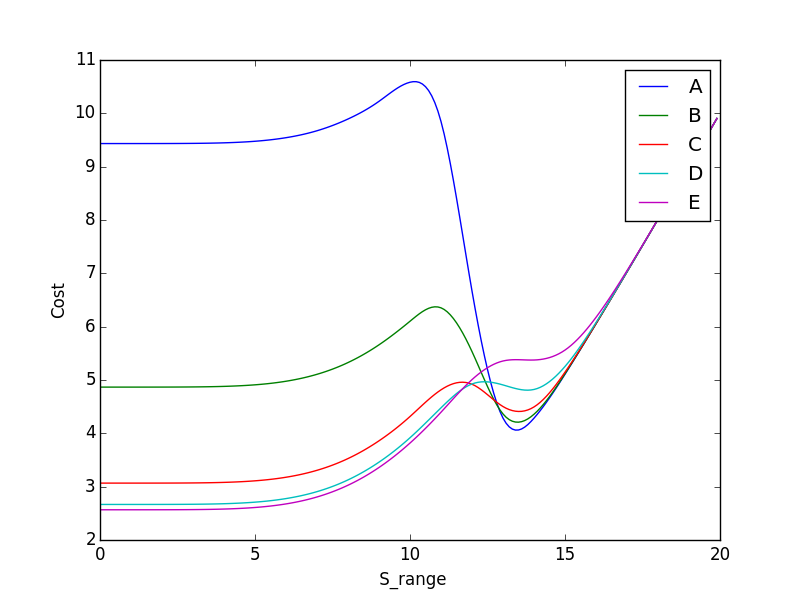
在如何使用它时要小心,因为这只是插值点,而不是真实的数据点。
希望这能有所帮助
页面原文内容由Stack Overflow提供。腾讯云小微IT领域专用引擎提供翻译支持
原文链接:
https://stackoverflow.com/questions/30449421
复制相关文章
相似问题
腾讯云开发者

Copyright © 2013 - 2026 Tencent Cloud. All Rights Reserved. 腾讯云 版权所有
深圳市腾讯计算机系统有限公司 ICP备案/许可证号:粤B2-20090059 ![]() 粤公网安备44030502008569号
粤公网安备44030502008569号
腾讯云计算(北京)有限责任公司 京ICP证150476号 | 京ICP备11018762号