
直方图中的r直方图
直方图中的r直方图
提问于 2015-04-28 13:26:22
我正在尝试从下面的数据生成一个直方图。
a 11
a 14
a 23
b 12
b 21
c 17
c 14
c 29
c 22
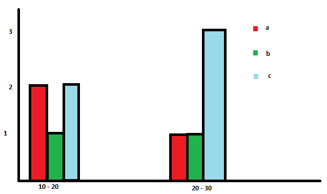
c 25这是我的目标阴谋
看起来我可以这样做,但我在我的系统中没有ggplot。它是否有可能产生它而不加图形?
回答 1
Stack Overflow用户
回答已采纳
发布于 2015-04-28 14:30:00
更新
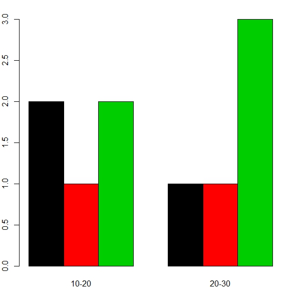
下面是代码的一个更好的版本,它可以更容易地调整到任何数字范围,以便通过以下方法分离:
dat <- data.frame(c1 = c("a", "a", "a", "b", "b", rep("c", 5)), c2=c(11, 14, 23, 12, 21, 17, 14, 29, 22, 25))

groups <- levels(dat$c1)
nranges <- 2
limits <- c(10, 20, 30) #Must have length equal to nranges + 1
intervals <- sapply(1:nranges, function(i) paste0(limits[i], "-", limits[i+1]))

frequencies <- sapply(1:nranges, function(i) sapply(groups, function(j) sum(dat[dat$c2>limits[i] & dat$c2<limits[i+1],1]==j)))
# Or using table(). One of them might be faster than the other for large data
#frequencies <- sapply(1:nranges, function(i) rowSums(table(dat[dat$c2>limits[i] & dat$c2<limits[i+1],])))

barplot(frequencies, beside = TRUE, col=1:length(groups), names.arg=intervals)
结果如下所示,组的颜色和适当的标签相同:
原始
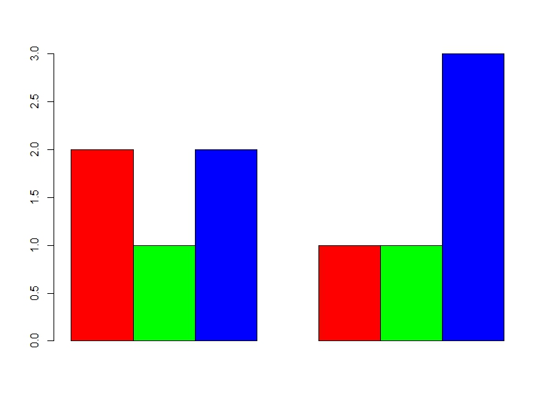
这对您的实际数据可能并不理想,但它适用于您的示例,并将给您一个开始:
dat <- data.frame(c1 = c("a", "a", "a", "b", "b", rep("c", 5)), c2=c(11, 14, 23, 12, 21, 17, 14, 29, 22, 25))

groups <- levels(dat$c1)
dat1 <- sapply(groups, function(i) sum(dat[dat$c2>10 & dat$c2<20,1]==i))
dat2 <- sapply(groups, function(i) sum(dat[dat$c2>20 & dat$c2<30,1]==i))

barplot(matrix(c(dat1, dat2), ncol=2), beside = TRUE, col=c("Red", "Green", "Blue"))
它产生:
这样做的目的是计算频率,然后用并行叠加的数据来绘制那些使用桶形图的频率,而不是试图使用hist()。
页面原文内容由Stack Overflow提供。腾讯云小微IT领域专用引擎提供翻译支持
原文链接:
https://stackoverflow.com/questions/29920876
复制相关文章
相似问题
腾讯云开发者

Copyright © 2013 - 2026 Tencent Cloud. All Rights Reserved. 腾讯云 版权所有
深圳市腾讯计算机系统有限公司 ICP备案/许可证号:粤B2-20090059 ![]() 粤公网安备44030502008569号
粤公网安备44030502008569号
腾讯云计算(北京)有限责任公司 京ICP证150476号 | 京ICP备11018762号