
从python创建“经济学人”风格的图表
从python创建“经济学人”风格的图表
提问于 2015-04-25 00:20:28
通过使用python和marplotlib以及一个像海运这样的工具,我想从“经济学人”中创建一个这样的图表(因为我认为它的风格很棒)。
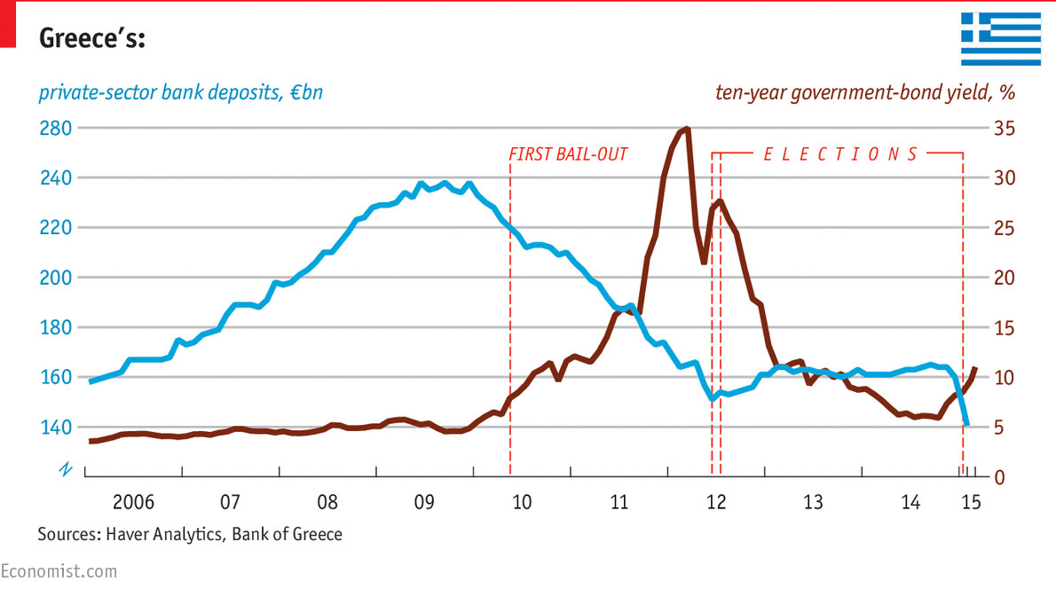
这是一个时间序列图,我想要再现的关键是水平网格线,其标签与带有滴答标记的较低水平轴相匹配。网格线两端的不同颜色标签将是一种奖励,并有相应的标题(左和右对齐)。注释将是双倍的奖励。
我试着用海运来做类似的东西,但没能走到第一步。
回答 1
Stack Overflow用户
回答已采纳
发布于 2015-04-26 00:54:10
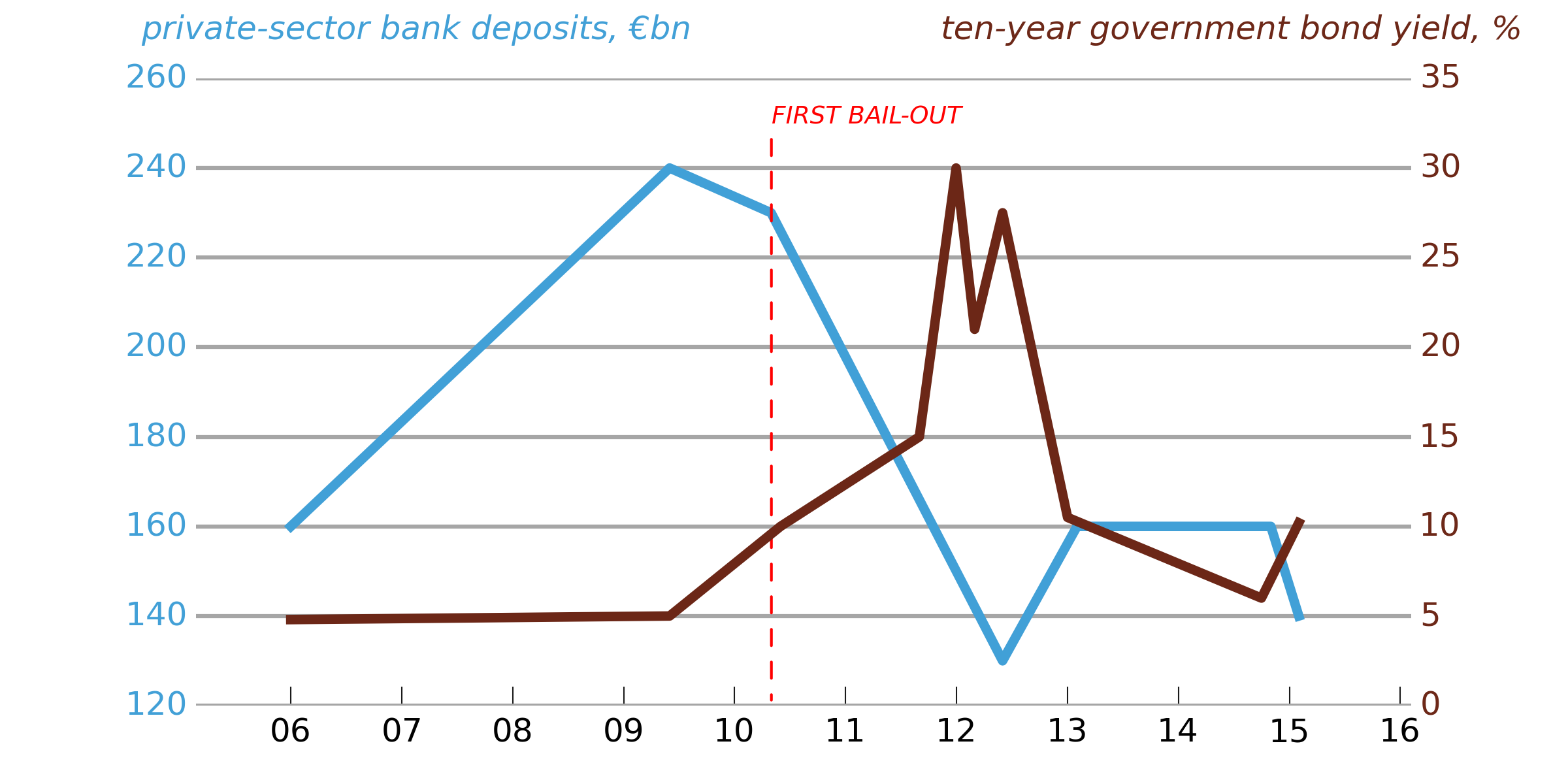
并不完美(我还没花很长时间来玩它),但是为了让您了解需要用哪种Matplotlib方法来按您需要的方式定制一个图,下面有一些代码。
请注意,要对这样的情节进行微调,很难将内容和表示分开(您可能需要手动设置滴答标签等等,因此如果您更改数据,它就不会自动工作)。“经济学人”的图形人显然是这样做的,因为他们似乎弄错了左上角的勾标(280应该是260)。
# -*- coding: utf-8 -*-
import numpy as np
import matplotlib.pyplot as plt
import matplotlib.dates as mdates
import matplotlib.ticker as ticker
from datetime import datetime

# Load in some sample data
bond_yields = np.loadtxt('bond_yields.txt',
                         converters={0: mdates.strpdate2num('%Y-%m-%d')},
                         dtype = {'names': ('date', 'bond_yield'),
                                  'formats': (datetime, float)})
bank_deposits = np.loadtxt('bank_deposits.txt',
                         converters={0: mdates.strpdate2num('%Y-%m-%d')},
                         dtype = {'names': ('date', 'bank_deposits'),
                                  'formats': (datetime, float)})

# Bond yields line is in light blue, bank deposits line in dark red:
bond_yield_color = (0.424, 0.153, 0.090)
bank_deposits_color = (0.255, 0.627, 0.843)

# Set up a figure, and twin the x-axis so we can have two different y-axes
fig = plt.figure(figsize=(8, 4), frameon=False, facecolor='white')
ax1 = fig.add_subplot(111)
ax2 = ax1.twinx()
# Make sure the gridlines don't end up on top of the plotted data
ax1.set_axisbelow(True)
ax2.set_axisbelow(True)

# The light gray, horizontal gridlines
ax1.yaxis.grid(True, color='0.65', ls='-', lw=1.5, zorder=0)

# Plot the data
l1, = ax1.plot(bank_deposits['date'], bank_deposits['bank_deposits'],
         c=bank_deposits_color, lw=3.5)
l2, = ax2.plot(bond_yields['date'], bond_yields['bond_yield'],
         c=bond_yield_color, lw=3.5)

# Set the y-tick ranges: chosen so that ax2 labels will match the ax1 gridlines
ax1.set_yticks(range(120,280,20))
ax2.set_yticks(range(0, 40, 5))

# Turn off spines left, top, bottom and right (do it twice because of the twinning)
ax1.spines['left'].set_visible(False)
ax1.spines['right'].set_visible(False)
ax1.spines['top'].set_visible(False)
ax2.spines['left'].set_visible(False)
ax2.spines['right'].set_visible(False)
ax2.spines['top'].set_visible(False)
ax1.spines['bottom'].set_visible(False)
ax2.spines['bottom'].set_visible(False)
# We do want ticks on the bottom x-axis only
ax1.xaxis.set_ticks_position('bottom')
ax2.xaxis.set_ticks_position('bottom')

# Remove ticks from the y-axes
ax1.tick_params(axis='y', length=0)
ax2.tick_params(axis='y', length=0)

# Set tick-labels for the two y-axes in the appropriate colors
for tick_label in ax1.yaxis.get_ticklabels():
    tick_label.set_fontsize(12)
    tick_label.set_color(bank_deposits_color)
for tick_label in ax2.yaxis.get_ticklabels():
    tick_label.set_fontsize(12)
    tick_label.set_color(bond_yield_color)

# Set the x-axis tick marks to two-digit years
ax1.xaxis.set_major_locator(mdates.YearLocator())
ax1.xaxis.set_major_formatter(mdates.DateFormatter('%y'))

# Tweak the x-axis tick label sizes
for tick in ax1.xaxis.get_major_ticks():
    tick.label.set_fontsize(12)
    tick.label.set_horizontalalignment('center')

# Lengthen the bottom x-ticks and set them to dark gray
ax1.tick_params(direction='in', axis='x', length=7, color='0.1')

# Add the line legends as annotations
ax1.annotate(u'private-sector bank deposits, €bn', xy=(0.09, 0.95),
             xycoords='figure fraction', size=12, color=bank_deposits_color,
             fontstyle='italic')
ax2.annotate(u'ten-year government bond yield, %', xy=(0.6, 0.95),
             xycoords='figure fraction', size=12, color=bond_yield_color,
             fontstyle='italic')

# Add an annotation at the date of the first bail-out. relpos=(0,0) ensures
# that the label lines up on the right of a vertical line
first_bailout_date = datetime.strptime('2010-05-02', '%Y-%m-%d')
xpos = mdates.date2num(first_bailout_date)
ax1.annotate(u'FIRST BAIL-OUT', xy=(xpos, 120), xytext=(xpos, 250), color='r',
             arrowprops=dict(arrowstyle='-', edgecolor='r', ls='dashed',
             relpos=(0,0)), fontsize=9, fontstyle='italic')

fig.savefig('fig.png', facecolor=fig.get_facecolor(), edgecolor='none')
页面原文内容由Stack Overflow提供。腾讯云小微IT领域专用引擎提供翻译支持
原文链接:
https://stackoverflow.com/questions/29859565
复制相关文章
相似问题
腾讯云开发者

Copyright © 2013 - 2026 Tencent Cloud. All Rights Reserved. 腾讯云 版权所有
深圳市腾讯计算机系统有限公司 ICP备案/许可证号:粤B2-20090059 ![]() 粤公网安备44030502008569号
粤公网安备44030502008569号
腾讯云计算(北京)有限责任公司 京ICP证150476号 | 京ICP备11018762号