
用ggplot2可视化统计测试结果
我想把我的统计测试结果整合到我的计划中。使用虚拟变量的脚本示例(下面的虚拟数据是在第一篇文章之后生成的):
cases <- rep(1:1:5,times=10)
var1 <- rep(11:15,times=10)
outcome <- rep(c(1,1,1,2,2),times=10)

maindata <- data.frame(cases,var1,outcome)

df1 <- maindata %>%
  group_by(cases) %>%
  select(cases,var1,outcome) %>%
  summarise(var1 = max(var1, na.rm = TRUE), outcome=mean(outcome, na.rm =TRUE))

wilcox.test(df1$var1[df1$outcome<=1], df1$var1[df1$outcome>1])

ggplot(df1, aes(x = as.factor(outcome), y = as.numeric(var1), fill=outcome)) + geom_boxplot()
所有这些操作都很好,但我无法找到一种方法将我的wilcox.test结果自动集成到我的绘图中(当然,我可以使用注释()并手动编写结果,但这不是我想要的。
我的脚本在y轴上生成两个var1最大值,并在x轴上按结果分组(只有两个不同的值表示结果)。我想将我的wilcox.test结果添加到这个方框中,所有其他相关数据都会出现。试图从论坛和帮助文件中找到一种方法,但是找不到方法(至少在ggplot2中是这样)
我对R很陌生,我试着通过使用ggplot2和dplyr来学习一些东西,我认为这是最直观的操作和可视化包。不知道它们是否最适合于我所追求的解决方案,所以请随意从其他软件包中提出解决方案.
回答 1
Stack Overflow用户
发布于 2015-04-14 18:37:57
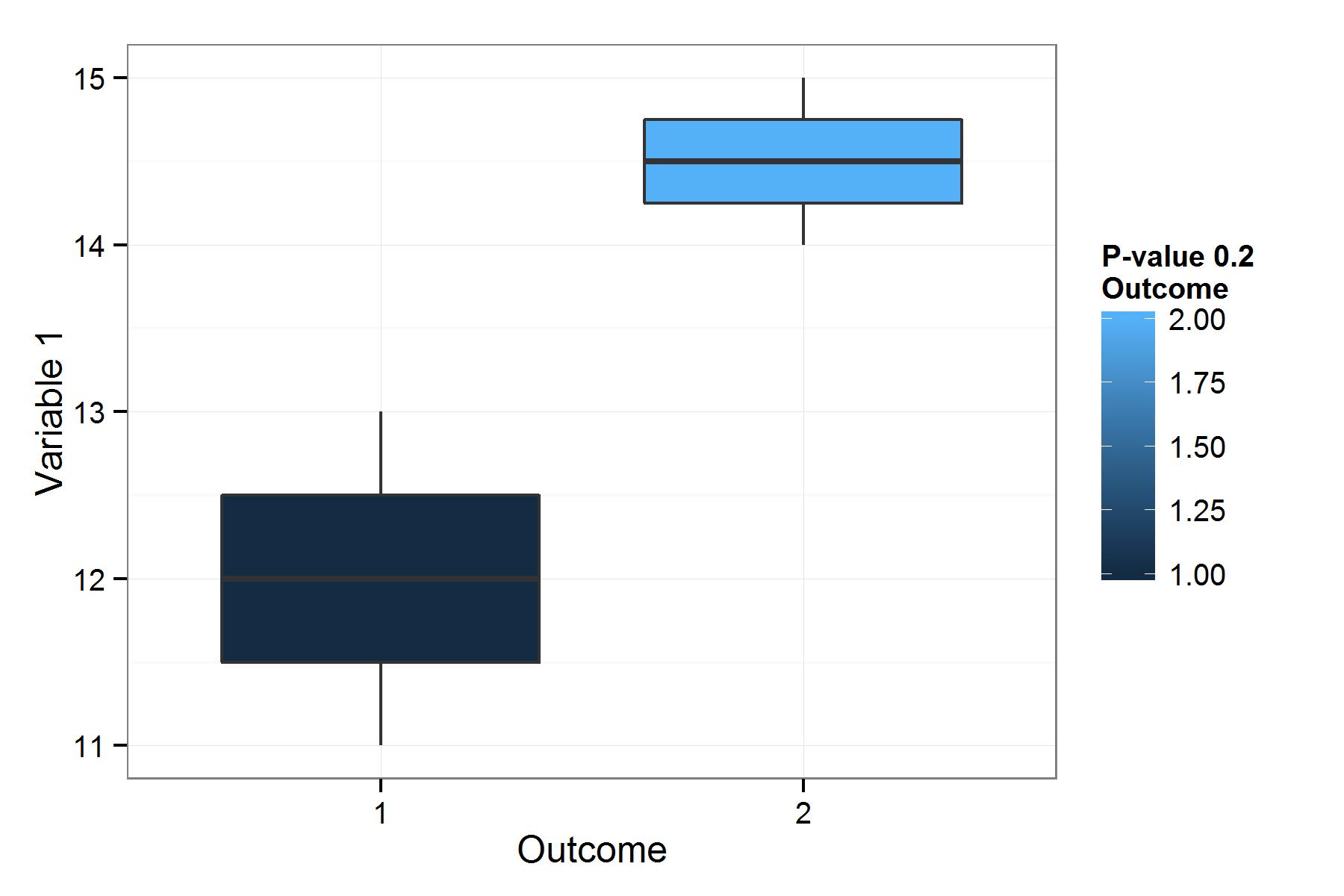
我认为这个数字显示了你想要的。我还在代码中添加了一些部分,因为您是ggplot2的新手。要么接受,要么离开,但我确实做了一些出版质量的数字:
wtOut = wilcox.test(df1$var1[df1$outcome<=1], df1$var1[df1$outcome>1])
exampleOut <- ggplot(df1,
     aes(x = as.factor(outcome), y = as.numeric(var1), fill=outcome)) +
     geom_boxplot() +
     scale_fill_gradient(name = paste0("P-value: ",
                                       signif(wtOut$p.value, 3), "\nOutcome")) +
     ylab("Variable 1") + xlab("Outcome") + theme_bw()

ggsave('exampleOut.jpg', exampleOut, width = 6, height = 4)
如果您想将p值作为它自己的图例,它看起来就像是some work, but doable。
或者,如果您愿意,只需将signif(wtOut$p.value, 3)扔到annotate(...)中即可。你只需要想出把它放在哪里的规则。
https://stackoverflow.com/questions/29617213
复制相似问题
腾讯云开发者

Copyright © 2013 - 2026 Tencent Cloud. All Rights Reserved. 腾讯云 版权所有
深圳市腾讯计算机系统有限公司 ICP备案/许可证号:粤B2-20090059 ![]() 粤公网安备44030502008569号
粤公网安备44030502008569号
腾讯云计算(北京)有限责任公司 京ICP证150476号 | 京ICP备11018762号