
如何创建在IE11中工作的柔性盒模式?
如何创建在IE11中工作的柔性盒模式?
提问于 2015-03-13 01:32:24
我使用flexbox实现了这个模式,因为我想要一个粘性的页眉和页脚。我的解决方案适用于Chrome和Firefox:http://codepen.io/cjcenizal/pen/JomaNo
玉石标记:
.blackout
  .flexModal
    .flexModal__inner
      .flexModal__header
        | Header
      .flexModal__body
        p Body content
      .flexModal__footer
        | Footer
SCSS:
.blackout {
  background-color: rgba(black, .5);
  position: fixed;
  width: 100%;
  height: 100%;
  top: 0;
  left: 0;
  display: flex;
  align-items: center;
  justify-content: center;
}

  .flexModal {
    max-height: calc(100% - 40px);
    min-width: 400px;
    background-color: white;
    display: flex;
    flex-direction: column;
  }

    .flexModal__inner {
      min-height: 100%;
      display: flex;
      flex-direction: column;
    }

    .flexModal__header {
      display: flex;
      flex-shrink: 0;
    }

    .flexModal__body {
      flex-shrink: 1;
      overflow: auto;
    }

    .flexModal__footer {
      display: flex;
      flex-shrink: 0;
    }
问题是,IE11在最初绘制页面时没有正确地呈现该模型,在扩展窗口时也没有正确地重新呈现它。
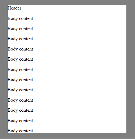
以下是它在第一次渲染时的显示方式。注意到页脚是如何不可见的?
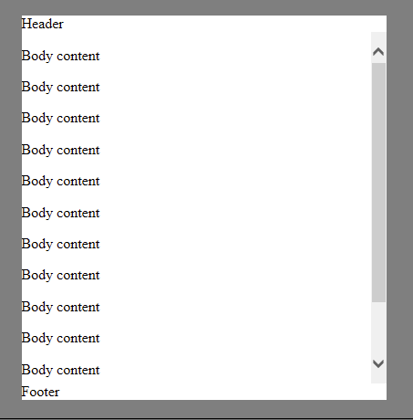
使窗口变小时,它将正确地重新呈现:
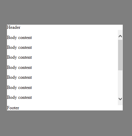
当您使窗口变大时,它重新呈现错误:
对于如何解决这个问题,或者根本原因是什么,有什么建议吗?
回答 1
Stack Overflow用户
回答已采纳
发布于 2015-03-17 18:25:23
我无法找到解决我的技术问题的方法,所以我决定用vh单元来控制模态体的大小,就像这个CSS模式一样。
通过在模态体上设置max-height: calc(100vh - {height of header + height of footer + arbitrary margin between modal and edge of browser window}),可以使车身相对于窗口的高度调整大小,这是所需的结果。
这里有一个代码库:http://codepen.io/cjcenizal/pen/zxMJzb
页面原文内容由Stack Overflow提供。腾讯云小微IT领域专用引擎提供翻译支持
原文链接:
https://stackoverflow.com/questions/29023384
复制相关文章
相似问题
腾讯云开发者

Copyright © 2013 - 2026 Tencent Cloud. All Rights Reserved. 腾讯云 版权所有
深圳市腾讯计算机系统有限公司 ICP备案/许可证号:粤B2-20090059  粤公网安备44030502008569号
腾讯云计算(北京)有限责任公司 京ICP证150476号 | 京ICP备11018762号