
在某个断点,同一页面上的2个砖石容器的内容开始重叠。
在砖石布局中,我在博客索引页面上显示wordpress的帖子。我还在页脚上激活了砖石,以在砖石布局中显示wordpress页脚小部件。
因此,基本上,我有2砌体容器在相同的页面。
- 一个用来显示博客文章,以及
- 其他用于显示页脚小部件。
页面的html标记如下所示:
<!-- Posts -->
<main id="main">
    <div class="testmason">
        <article class="hentry">Post 1</article>
        <article class="hentry">Post 2</article>
        <article class="hentry">Post 3</article>
        .....
        .....
        <article class="hentry">Post n</article>
     </div>
</main>

<!-- Footer Widgets -->
<div id="footer-widgets" class="footer-widgets">
    <aside class="widget">Widget 1</aside>
    <aside class="widget">Widget 2</aside>
    <aside class="widget">Widget 3</aside>
    .....
    .....
    <aside class="widget">Widget n</aside>
</div>
下面是我试图实现此布局的url。-- http://lanarratrice-al-rawiya.com/lanarratrice/blog/
我不想在移动设备上加载砖石。
- 我希望只有当文档的最小宽度为837 is时,Posts上的砖石才能工作。
- 另外,我希望只有当文档的最小宽度为880 is时,页脚上的砖石才能工作。
任何低于上述宽度的媒体查询都不会触发砖石布局,我将以全宽度显示我的所有帖子和小部件(占用全部可用空间)。要实现这个,我使用的是查询js,如果它与媒体查询匹配,就会触发砌体布局。以下是我的javascript:
JAVASCRIPT
// Masonry settings to organize footer widgets and blog posts
jQuery(document).ready(function($){
    var $container = $('#footer-widgets'),
        $maincontent = $('.blog .testmason');

    enquire.register("screen and (min-width:837px)", {

        // Triggered when a media query matches.
        match : function() {
            $maincontent.masonry({
                columnWidth: 200,
                itemSelector: '.hentry',
                isFitWidth: true,
                isAnimated: true
            });
        },

        // Triggered when the media query transitions
        // from a matched state to an unmatched state.
        unmatch : function() {
            $maincontent.masonry('destroy');
        }

    });

    enquire.register("screen and (min-width:880px)", {

    // Triggered when a media query matches.
    match : function() {
        $container.masonry({
            columnWidth: 400,
            itemSelector: '.widget',
            isFitWidth: true,
            isAnimated: true
        });
    },

    // Triggered when the media query transitions
    // from a matched state to an unmatched state.
    unmatch : function() {
      $container.masonry('destroy');
    }

    });
});
最后,这是我在这个页面上应用的css:
CSS
#main {
    max-width: 100%;
    width: 100%;
}

.testmason {
    margin: 0 auto 35px;
}

#main article {
    margin: 0 20px 35px;
    width: 360px;
    float: left;
}

@media screen and (max-width: 854px) {
    #main { width: 100%; }

    #main .testmason {
        margin: 0 10px;
        width: auto!important;
        height: auto!important;
    }

    #main article {
        float: none;
        width: 100%;
        margin: 0 0 35px;
    }

    #main .index-box {
        box-shadow: 0 1px 2px 0 rgba(0, 0, 0, 0.22);
        margin: 0 auto 2em;
        width: auto;
        max-width: 780px;
        max-width: 78rem;
    }

    #main .navigation {
        width: auto;
        max-width: 780px;
        max-width: 78rem;
    }
}

.index-box {
    margin: 0;
}

nav.paging-navigation {
    width: 90%;
    position: static!important;
    margin: 0 auto;
}看来我的javascript工作正常,因为砖石布局是实现的。,但是当我将火狐浏览器窗口调整到大约846 as (大约这个大小)时,我看到了一个坏的布局。我有时看到柱子在脚上。请参阅附图。
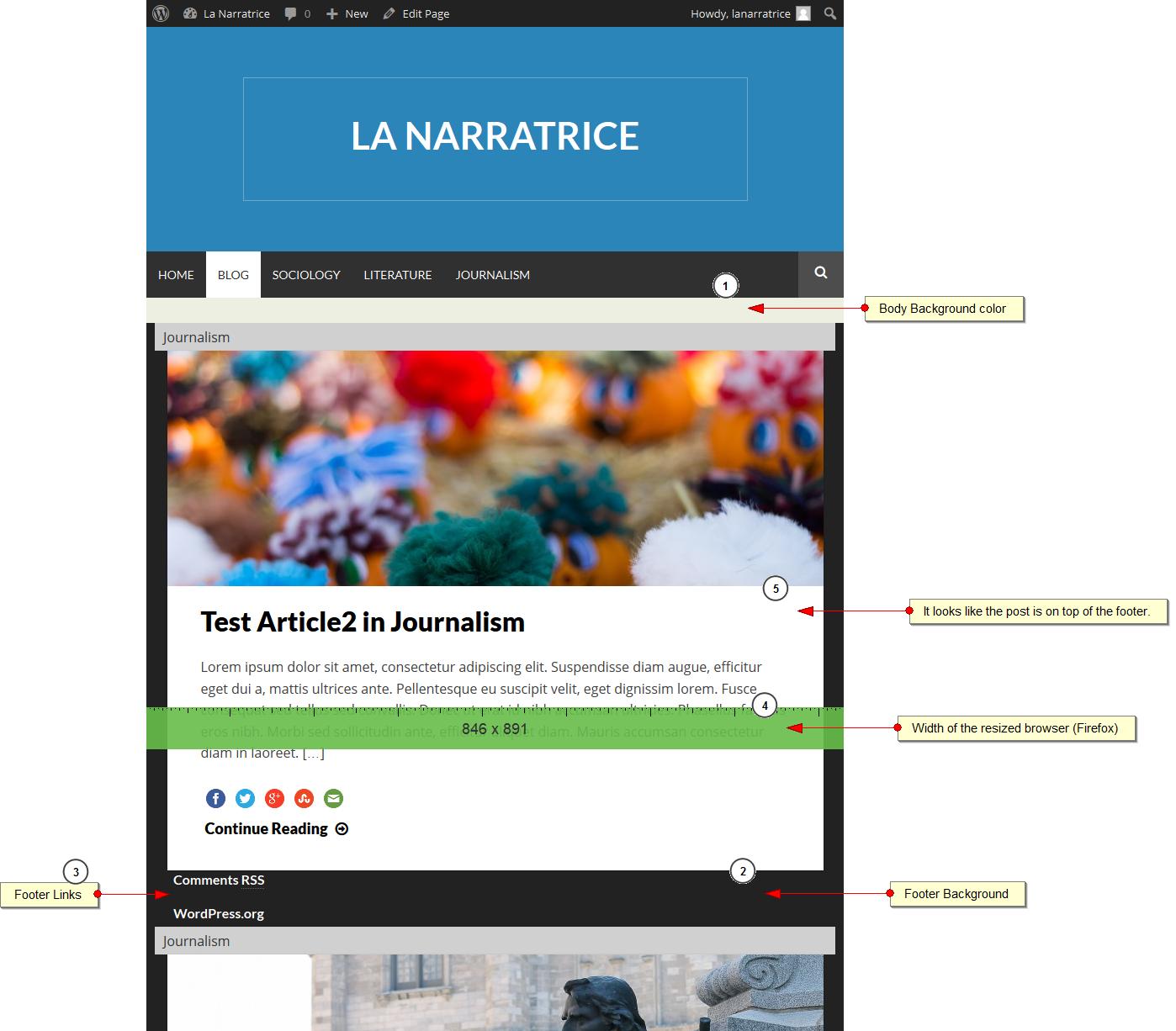
要重现这个bug,您可能需要收缩和扩展浏览器窗口(firefox)大约5-8次。有时,如果你缩小它非常快或非常慢,你可能看不到破碎的布局。顺便说一下,我使用的是Firefox35.0.1。请让我知道我能做些什么来解决这个问题。谢谢。
回答 1
Stack Overflow用户
发布于 2015-02-27 06:01:42
在页面加载时添加$container.masonry()函数。
问题是,它在调整大小时注册事件,但在加载时它无法计算身体高度来计算位置。由于这些柱子块是绝对定位的,它在脚上流血。
https://stackoverflow.com/questions/28757981
复制相似问题
腾讯云开发者

Copyright © 2013 - 2026 Tencent Cloud. All Rights Reserved. 腾讯云 版权所有
深圳市腾讯计算机系统有限公司 ICP备案/许可证号:粤B2-20090059  粤公网安备44030502008569号
腾讯云计算(北京)有限责任公司 京ICP证150476号 | 京ICP备11018762号