
将线条添加到使用plotrix库创建的图中
将线条添加到使用plotrix库创建的图中
提问于 2015-02-20 20:58:56
我已经使用multhist函数在plotrix库中创建了一个叠加的直方图,但是我无法在这个直方图中添加一条直线。我通常使用的代码在此设置中似乎不起作用。
下面是一个例子。我试图将总体分布的平均和标准误差添加为直方图上的简单垂直线,但这些都不能正常工作。我做错了什么?
library(plotrix)

test1<-rnorm(30,0)
test2<-rnorm(30,0)
test3<-rnorm(30,0)

forstats<-c(test1,test2,test3)
mn<-mean(forstats)
se<-std.error(forstats)

together<-list(test1,test2,test3)
multhist(together, col=c(7,4,2), space=c(0,0), beside=FALSE,right=FALSE)

abline(v=mn)
abline(v=mn+se)
abline(v=mn-se)回答 1
Stack Overflow用户
回答已采纳
发布于 2015-02-20 23:35:26
multhist使用barplot,所以当@BenBolker提到here时,x轴对应于bin索引。在本机坐标和bin索引单元之间进行转换有点棘手,因此我为叠加直方图(至少对于频率)设置了另一个函数:
histstack <- function(x, breaks, col=rainbow(length(x)), ...) {
  col <- rev(col)
  if (length(breaks)==1) {
    rng <- range(pretty(range(x)))
    breaks <- seq(rng[1], rng[2], length.out=breaks)
  }
  h <- lapply(x, hist, plot=FALSE, breaks=breaks)
  cumcounts <- apply(sapply(h, '[[', 'counts'), 1, cumsum)

  for(i in seq_along(h)) {
    h[[i]]$counts <- cumcounts[nrow(cumcounts) - i + 1, ]
  }
  max_cnt <- max(sapply(h, '[[', 'counts'))
  plot(h[[1]], xlim=range(sapply(h, '[', 'breaks')), yaxt='n',
       ylim=c(0, max(pretty(max_cnt))), col=col[1], ...)
  sapply(seq_along(h)[-1], function(i) plot(h[[i]], col=col[i], add=TRUE, ...))
  axis(2, at=pretty(c(0, max_cnt)), labels=pretty(c(0, max_cnt)), ...)
}
下面是:
histstack(together, seq(-3, 3, 0.5), col=c(7, 4, 2), main='',
          las=1, xlab='', ylab='')

abline(v=c(mn, mn+se, mn-se), lwd=2, )
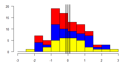
国际海事组织的x轴标记可能比multhist更合适,因为multhist意味着计数与中档值有关,而上面的x轴滴答可以清楚地勾勒出垃圾箱。
页面原文内容由Stack Overflow提供。腾讯云小微IT领域专用引擎提供翻译支持
原文链接:
https://stackoverflow.com/questions/28638086
复制相关文章
相似问题
腾讯云开发者

Copyright © 2013 - 2026 Tencent Cloud. All Rights Reserved. 腾讯云 版权所有
深圳市腾讯计算机系统有限公司 ICP备案/许可证号:粤B2-20090059 ![]() 粤公网安备44030502008569号
粤公网安备44030502008569号
腾讯云计算(北京)有限责任公司 京ICP证150476号 | 京ICP备11018762号