
R中的热图(使用heatmap()函数)
R中的热图(使用heatmap()函数)
提问于 2015-02-11 14:40:53
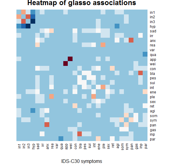
我有一个相关矩阵,我想得到一个从冷(负相关)到红色(正相关)的热图,白色是0相关。
现在,heatmap命令看起来似乎是平均的,即使我说'scale=none',这意味着平均相关性被描绘成白色(在我的例子中,这意味着所有的0关联都是蓝色的)。
你能帮我修一下吗?谢谢
library(stats)
library(gplots)
library(RColorBrewer)
heatmap(graph.g,Colv = NA, Rowv=NA, revC=T, scale='none',
    xlab= "IDS-C30 symptoms", main = "Heatmap of glasso associations",
    col = rev(brewer.pal(11,"RdBu")))
回答 2
Stack Overflow用户
回答已采纳
发布于 2015-02-12 07:59:27
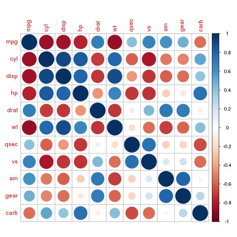
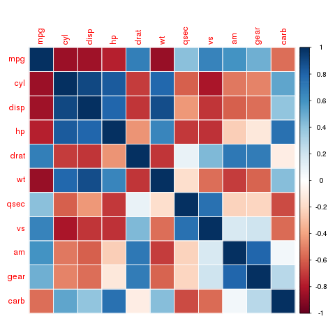
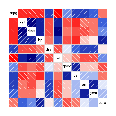
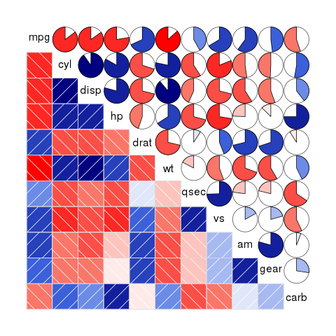
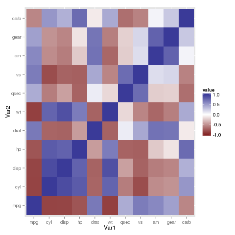
对于相关矩阵,还可以使用专门为此目的设计的编成或相关图库。他们工作的盒子外,也有额外的绘图功能。在中,您可以找到示例,说明如何使用ggplot2使用geom_tile()或geom_raster()函数绘制这种绘图。
library(corrplot)
library(corrgram)
library(ggplot2)
library(reshape2)

corrplot(cor(mtcars))
corrplot(cor(mtcars), method="color")
corrgram(cor(mtcars))
corrgram(cor(mtcars), lower.panel=panel.shade,
         upper.panel=panel.pie)

p <- ggplot(melt(cor(mtcars)), aes(x=Var1, y=Var2, fill=value))
p + geom_tile() + scale_fill_gradient2(midpoint=0, limits=c(-1, 1))
Stack Overflow用户
发布于 2015-02-11 16:56:47
这不是一个优雅的解决方案,但它似乎完成了工作。其要点是将频谱限制在相关矩阵所取的值上,并使调色板从brewer.pal提供的11-值最大值(使用奇数重复以使中值保持整数)的调色板更加平滑。
vec <- rep(rev(brewer.pal(11,"RdBu")), each = 101)  # stretched palette
med <- (length(vec) + 1) / 2  # middle of palette
rad <- length(vec) - med  # radius of palette
min.g <- med + min(graph.g) * rad  # lowest value taken
max.g <- med + max(graph.g) * rad  # highest value taken
heatmap(graph.g,Colv = NA, Rowv=NA, revC=T, scale='none',
    xlab= "IDS-C30 symptoms", main = "Heatmap of glasso associations",
col = vec[min.g:max.g]) # palette restricted to realized values页面原文内容由Stack Overflow提供。腾讯云小微IT领域专用引擎提供翻译支持
原文链接:
https://stackoverflow.com/questions/28461239
复制相关文章
相似问题
腾讯云开发者

Copyright © 2013 - 2026 Tencent Cloud. All Rights Reserved. 腾讯云 版权所有
深圳市腾讯计算机系统有限公司 ICP备案/许可证号:粤B2-20090059 ![]() 粤公网安备44030502008569号
粤公网安备44030502008569号
腾讯云计算(北京)有限责任公司 京ICP证150476号 | 京ICP备11018762号