
无线电台m3u中声音直方图的产生
无线电台m3u中声音直方图的产生
提问于 2015-01-22 15:08:37
我想对以*.m3u8格式广播的无线电台进行采样,并生成前n秒钟的直方图(用户在其中修正n)。
我一直在尝试使用无线电机,但它不起作用,而gnuradio似乎毫无用处。我如何生成和显示这个直方图?
编辑:,我现在使用GStreamerv1.0,这样我就可以直接播放它了,但是现在我需要直播我的广播。我怎样才能用Gst做这件事?
回答 1
Stack Overflow用户
发布于 2015-11-23 10:59:43
gnuradio似乎毫无用处
好吧,如果你要找的是实时谱图的话,我认为这就是你要找的:
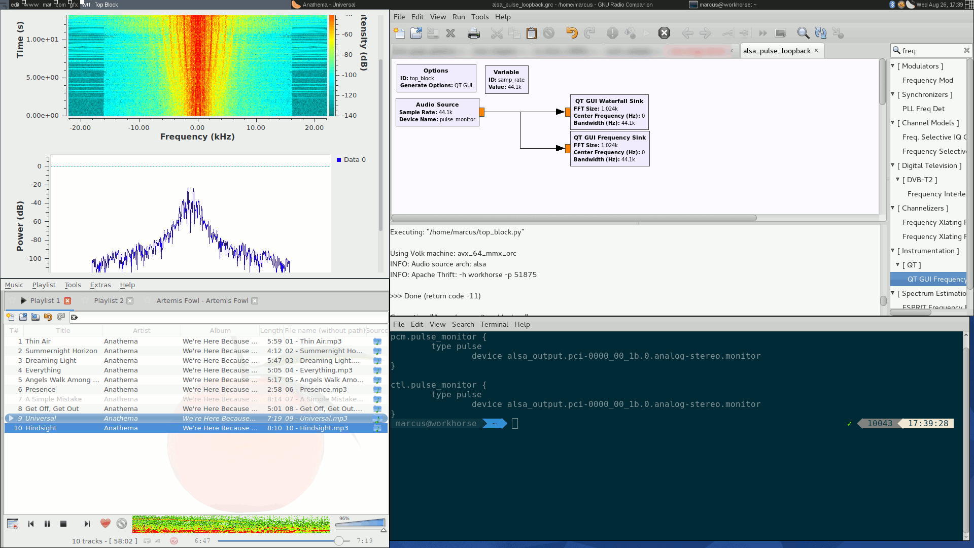
正如您所看到的,这只是将配置正确的音频源连接到Qt接收器的问题。如果配置正确(我编写了一个回答和一个GNU无线wiki页面)。
重点是:你不应该一个人去玩一个网站。让一个软件去做那些知道它在做什么的事情。
就你而言,我建议:
- 使用VLC或mplayer来写收音机,解码后将它解码成PCM 32位浮点数的固定采样率到一个文件。
- 使用Python与库Numpy一起打开该文件(
samples = numpy.fromfile(filename, dtype=numpy.float32)),并使用matplotlib/pyplot将分光图绘制到文件中,即类似于(未经测试,因为编写在这里):
#!/usr/bin/python2
import sys
import os
import tempfile
import numpy
from matplotlib import pyplot

stream = sys.argv[1] ## you can pass the stream URL as argument
outfile = sys.argv[2] ## second argument: output file; ending determines type!
num_of_seconds = min(int(sys.argv[3]), 60) # not more than 1min of streaming
(intermediate_file, inter_fname) = tempfile.mkstemp()
# pan = number of output channels (1: mix to mono)
# resample = sampling rate. this must be the same for all files, so that we can actually compare spectrograms
# format = sample format, here: native floats
sys.system("mplayer -endpos %d -vo null -af pan=1 -af resample=441000 -af format=floatne -ao pcm:nowaveheader:file=%s" % num_of_seconds % inter_fname)
samples = numpy.fromfile(inter_fname, dtype=float32)

pyplot.figure((num_of_seconds * 44100, 256), dpi=1)
### Attention: this call to specgram expects of you to understand what the Discrete Fourier Transform does.
### This uses a Hanning window by default; whether that is appropriate for audio data is questionable. Use all your DSP skillz!
### pyplot.specgram has a lot of options, including colormaps, frequency scaling, overlap. Make yourself acquintanced with those!
pyplot.specgram(samples, NFFT=256, FS=44100)
pyplot.savefig(outfile, bbox_inches="tight")页面原文内容由Stack Overflow提供。腾讯云小微IT领域专用引擎提供翻译支持
原文链接:
https://stackoverflow.com/questions/28092087
复制相关文章
相似问题
腾讯云开发者

Copyright © 2013 - 2026 Tencent Cloud. All Rights Reserved. 腾讯云 版权所有
深圳市腾讯计算机系统有限公司 ICP备案/许可证号:粤B2-20090059 ![]() 粤公网安备44030502008569号
粤公网安备44030502008569号
腾讯云计算(北京)有限责任公司 京ICP证150476号 | 京ICP备11018762号