
R:如何用rCharts绘制统计函数
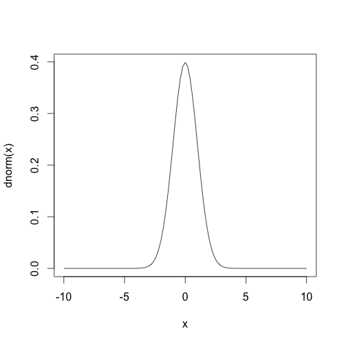
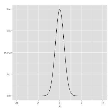
我想用rCharts包绘制统计分布(如正态分布)。我能够像这样使用curve或ggplot2绘制它。
曲线
curve(dnorm, xlim=c(-10,10))
ggplot2
ggplot(data.frame(x=c(-10,10)), aes(x)) + stat_function(fun=dnorm, args=list(0, 1))
我想用rCharts绘制统计函数,但我做不到。我如何绘制它呢?
回答 1
Stack Overflow用户
发布于 2015-01-05 20:59:19
您不能在rChart中显式地做到这一点,但是对于任何统计分布,通常对于您想要的任何函数来说,单独这样做都是非常容易的。您可以对每个统计分布使用完全相同的技术,如d/r/p/q-distribution,如?rnorm,?rbinom等,但对于,您想要的任何函数,都可以将其推广。我还包括一个泛型函数的示例。
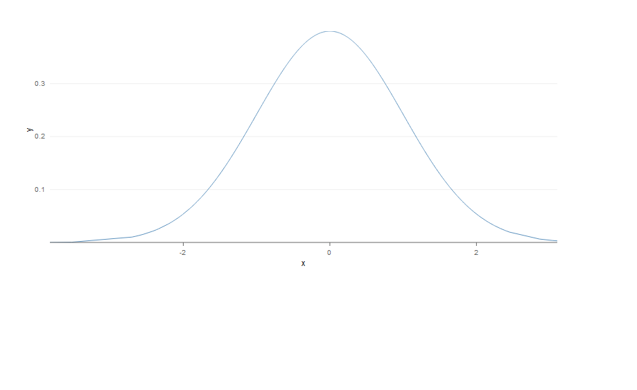
用dnorm rnorm**:**和表示正态分布的
x <- rnorm(1000) #you need rnorm here to create 1000 standard normally distributed observations.
y <- eval(dnorm(x)) #evaluate the function using dnorm now to get probabilities.
#the use of eval() will be clear in the next example. Here you can even omit it if it confuses you.
df <- data.frame(x,y) #make df

#plot
rPlot(y ~ x, data=df, type='line' )
类似地,对于二项分布,您将使用dbinom和rbinom进行完全相同的操作。其他发行也是一样的。
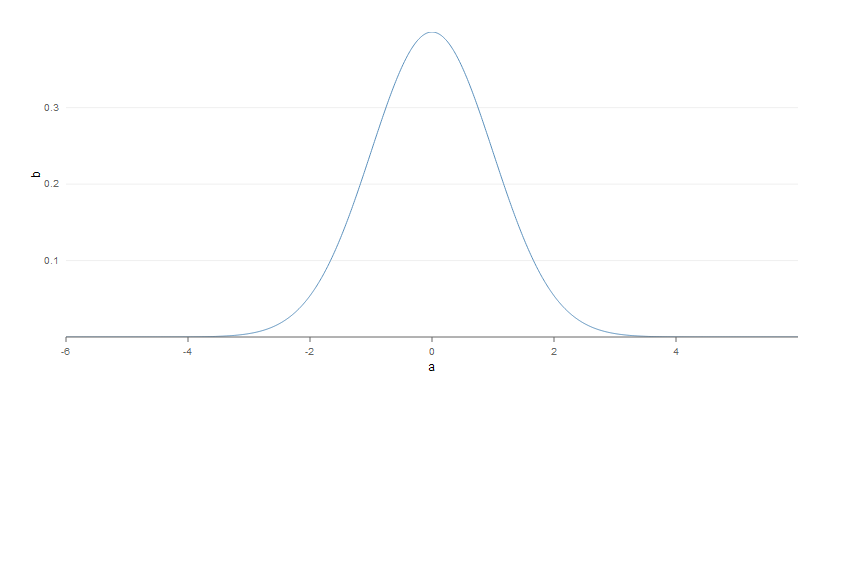
您还可以按照@Gregor的注释使用类似于x = seq(-6, 6, length = 1000)的内容,而不是使用rnorm函数来创建自定义x变量,然后使用dnorm生成相应的概率。这种方法的优点是您可以直接设置x轴的限制。例如:
a <- seq(-6,6,length=1000) #use -10,10 to reproduce your example
b <- dnorm(a)
df <- data.frame(a,b)
rPlot(b~a,data=df,type='line')
作为如何绘制任意函数的演示和推广
让我们以函数log(1+x)为例。在这里,您将看到绘制任何函数是多么容易:
x <- runif(1000,1,10) #1000 points are enough
y <- eval(log(1+x)) #easily evaluate the function for your x vector
#the previous was a very special case where you had 2 functions rnorm and dnorm
#instead of an x vector and an f(x) function like here
#this is very easy to generalize
df <- data.frame(x,y) #make df

#plot
rPlot(y ~ x, data=df, type='line' )
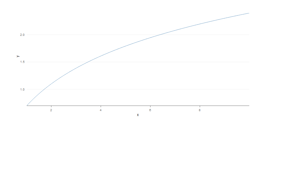
你可以用同样的方式使用任何你想要的函数!
https://stackoverflow.com/questions/27778544
复制相似问题
腾讯云开发者

Copyright © 2013 - 2026 Tencent Cloud. All Rights Reserved. 腾讯云 版权所有
深圳市腾讯计算机系统有限公司 ICP备案/许可证号:粤B2-20090059 ![]() 粤公网安备44030502008569号
粤公网安备44030502008569号
腾讯云计算(北京)有限责任公司 京ICP证150476号 | 京ICP备11018762号