
如何用ggplot2中列的值和来做直方图?
如何用ggplot2中列的值和来做直方图?
提问于 2014-12-18 11:02:46
我有数据,我想画成柱状图。这是我的数据
convergence,rules,fact,time
1,domain,1802,8629
1,domain,1802,8913
1,rdfs,595,249
1,domain,1,9259
1,videcom,1,9071
2,domain,314151,9413
2,rdfs,8,253
....我想要的是绘制每个convergence值,每个rules的time之和。
以下是我迄今为止所做的
图书馆(Ggplot2)
w <- read.csv(file="s2.csv", head=TRUE, sep=",")
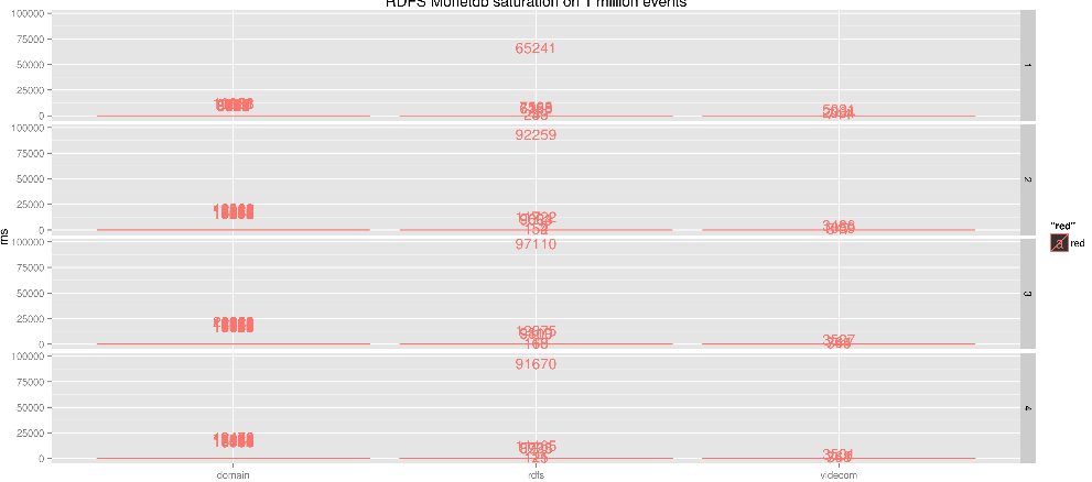
p <- ggplot(data=w, aes(group=convergence, x=factor(rules))) + geom_bar(aes(colour="red")) + + geom_text(aes(y=time + 1000, colour="red", label=time)) + facet_grid( convergence ~ . )
ggsave(file="s2.1m.png", width=15)但是结果并不像我想要的那样,每个rules的总和都是rules。
简单地说
我希望每个rules值都有一个直方图,表示对应的time值的和。
我在这里错过了什么?
回答 2
Stack Overflow用户
回答已采纳
发布于 2014-12-18 13:47:05
您需要使用weights美学。这将使每个回收站的计数按回收站的值加权。
ggplot(w, aes(x=rules, weights=time)) +
  geom_bar() + facet_grid(convergence ~ .) +
  geom_text(stat="bin", aes(label=..count..), color="red", vjust=-0.1)
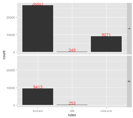
为了使文本工作,我们需要使用stat="bin",这与geom_bar()隐式地执行相同的操作。然后,我们可以使用特殊值..count..,它引用数据帧中的一个列,ggplot在计算统计数据后在内部生成。
Stack Overflow用户
发布于 2014-12-18 12:08:13
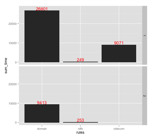
在这个问题上,尽我最大的理解,这里有一个尝试。
# sample data
DF = read.table(text="  convergence   rules   fact time
1           1  domain   1802 8629
2           1  domain   1802 8913
3           1    rdfs    595  249
4           1  domain      1 9259
5           1 videcom      1 9071
6           2  domain 314151 9413
7           2    rdfs      8  253", header=T)

# the operation
# you need to tranform the data before plot (below is what I guess on what you what)
library(dplyr); library(ggplot2)
DF_new = DF %>% group_by(convergence, rules) %>% summarise(sum_time = sum(time))
#   convergence   rules sum_time
# 1           1  domain    26801
# 2           1    rdfs      249
# 3           1 videcom     9071
# 4           2  domain     9413
# 5           2    rdfs      253

ggplot(data=DF_new, aes(x=rules, y=sum_time)) +
  geom_bar(stat="identity") +
  geom_text(aes(y=sum_time + 1000, label=sum_time), colour="red") +
  facet_grid(convergence ~.)
页面原文内容由Stack Overflow提供。腾讯云小微IT领域专用引擎提供翻译支持
原文链接:
https://stackoverflow.com/questions/27545024
复制相关文章
相似问题
腾讯云开发者

Copyright © 2013 - 2026 Tencent Cloud. All Rights Reserved. 腾讯云 版权所有
深圳市腾讯计算机系统有限公司 ICP备案/许可证号:粤B2-20090059 ![]() 粤公网安备44030502008569号
粤公网安备44030502008569号
腾讯云计算(北京)有限责任公司 京ICP证150476号 | 京ICP备11018762号