
分类线图上的自定义ggplot2阴影错误区域
分类线图上的自定义ggplot2阴影错误区域
提问于 2014-10-16 04:18:21
我试图绘制一条由黄土平滑的线,但我试图找出如何包含由现有变量定义的阴影错误区域,但也是平滑的。
此代码创建示例数据:
set.seed(12345)
data <- cbind(rep("A", 100), rnorm(100, 0, 1))
data <- rbind(data, cbind(rep("B", 100), rnorm(100, 5, 1)))
data <- rbind(data, cbind(rep("C", 100), rnorm(100, 10, 1)))
data <- rbind(data, cbind(rep("D", 100), rnorm(100, 15, 1)))
data <- cbind(rep(1:100, 4), data)
data <- data.frame(data)
names(data) <- c("num", "category", "value")
data$num <- as.numeric(data$num)
data$value <- as.numeric(data$value)
data$upper <- data$value+0.20
data$lower <- data$value-0.30
绘制下面的数据,这就是我得到的:
ggplot(data, aes(x=num, y=value, colour=category)) +
  stat_smooth(method="loess", se=F)
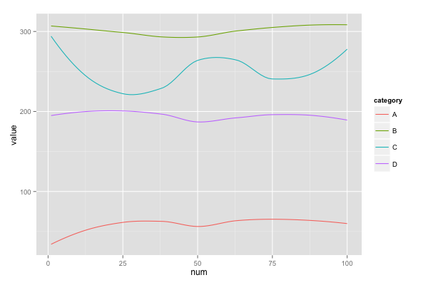
我想要的是一幅如下所示的图,除了阴影区域的上、下界被生成的数据中的“上”和“下”变量的平滑线所包围外。
任何帮助都将不胜感激。
回答 1
Stack Overflow用户
回答已采纳
发布于 2014-10-16 06:18:00
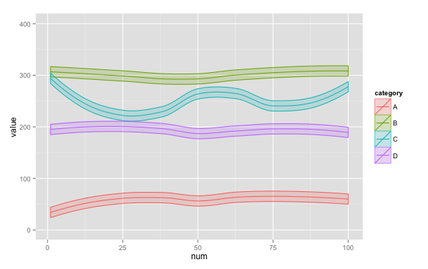
这里有一种方法可以添加平滑版本的upper和lower。我们将在数据框架中添加对upper和lower的黄土预测,然后用geom_ribbon绘制这些预测。如果所有这些都可以在对ggplot的调用中完成,那就更优雅了。这很可能是通过向stat_summary提供一个特殊用途的函数来实现的,并且希望其他人能够使用这种方法发布一个答案。
# Expand the scale of the upper and lower values so that the difference
# is visible in the plot
data$upper = data$value + 10
data$lower = data$value - 10

# Order data by category and num
data = data[order(data$category, data$num),]

# Create LOESS predictions for the values of upper and lower
# and add them to the data frame. I'm sure there's a better way to do this,
# but my attempts with dplyr and tapply both failed, so I've resorted to the clunky
# method below.
data$upperLoess = unlist(lapply(LETTERS[1:4],
                  function(x) predict(loess(data$upper[data$category==x] ~
                                                  data$num[data$category==x]))))
data$lowerLoess = unlist(lapply(LETTERS[1:4],
                  function(x) predict(loess(data$lower[data$category==x] ~
                                                  data$num[data$category==x]))))

# Use geom_ribbon to add a prediction band bounded by the LOESS predictions for
# upper and lower
ggplot(data, aes(num, value, colour=category, fill=category)) +
  geom_smooth(method="loess", se=FALSE) +
  geom_ribbon(aes(x=num, y=value, ymax=upperLoess, ymin=lowerLoess),
              alpha=0.2)
结果是:
页面原文内容由Stack Overflow提供。腾讯云小微IT领域专用引擎提供翻译支持
原文链接:
https://stackoverflow.com/questions/26396149
复制相关文章
相似问题
腾讯云开发者

Copyright © 2013 - 2026 Tencent Cloud. All Rights Reserved. 腾讯云 版权所有
深圳市腾讯计算机系统有限公司 ICP备案/许可证号:粤B2-20090059 ![]() 粤公网安备44030502008569号
粤公网安备44030502008569号
腾讯云计算(北京)有限责任公司 京ICP证150476号 | 京ICP备11018762号