
Webfont字体位置呈现问题
Webfont字体位置呈现问题
提问于 2014-09-19 14:29:38
我在我的页面上使用一个定制的网页字体,并且在不同的平台上有一些渲染问题。在linux和windows中,块中的文本对齐方式有些不同。下面是一个例子:
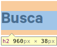
Linux中的Chrome:
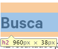
Windows中的Chrome:
它们都使用相同版本的字体(otf),样式完全相同(相同的行高和边距)。
下面是字体的来源:
@font-face {
  font-family: 'Calibre Regular';
  src: url('fonts/Calibre-Regular.eot') format('embedded-opentype'),
       url('Calibre-Regular.otf')  format('opentype'),
       url('fonts/Calibre-Regular.woff') format('woff'),
       url('fonts/Calibre-Regular.ttf')  format('truetype'),
       url('fonts/Calibre-Regular.svg#Calibre-Regular') format('svg');
  font-weight: normal;
  font-style: normal;
}
有什么办法解决这个问题吗?
回答 2
Stack Overflow用户
回答已采纳
发布于 2014-09-19 14:44:56
这可能是由webkit造成的,当呈现自定义字体时,尝试使用-webkit-font-smoothing。其默认值是subpixel-antialiased。试着设置:
h1,h2,h3,h4,h5,h6 {
    -webkit-font-smoothing: antialiased;
}
替代解决方案
如果上面的方法不起作用,那么这可能会起作用,我以前也有过一个类似的问题,并且随机地找到了这个修复程序。不知道在哪里,但它基本上迫使Chrome使用SVG版本的字体。
@media screen and (-webkit-min-device-pixel-ratio:0) {
    @font-face {
        font-family: 'nameOfFontFamily';
        src: font-url('url/to/svgfont.svg') format('svg');
    }
}Stack Overflow用户
发布于 2014-09-19 14:36:02
浏览器呈现的元素不同--即使是同一个浏览器,也可能是问题所在。在CSS中定义边距、填充和直线高度--您可以使用“reset.css”。
试试这个:
p,h1,h2,h3,h4,h5,h6  {
    margin: 0;
    padding: 0;
    line-height: 1.4;
} 页面原文内容由Stack Overflow提供。腾讯云小微IT领域专用引擎提供翻译支持
原文链接:
https://stackoverflow.com/questions/25936303
复制相关文章
相似问题
腾讯云开发者

Copyright © 2013 - 2026 Tencent Cloud. All Rights Reserved. 腾讯云 版权所有
深圳市腾讯计算机系统有限公司 ICP备案/许可证号:粤B2-20090059  粤公网安备44030502008569号
腾讯云计算(北京)有限责任公司 京ICP证150476号 | 京ICP备11018762号