
KendoUI集Northwind演示类
我正在使用最新的KendoUI,并试图设置一个量规,如kendoUI的官方网站广告图像显示。
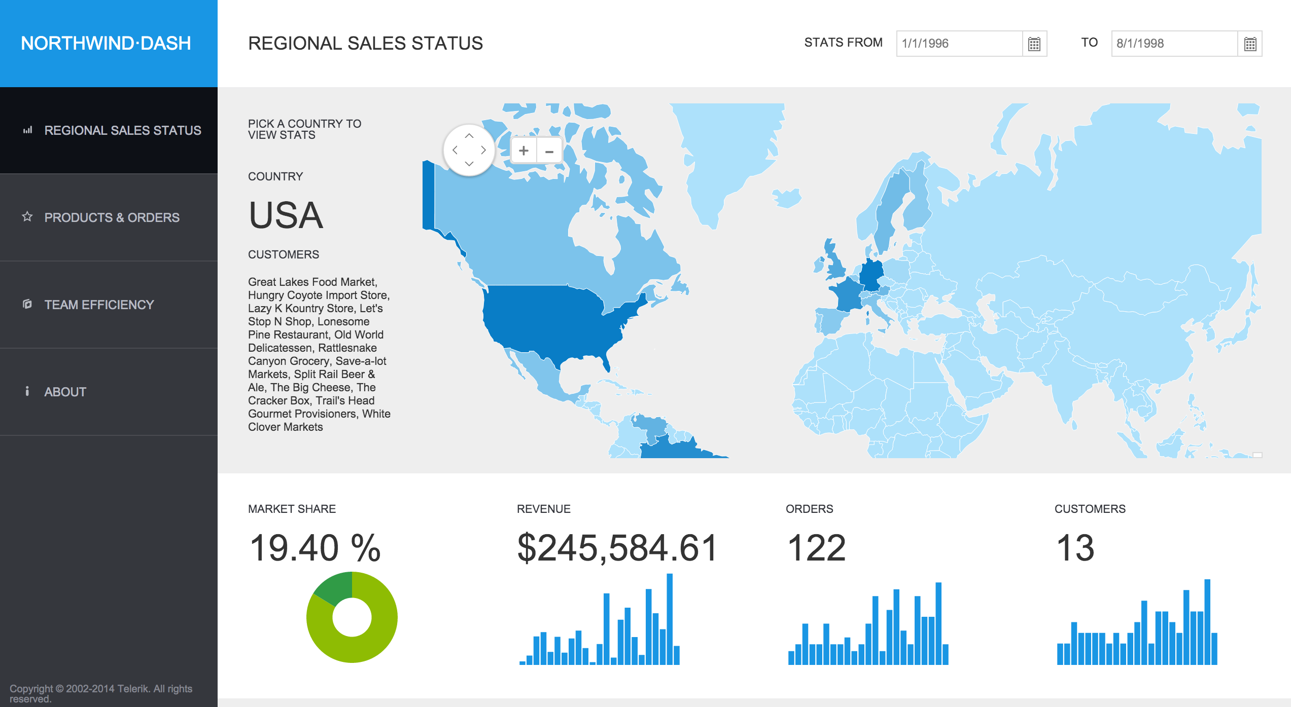
您可以在以下位置找到广告图像:http://www.telerik.com/kendo-ui请查看该图像,它显示一个名为“northwind-破折号”的应用程序,上面有一个绿色量规,其中有一个白色文本"63%“。
我尝试下面的代码:
<!DOCTYPE html>
<html>
<head>
    <title></title>
    <link href="styles/kendo.common.min.css" rel="stylesheet" />
    <link href="styles/kendo.default.min.css" rel="stylesheet" />
    <link href="styles/kendo.dataviz.min.css" rel="stylesheet" />
    <link href="styles/kendo.dataviz.default.min.css" rel="stylesheet" />
    <script src="js/jquery.min.js"></script>
    <script src="js/angular.min.js"></script>
    <script src="js/kendo.all.min.js"></script>
</head>
<body>
            <div id="example" class="k-content">
            <div id="gauge-container">
                <div id="gauge"></div>

                <input id="gauge-value" value="65">
            </div>

            <script>
                function createGauge() {
                    $("#gauge").kendoRadialGauge({

                        pointer: {
                            value: $("#gauge-value").val()
                        },

                        scale: {
                            minorUnit: 5,
                            startAngle: -30,
                            endAngle: 210,
                            max: 180
                        }
                    });
                }

                $(document).ready(function() {
                    createGauge();

                    function updateValue() {
                        $("#gauge").data("kendoRadialGauge").value($("#gauge-value").val());
                    }

                    if (kendo.ui.Slider) {
                        $("#gauge-value").kendoSlider({
                            min: 0,
                            max: 180,
                            showButtons: false,
                            change: updateValue
                        });
                    } else {
                        $("#gauge-value").change(updateValue);
                    }


                    $(document).bind("kendo:skinChange", function(e) {
                        createGauge();
                    });
                });
            </script>

            <style scoped>
                #gauge-container {
                    background: transparent url("../content/dataviz/gauge/gauge-container-partial.png") no-repeat 50% 50%;
                    width: 386px;
                    height: 386px;
                    text-align: center;
                    margin: 0 auto 30px auto;
                }

                #gauge {
                    width: 350px;
                    height: 300px;
                    margin: 0 auto;
                }

                #gauge-container .k-slider {
                    margin-top: -11px;
                    width: 140px;
                }

            </style>
        </div>


</body>
</html>
但是,我只能得到正常的径向量规。我在KendoUI的文档中到处查找,但是找不到任何关于northwind-破折号的演示或示例。
谁知道如何改变量规的风格,使它就像图像显示。
你的,伊凡
回答 1
Stack Overflow用户
发布于 2014-08-29 21:36:54
您可以在KendoUI + Northwind应用程序的GitHub中找到源代码,还可以看到在Telerik ASPNET-MVC演示站点中运行的版本。
但是不,它看起来不像他们所拥有的捕获,不确定这是这个项目的旧版本还是内部版本。
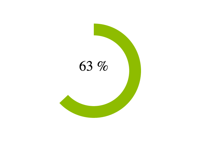
然而,没有选择放置这个百分比,你必须手动播放HTML和CSS。
您可以做的是使用这样的DataSource来定义图表:
$("#value").kendoChart({
    // Define Data Source, the first element is the value to represent,
    //                     the second is 100 - first element.
    dataSource: {
        data: [
            { "value": 63 },
            // The remaining part of the Chart is transparent so we actually
            // only see the first value
            { "value": 37, color: "transparent" }
        ]
    },
    // Define a DataBound event handler used when we change the data and will
    // print the value inside the Chart.
    dataBound: function () {
        // Get current value and compute percentage.
        var percentage = (this.dataSource.at(0).value / 100);
        // Convert percentage to text and place it in inside the chart
        $("#value-label").text(kendo.toString(percentage, "p0"));
    },
    // No legend
    legend: {
        visible: false
    },
    seriesDefaults: {
        // Type of series: Donut
        type: "donut",
        // Size of the hole of the Donut
        holeSize: 60,
        // Thickness of the Donut
        size: 20
    },
    series: [
        // The value of the series is in "value" field while the color is
        // a field called color.
        { field: "value", colorField: "color" }
    ],
    // No tooltip
    tooltip: { visible: false }
});
现在,用于将标签放在图表顶部的HTML和CSS定义:
<div class="value-container">
    <div id="value"></div>
    <div id="value-label" class="overlay"></div>
</div>包含两个DIV的容器,第一个用于图表,第二个用于标签。为了在图表的顶部显示标签,我们将CSS类overlay定义为:
    .overlay {
        font-size: 24px;
        width: 100%;
        height: 100%;
        position: absolute;
        top: 220px;
        left: 0;
        text-align: center;
}在这里,我们从顶部和中间水平指定标签的大小及其位置(在这里,我硬编码了垂直位置(220px),但是您可以找到在DIV中对文本进行居中的方法。
您可以在这里看到它的作用:http://jsfiddle.net/OnaBai/egfrohtx/
看上去像是:
https://stackoverflow.com/questions/25561471
复制相似问题
腾讯云开发者

Copyright © 2013 - 2026 Tencent Cloud. All Rights Reserved. 腾讯云 版权所有
深圳市腾讯计算机系统有限公司 ICP备案/许可证号:粤B2-20090059 ![]() 粤公网安备44030502008569号
粤公网安备44030502008569号
腾讯云计算(北京)有限责任公司 京ICP证150476号 | 京ICP备11018762号