
合并两个不同的图形:一个在X轴上,另一个在Y轴上。
合并两个不同的图形:一个在X轴上,另一个在Y轴上。
提问于 2014-08-09 12:44:07
我有独立的表示,这两个图使用R:
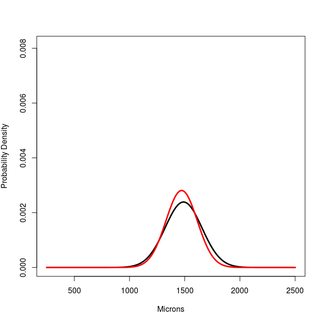
#PLOT 1
    x<-250:2500
    #Hsap. Northern European
        a<-dnorm(x,1489,167)
    #Hsap. South African
        b<-dnorm(x,1472,142)

    plot(x,a, type="l", lwd=3, ylim=c(0,1.2*max(a,b,c)), ylab="Probability Density", xlab="Microns")
    lines(x,b, type="l", lwd=3, col="Red")
地块2
#CUSPAL ENAMEL FORMATION TIME
x<-0:800
#Hsap. Northern European
a<-dnorm(x,447,37)
#Hsap. South African
b<-dnorm(x,444,33)
plot(x,a, type="l", lwd=3, ylim=c(0,1.2*max(a,b,c)), ylab="Probability Density", xlab="Days")
lines(x,b, type="l", lwd=3, col="Red")
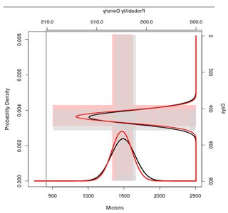
![enter image description here][2]我想合并两者使用R,并获得一个类似于以下所示的图像。有趣的是,我还想突出+- 1SD的间隔,看看两个地块中的重叠区域。
在R中哪个代码才能成功,我的目的?
更新
现在,根据我的数据,我得到了下一个数字:
正如你所看到的,重叠的标准差并不在最佳位置。我希望这些重叠区域高于X轴上的正态分布。这样我就能清楚地看到他们。
所以问题是,你能不能写一些例子,这样我就能学会如何移动这些天平来避免这种情况?
在我的例子中,我想向上移动,右正态分布(Y轴)。
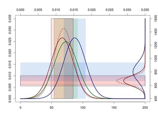
x1<-30:200
a1<-dnorm(x1,87,15)
b1<-dnorm(x1,89,13)
c1<-dnorm(x1,92,16)
d1<-dnorm(x1,104,15)

x2<-000:1600
a2<-dnorm(x2,724,66)
b2<-dnorm(x2,724,50)
d2<-dnorm(x2,835,117)

scale<-range(pretty(range(a1,a2,b1,b2,c1,d1,d2)))

remap<-function(x, to, from=range(x)) {
    (x-from[1]) / (from[2]-from[1]) * (to[2]-to[1]) + to[1]
}

plot(NA, NA, xaxt="n", yaxt="n", type="n", xlim=scale, ylim=scale)
rect(remap(87-15, scale, range(x1)), scale[1],
     remap(87+15, scale, range(x1)), scale[2], col="#ff606025", lty=1)
rect(remap(89-13, scale, range(x1)), scale[1],
     remap(89+13, scale, range(x1)), scale[2], col="#ff606025", lty=2)
rect(remap(92-16, scale, range(x1)), scale[1],
     remap(92+16, scale, range(x1)), scale[2], col="#3dae0025", lty=0)
rect(remap(104-15, scale, range(x1)), scale[1],
     remap(104+15, scale, range(x1)), scale[2], col="#005ccd25", lty=0)

rect(scale[1], remap(724-66, scale, range(x2)),
     scale[2], remap(724+66, scale, range(x2)), col="#ff606025", lty=1)
rect(scale[1], remap(724-50, scale, range(x2)),
     scale[2], remap(724+50, scale, range(x2)), col="#ff606025", lty=2)
rect(scale[1], remap(835-117, scale, range(x2)),
     scale[2], remap(835+117, scale, range(x2)), col="#005ccd25", lty=0)

lines(remap(x1,scale), a1, col="darkred", lwd=3)
lines(remap(x1,scale), b1, col="darkred", lwd=3, lty=3)
lines(remap(x1,scale), c1, col="darkgreen", lwd=3)
lines(remap(x1,scale), d1, col="darkblue", lwd=3)

lines(scale[2]-a2, remap(x2,scale), col="darkred", lwd=3)
lines(scale[2]-b2, remap(x2,scale), col="darkred", lwd=3, lty=3)
lines(scale[2]-d2, remap(x2,scale), col="darkblue", lwd=3)


axis(2); axis(3)
axis(1, at=remap(pretty(x1), scale), pretty(x1))
axis(4, at=remap(pretty(x2), scale), pretty(x2))
谢谢
回答 1
Stack Overflow用户
回答已采纳
发布于 2014-08-09 19:41:14
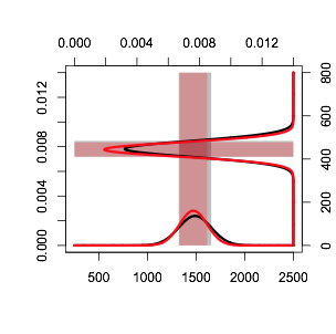
棘手的是,每一个地块只能容纳一个坐标系。所以我们需要做的就是把所有的值都缩放到相同的范围,然后我们可以在轴上做一些模糊处理,以返回到正确的比例。这里有一个完整的解决方案
x1<-250:2500
a1<-dnorm(x1,1489,167)
b1<-dnorm(x1,1472,142)

x2<-0:800
a2<-dnorm(x2,447,37)
b2<-dnorm(x2,444,33)

scale<-range(pretty(range(a1,a2,b1,b2)))

remap<-function(x, to, from=range(x)) {
    (x-from[1]) / (from[2]-from[1]) * (to[2]-to[1]) + to[1]
}


plot(NA, NA, xaxt="n", yaxt="n", type="n", xlim=scale, ylim=scale, xlab="", ylab="")
rect(remap(1489-167, scale, range(x1)), scale[1],
    remap(1489+167, scale, range(x1)), scale[2], col=rgb(0,0,0,.25), lty=0)
rect(remap(1472-142, scale, range(x1)), scale[1],
    remap(1472+142, scale, range(x1)), scale[2], col=rgb(1,0,0,.25), lty=0)

rect(scale[1], remap(447-37, scale, range(x2)),
    scale[2], remap(447+37, scale, range(x2)), col=rgb(0,0,0,.25), lty=0)
rect(scale[1], remap(444-33, scale, range(x2)),
    scale[2], remap(444+33, scale, range(x2)), col=rgb(1,0,0,.25), lty=0)

lines(remap(x1,scale), a1, col="black", lwd=3)
lines(remap(x1,scale), b1, col="red", lwd=3)
lines(scale[2]-a2, remap(x2,scale), col="black", lwd=3)
lines(scale[2]-b2, remap(x2,scale), col="red", lwd=3)
axis(2); axis(3)
axis(1, at=remap(pretty(x1), scale, range(x1)), pretty(x1))
axis(4, at=remap(pretty(x2), scale, range(x2)), pretty(x2))
产
页面原文内容由Stack Overflow提供。腾讯云小微IT领域专用引擎提供翻译支持
原文链接:
https://stackoverflow.com/questions/25221998
复制相关文章
相似问题
腾讯云开发者

Copyright © 2013 - 2026 Tencent Cloud. All Rights Reserved. 腾讯云 版权所有
深圳市腾讯计算机系统有限公司 ICP备案/许可证号:粤B2-20090059 ![]() 粤公网安备44030502008569号
粤公网安备44030502008569号
腾讯云计算(北京)有限责任公司 京ICP证150476号 | 京ICP备11018762号