
箱形图与木素图重叠
箱形图与木素图重叠
提问于 2014-08-04 08:43:57
我用我的数据和lattice库的lattice函数做了一个条件盒图。
    A1 <- bwplot(measure ~ month | plot , data = prueba,
              strip = strip.custom(bg = 'white'),
              cex = .8, layout = c(2, 2),
              xlab = "Month", ylab = "Total",
              par.settings = list(
                box.rectangle = list(col = 1),
                box.umbrella  = list(col = 1),
                plot.symbol   = list(cex = .8, col = 1)),
              scales = list(x = list(relation = "same"),
y = list(relation = "same")))然后,我做了一个木偶图,因为我还想使用来自xyplot库的lattice将沉淀数据添加到前面的图中。
    B1 <- xyplot(precip ~ month | plot, data=prueba,
   type="b",
   ylab = '% precip',
   xlab = 'month',
   strip = function(bg = 'white', ...)
     strip.default(bg = 'white', ...),
   scales = list(alternating = F,
                 x=list(relation = 'same'),
y=list(relation = 'same')))我尝试使用来自grid.arrange库的gridExtra在同一张图上绘制它们:
grid.arrange(A1,B1)但是有了这个,我没有重叠数据,但是结果是
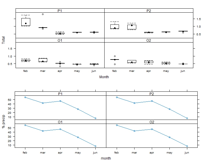
我怎么能“在”受情节制约的盒子里画出沉淀数据呢?
谢谢
回答 2
Stack Overflow用户
回答已采纳
发布于 2014-08-04 09:28:54
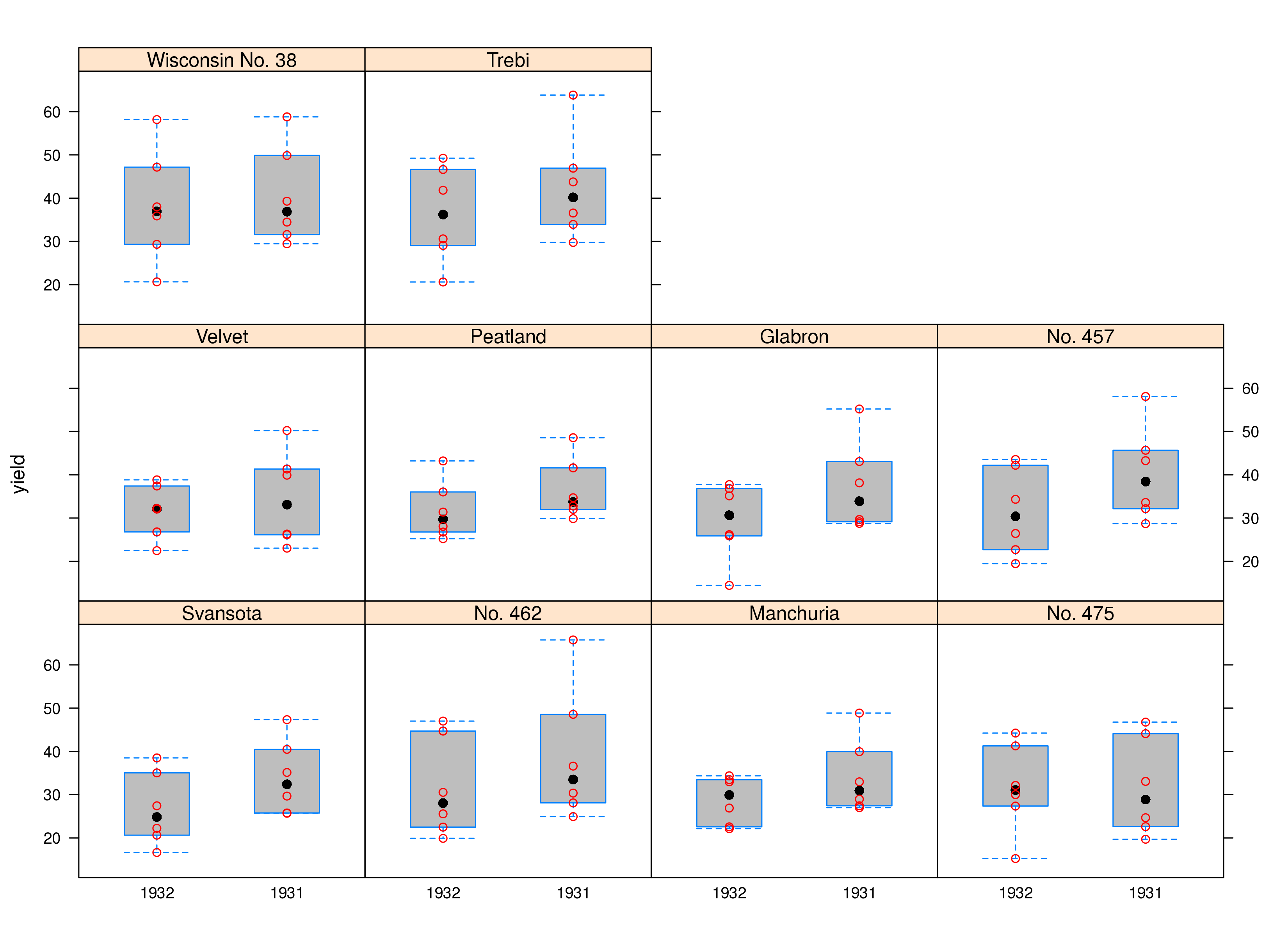
像Andrie一样使用barley数据,这是使用latticeExtra的另一种方法
library(lattice)
library(latticeExtra)

bwplot(yield ~ year | variety , data = barley, fill = "grey") +
xyplot(yield ~ year | variety , data = barley, col = "red")
Stack Overflow用户
发布于 2014-08-04 09:02:09
您需要创建一个自定义面板函数。我用内置的barley数据演示:
假设您希望使用bwplot数据创建一个简单的barley和xyplot。您的代码可能如下所示:
library(lattice)

bwplot(yield ~ year | variety , data = barley)
xyplot(yield ~ year | variety , data = barley)要组合这些绘图,您需要创建一个面板函数,该函数首先绘制默认的panel.bwplot,然后绘制panel.xyplot。试试这个:
bwplot(yield ~ year | variety , data = barley,
       panel = function(x, y, ...){
         panel.bwplot(x, y, fill="grey", ...)
         panel.xyplot(x, y, col="red", ...)
       }
)
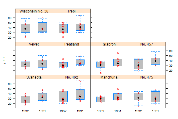
在“帮助?xyplot -向下滚动到panel参数的详细信息”中,有一些关于这样做的信息。
页面原文内容由Stack Overflow提供。腾讯云小微IT领域专用引擎提供翻译支持
原文链接:
https://stackoverflow.com/questions/25114761
复制相关文章
相似问题
腾讯云开发者

Copyright © 2013 - 2026 Tencent Cloud. All Rights Reserved. 腾讯云 版权所有
深圳市腾讯计算机系统有限公司 ICP备案/许可证号:粤B2-20090059 ![]() 粤公网安备44030502008569号
粤公网安备44030502008569号
腾讯云计算(北京)有限责任公司 京ICP证150476号 | 京ICP备11018762号