
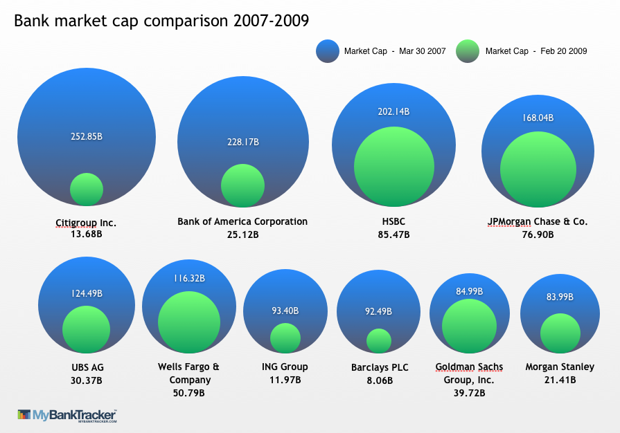
气泡图,气泡沿底部边缘排列
气泡图,气泡沿底部边缘排列
提问于 2014-07-14 13:54:41
有没有一种简单的方法在R中制作一个像这样的气泡图:
我和ggplot玩过假数据的游戏,已经走到了这一步:
cat<-c("A", "A", "B", "B", "C", "C")
chara<-c("1", "0", "1", "0", "1", "0")
percent<-c(80, 20, 60, 40, 90,10)
xcoord<-c(10,10,11,11,12,12)
ycoord<-c(10,10,10,10,10,10)

DF<-data.frame(cat,chara, percent, xcoord, ycoord)

NewBubbleChart <- ggplot(DF, aes(x = cat, y = "", size = percent, label = NULL, fill = chara), legend = FALSE) +
                    geom_point(color = "grey50", shape = 21, alpha = 0.99) +
                   #geom_text(size=4) +
                    theme_bw() +
                    scale_size(range = c(5, 20))

NewBubbleChart <- NewBubbleChart +
                    scale_fill_manual(name = "Type",
                                      values = c("darkblue", "lightblue"),
                                      labels = c("0" = "Type 0", "1" = "Type 1"))
最后,我没有使用xcoord和ycoord部分,但我没有使用它。我知道条形图也能工作,但是需要一个泡泡图。
回答 2
Stack Overflow用户
回答已采纳
发布于 2014-07-14 20:02:24
这似乎很接近了。
library(ggplot2)
# function to calculate coords of a circle
circle <- function(center,radius) {
th <- seq(0,2*pi,len=200)
data.frame(x=center[1]+radius*cos(th),y=center[2]+radius*sin(th))
}
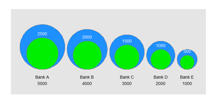
# example dataset, similar to graphic
df <- data.frame(bank=paste("Bank",LETTERS[1:5]),start=1000*(5:1),end=500*(5:1))
max <- max(df$start)
n.bubbles <- nrow(df)
scale <- 0.4/sum(sqrt(df$start))
# calculate scaled centers and radii of bubbles
radii <- scale*sqrt(df$start)
ctr.x <- cumsum(c(radii[1],head(radii,-1)+tail(radii,-1)+.01))
# starting (larger) bubbles
gg.1 <- do.call(rbind,lapply(1:n.bubbles,function(i)cbind(group=i,circle(c(ctr.x[i],radii[i]),radii[i]))))
text.1 <- data.frame(x=ctr.x,y=-0.05,label=paste(df$bank,df$start,sep="\n"))
# ending (smaller) bubbles
radii <- scale*sqrt(df$end)
gg.2 <- do.call(rbind,lapply(1:n.bubbles,function(i)cbind(group=i,circle(c(ctr.x[i],radii[i]),radii[i]))))
text.2 <- data.frame(x=ctr.x,y=2*radii+0.02,label=df$end)
# make the plot
ggplot()+
geom_polygon(data=gg.1,aes(x,y,group=group),fill="dodgerblue")+
geom_path(data=gg.1,aes(x,y,group=group),color="grey50")+
geom_text(data=text.1,aes(x,y,label=label))+
geom_polygon(data=gg.2,aes(x,y,group=group),fill="green2")+
geom_path(data=gg.2,aes(x,y,group=group),color="grey50")+
geom_text(data=text.2,aes(x,y,label=label), color="white")+
labs(x="",y="")+scale_y_continuous(limits=c(-0.1,2.5*scale*sqrt(max(df$start))))+
coord_fixed()+
theme(axis.text=element_blank(),axis.ticks=element_blank(),panel.grid=element_blank())这是一个“泡沫中的泡沫”图表,它代表了一个度量指标(你的图表中的银行市值)在两个事件或时间(在经济崩溃之前和之后,在你的图表中)的变化。为了使其工作,结束条件必须小于起始条件(否则“内部”气泡比外部气泡大)。
诀窍是让圆圈沿底部边缘对齐。这真的很难使用geom_point(...),所以我选择只为气泡画圆圈。
我怀疑在一个真实的情况下,你将不得不手工调整文本的位置。如果您想要多个行(如图中所示),您可以考虑使用ggplot。
最后,如果你想要圆的阴影(例如,一个颜色梯度),这并不是真正的目的:这是可能的,但海事组织比它的价值更多的工作。
Stack Overflow用户
发布于 2014-07-14 14:09:13
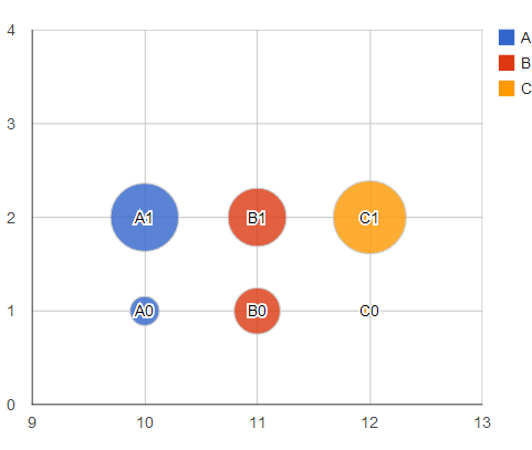
我不太清楚你想让图表看起来怎样,但你可以试着在googleVis包中玩googleVis
library(googleVis)
##
DF <- cbind(
  DF,
  ID=paste0(DF$cat,DF$chara)
)
bChart <- gvisBubbleChart(
  data=DF,
  idvar="ID",
  xvar="xcoord",
  yvar="chara",
  colorvar="cat",
  sizevar="percent",
  options=list(vAxis='{minValue:.8, maxValue:3}')
)
plot(bChart)
页面原文内容由Stack Overflow提供。腾讯云小微IT领域专用引擎提供翻译支持
原文链接:
https://stackoverflow.com/questions/24738172
复制相关文章
相似问题
腾讯云开发者

Copyright © 2013 - 2026 Tencent Cloud. All Rights Reserved. 腾讯云 版权所有
深圳市腾讯计算机系统有限公司 ICP备案/许可证号:粤B2-20090059 ![]() 粤公网安备44030502008569号
粤公网安备44030502008569号
腾讯云计算(北京)有限责任公司 京ICP证150476号 | 京ICP备11018762号