
CSS对齐聊天界面的3个布局元素
我正试图在浏览器窗口中构建一个聊天界面,我无法正确地获得CSS,我尝试了大约10个小时。
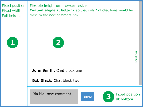
单元格#1和#3固定
编辑: #3也应该是一个固定的高度,例如80 by;其余的窗口高度将由#2使用。
中间的单元格#2 (大的)将包含聊天线路,任何调整窗口大小的窗口都应该将滚动条放在该窗口上,而不是整个窗口上。单元格#2也应该对齐底部的内容,这样只有1-2行而不是在窗口顶部很远。
我在第2单元格上使用这个CSS可以做到非常完美:
flex-direction:column;
flex-flow: row wrap;
align-content:flex-end;
但是它不会在那个单元格上放置滚动条,只有IE才会这样做。我想一定有一种更干净的方法,因为我的CSS看起来很难看,我甚至尝试过使用表格。
这是我现在拥有的,我想它很难读懂
回答 3
Stack Overflow用户
发布于 2014-07-02 17:25:50
嗯,这是一所有点老派的学校,但做你想做的事:http://jsfiddle.net/runPK/
HTML:
<div id="sidebar"></div>
<div id="primary">
    <div id="log"></div>
    <div id="composer"></div>
</div>
CSS:
#sidebar {
    width: 200px;
    height: inherit;
    float: left;
    background-color: gray;
}
#primary {
    margin-left: 200px;
    height: inherit;
}
#log {
    height: 80%;
    background-color: silver;
    overflow: auto;
}
#composer {
    height: 20%;
    background-color: darkgray;
}版本2:用于composer元素的固定高度,将此CSS用于#log和#composer
#log {
    height: calc(100% - 150px);
    background-color: silver;
    overflow: auto;
}
#composer {
    height: 150px;
    background-color: darkgray;
}Stack Overflow用户
发布于 2014-07-02 17:52:37
使用花车,使事情正确地布置。调整大小时更改的元素的百分比高度/宽度。还有一点javascript,以将文本保存在页面底部。
HTML:
<body>
    <div id="left">LEFT</div>
    <div id="right">
        <div id="top">Top
            <div id="empty"></div>
            <div id="chatContent"></div>
        </div>
        <div id="bottom">
            Bottom<br/>
            <textarea id="message">Heres some default texxt.</textarea><br/>
            <button id="clickMe">Send</button>
        </div>
    </div>
</body>
CSS:
body{
    height:500px;
}
#left{
    height:100%;
    width:20%;
    background-color:blue;
    float:left;
}
#right{
    height:100%;
    width:80%;
    float:right;
}
#top{
    overflow-y:scroll;
    background-color:red;
    height:80%;
}
#bottom{
    height:20%;
    background-color:green;
    float:bottom;
}
#chatContent{
    width:100%;
};
#empty{
    width:100%;
};
JavaScript:
$(function(){
    $('#clickMe').click(function(event){
        $('#chatContent').append($('#message').val()+"<br>");
        $('#empty').height($('#top').height()-$('#chatContent').height());
    });

});Stack Overflow用户
发布于 2014-07-02 17:31:31
这可以通过正确地使用浮点数来实现。
查看这个小提琴:http://jsfiddle.net/4ZqzP/1/
Clearfix:http://nicolasgallagher.com/micro-clearfix-hack/
HTML:
<div class="clearfix">
    <div class="item1">Item 1</div>
    <div class="item2">Lorem ipsum dolor sit amet, consectetur adipiscing elit. Nunc at magna nulla. Curabitur vulputate purus sed ligula suscipit placerat.</div>
    <div class="item3">Bottom Item</div>
</div>
CSS:
.clearfix:before,
.clearfix:after {content: ""; display: table;}
.clearfix:after {clear: both;}
.clearfix {zoom: 1;}

.item1,
.item3{
    float: left;
}

.item1{
    width: 20%;
    background-color: magenta;
    height: 600px;
}

.item2{
    width: 80%;
    height: 400px;
    background-color: lime;
    overflow-y: scroll;
    display: table-cell;
    vertical-align: bottom;
}
.item3{
    height: 200px;
    width: 80%;
    background-color: teal;
}https://stackoverflow.com/questions/24537178
复制相似问题
腾讯云开发者

Copyright © 2013 - 2026 Tencent Cloud. All Rights Reserved. 腾讯云 版权所有
深圳市腾讯计算机系统有限公司 ICP备案/许可证号:粤B2-20090059  粤公网安备44030502008569号
腾讯云计算(北京)有限责任公司 京ICP证150476号 | 京ICP备11018762号