
在纯CSS、CSS/SVG或CSS/HTML5 5中构建动态和可修复图形元素的大多数跨浏览器安全方法。
1.目标
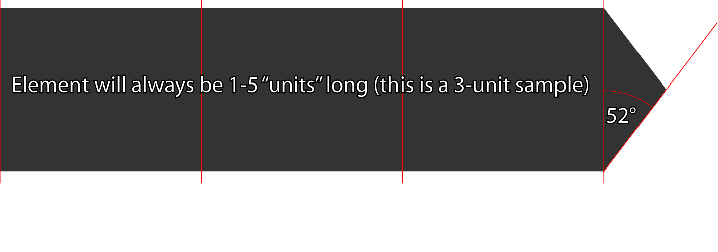
我正在开发一种高度动态的、可扩展的块/内联块级元素样式。看起来会是这样的:
2.我真正需要的
基本上,从我的选择中选择的建议。哪种方法最能兼容跨浏览器的友好性和扩展性作为主要关注点?
我使用SASS来呈现我的CSS,所以我的示例中的<style>元素是伪代码。我希望能够使用定义良好的类继承来动态地控制以下内容:
- 文本内容(特性)
- 高度(高度可变)
- 宽度(5种可能的宽度;我正在Zurb的基金会5中开发,元素总是介于1到5列之间)
- 背景色(这里只有2-5个选项)
- 颜色(这里只有3个选项)
- 方向(L &R可能足够)
3.我尝试过的东西--
位图
这是没有好处的,我要做的太多,不能控制的角度,因为它是延伸的高度。
纯CSS
这就是我想要做的。
<!-- the HTML -->
<div class="arrow-label">
    <h4 class="expand"><?php echo $label-text;?></h4>
    <a href="#" class="triangle right-facing"></a>
</div>

<style>
  div.arrow-label {
    h4 {
      display:inline-block;
      background-color: $arrow-label-background-color;
    }
     .triangle { background-color: $arrow-label-background-color; }
  }

.triangle {
  width:0;
  height:0;
  display:inline-block;
  margin:0;
  border-style: solid;
  transition: border-color 300ms ease-out;
  // I have removed transitional selectors (ie. :hover) below for brevity's sake

    &.up-facing {
      border-width: 0 rem-calc(12px) rem-calc(15px) rem-calc(12px);
      border-color: transparent transparent $triangle-color transparent;
    }
    // rinse/repeat for .left-facing, .right-facing, .bottom-facing

    &.disabled {
       transition:none;
       color: $triangle-disabled-color;
    }

    &.inherited-transition { transition: inherit}
  }
</style>
SVG
因此,我只想承认,我只是粗略地了解了如何利用SVG的强大潜力,这里。我已经在Illustrator中生成了这个SVG,尽管我认为它可能需要修改,以便尽可能地扩展:
<?xml version="1.0" encoding="utf-8"?>
<!DOCTYPE svg PUBLIC "-//W3C//DTD SVG 1.1//EN" "http://www.w3.org/Graphics/SVG/1.1/DTD/svg11.dtd">
<svg version="1.1" id="Layer_1" xmlns="http://www.w3.org/2000/svg" xmlns:xlink="http://www.w3.org/1999/xlink" x="0px" y="0px"
     width="635.436px" height="156.041px" viewBox="0 0 635.436 156.041" enable-background="new 0 0 635.436 156.041"
     xml:space="preserve">
<polygon fill="#333333" points="576.576,155.254 635.436,78.02 576.576,0.787 576.576,0 575.976,0 575.976,0 575.976,0 0,0
    0,156.041 576.576,156.041 "/>
</svg>但是,不要真正理解如何使用它;例如,我想,如果我将它用作包含文本的元素的background-image属性参数,我就无法达到目的;但我也不知道如何通过CSS动态完成这一任务。
更新
有一条评论要求编译后的CSS在这里;我还没有检查颜色,我认为它们目前是毫无意义的,但我认为这包括了它:
/* The element itself */
div.arrow-label h4 {
  display: inline-block;
  background-color: #323232;
}


/* the code I use to make triangles, and in this case, would be capping the element with
   note that, as per the standard, 1rem = 16px here */
.triangle {
  width: 0;
  height: 0;
  display: inline-block;
  margin: 0;
  border-style: solid;
  transition: border-color 300ms ease-out;
}

.triangle.up-facing {
  border-width: 0 0.75rem 0.9375rem 0.75rem;
  border-color: transparent transparent #ff5555 transparent;
}

.triangle.up-facing:hover {
  border-color: transparent transparent #ffa1a1 transparent;
}

.triangle.up-facing:active {
  border-color: transparent transparent #683939 transparent;
}

.triangle.down-facing {
  border-width: 0.9375rem 0.75rem 0 0.75rem;
  border-color: #ff5555 transparent transparent transparent;
}

.triangle.down-facing:hover {
  border-color: #ffa1a1 transparent transparent transparent;
}

.triangle.down-facing:active {
  border-color: #bb0000 transparent transparent transparent;
}

.triangle.right-facing {
  border-width: 0.75rem 0 0.75rem 0.9375rem;
  border-color: transparent transparent transparent #ff5555;
}

.triangle.right-facing:hover {
  border-color: transparent transparent transparent #ffa1a1;
}

.triangle.right-facing:active {
  border-color: transparent transparent transparent #683939;
}

.triangle.left-facing {
  border-width: 0.75rem 0.9375rem 0.75rem 0;
  border-color: transparent #ff5555 transparent transparent;
}

.triangle.left-facing:hover {
  border-color: transparent #ffa1a1 transparent transparent;
}

.triangle.left-facing:active {
  border-color: transparent #683939 transparent transparent;
}

.triangle.disabled {
  transition: none;
  color: #ffa1a1;
}

.triangle.inherited-transition {
  transition: inherit;
}回答 2
Stack Overflow用户
发布于 2014-07-02 17:59:29
SVG文件(简化代码)
<svg xmlns="http://www.w3.org/2000/svg" viewBox="0 0 500 100" >
    <polygon fill="#333" points="0,0 460,0 500,50 460,100 0,100" />
</svg>CSS文件,或嵌入<style>。
#my_block{
    width: 190px;
    height: 40px;
    background-image: url(../images/arrow.svg);/*change to the svg url*/
    background-position: right center;
    background-size: auto 100%;
    transition: 100ms 200ms ease-out;
}
#my_block:hover{
    width: 200px;
    transition: 100ms ease-out;
    opacity: 0.7;
}
HTML ( div可以是ul,p,内联块,..)
<div id="my_block"></div>Stack Overflow用户
发布于 2014-07-02 17:21:04
为什么不使用div“正方形”和一个div“三角形”(只使用CSS样式)呢?
纯CSS:http://css-tricks.com/snippets/css/css-triangle/中的三角形
给每个元素相同的高度和任何你想要的宽度,它应该工作得很好-容易。
编辑:有关“内联CSS三角形”的更多信息,请查看这是如此的帖子。编辑2:概念小提琴的证明
HTML:
<div class="pointyDiv">This is le content</div>CSS:
.pointyDiv {
    position:relative;
    display:inline-block;
    background-color:black;
    padding:50px 0px;
    color:white;
}
.pointyDiv:after {
    position: absolute;
    border: solid;
    border-color: transparent black;
    border-width: 60px 0px 60px 40px;
    content:"";
    text-align:center;
    right:-40px;
    top:0px;
}通过将它包装在一个容器中,它很容易地实现了才能做出反应。
https://stackoverflow.com/questions/24536396
复制相似问题
腾讯云开发者

Copyright © 2013 - 2026 Tencent Cloud. All Rights Reserved. 腾讯云 版权所有
深圳市腾讯计算机系统有限公司 ICP备案/许可证号:粤B2-20090059  粤公网安备44030502008569号
腾讯云计算(北京)有限责任公司 京ICP证150476号 | 京ICP备11018762号